Grids and ticks
This section demonstrates options available for axes grids and ticks.
Setup
Import packages:
import fivecentplots as fcp
import numpy as np
import pandas as pd
from pathlib import Path
Read some dummy data for examples:
df = pd.read_csv(Path(fcp.__file__).parent / 'test_data/fake_data.csv')
df.head()
| Substrate | Target Wavelength | Boost Level | Temperature [C] | Die | Voltage | I Set | I [A] | |
|---|---|---|---|---|---|---|---|---|
| 0 | Si | 450 | 0.2 | 25 | (1,1) | 0.0 | 0.0 | 0.0 |
| 1 | Si | 450 | 0.2 | 25 | (1,1) | 0.1 | 0.0 | 0.0 |
| 2 | Si | 450 | 0.2 | 25 | (1,1) | 0.2 | 0.0 | 0.0 |
| 3 | Si | 450 | 0.2 | 25 | (1,1) | 0.3 | 0.0 | 0.0 |
| 4 | Si | 450 | 0.2 | 25 | (1,1) | 0.4 | 0.0 | 0.0 |
Optionally set the design theme (skipping here and using default):
#fcp.set_theme('gray')
#fcp.set_theme('white')
Grids
Grid properties apply to a specific axis:
major vs. minor
xvs.x2vs.yvs.y2
fivecentplots allows you to adjust all major and all minor grids together (using grid_major_ as a keyword prefix) or to adjust only a specific axis (using grid_major_<x|y|x2|y2>_ as a keyword prefix).
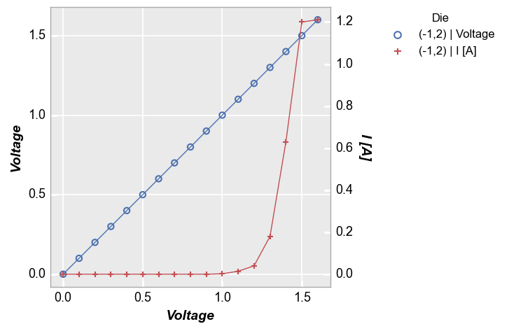
Major grid
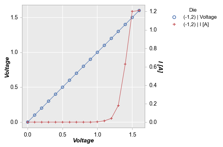
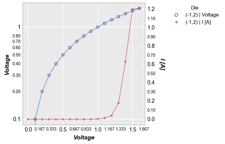
By default, only major gridlines for the primary axes are visible in a plot. Notice below that the secondary y-axis has tick marks only.
fcp.plot(df, x='Voltage', y=['Voltage', 'I [A]'], twin_x=True, legend='Die',
         filter='Substrate=="Si" & Target Wavelength==450 & Boost Level==0.2 & Temperature [C]==25 & Die=="(-1,2)"')
We can disable both primary gridlines using the grid_major keyword:
fcp.plot(df, x='Voltage', y=['Voltage', 'I [A]'], twin_x=True, legend='Die',
         filter='Substrate=="Si" & Target Wavelength==450 & Boost Level==0.2 & Temperature [C]==25 & Die=="(-1,2)"',
         grid_major=False)

Or we can just disable one gridline by specifying the axis of interest in our keyword:
fcp.plot(df, x='Voltage', y=['Voltage', 'I [A]'], twin_x=True, legend='Die',
         filter='Substrate=="Si" & Target Wavelength==450 & Boost Level==0.2 & Temperature [C]==25 & Die=="(-1,2)"',
         grid_major_y=False)

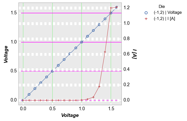
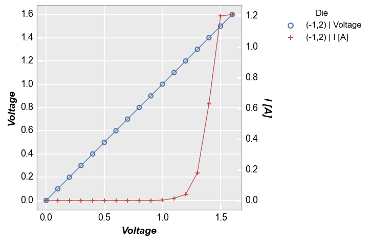
We can also turn on the secondary y-axis grid and give it a distinct look:
fcp.plot(df, x='Voltage', y=['Voltage', 'I [A]'], twin_x=True, legend='Die',
         filter='Substrate=="Si" & Target Wavelength==450 & Boost Level==0.2 & Temperature [C]==25 & Die=="(-1,2)"',
         grid_major_y2=True, grid_major_y2_style='--')

We can also customize the gridline color and style (albeit in a truly awful way here):
fcp.plot(df, x='Voltage', y=['Voltage', 'I [A]'], twin_x=True, legend='Die',
         filter='Substrate=="Si" & Target Wavelength==450 & Boost Level==0.2 & Temperature [C]==25 & Die=="(-1,2)"',
         grid_major_y2=True, grid_major_y2_style='--', grid_major_y2_width=8,
         grid_major_x_color='#00FF00', grid_major_x_alpha=0.3, grid_major_y_color='#FF00FF')
Minor grid
Minor grids are disabled by default but can be turned on and styled using either the grid_minor_ family of keywords to adjust all primary axes, or the grid_minor_<x|y|x2|y2_> family of keywords to change a single axis.
fcp.plot(df, x='Voltage', y=['Voltage', 'I [A]'], twin_x=True, legend='Die',
         filter='Substrate=="Si" & Target Wavelength==450 & Boost Level==0.2 & Temperature [C]==25 & Die=="(-1,2)"',
         grid_minor=True)
Tick marks
Visibility
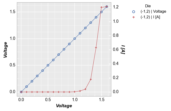
Tick marks are controlled by keywords with the prefix ticks_major_ or ticks_minor_ and, like grid lines, can be controlled as one for major and minor ticks or by specific axis. They are enabled by default on the inside of the plot whenever a grid line is enabled. However, you can enable tick marks without enabling the accompanying grid lines:
fcp.plot(df, x='Voltage', y=['Voltage', 'I [A]'], twin_x=True, legend='Die',
         filter='Substrate=="Si" & Target Wavelength==450 & Boost Level==0.2 & Temperature [C]==25 & Die=="(-1,2)"',
         ticks_minor=True)

Tick Style
All tick mark parameters can be changed via keywords at the time of plot execution or on a more permanent basis via the theme file. Consider the option below:
fcp.plot(df, x='Voltage', y=['Voltage', 'I [A]'], twin_x=True, legend='Die',
         filter='Substrate=="Si" & Target Wavelength==450 & Boost Level==0.2 & Temperature [C]==25 & Die=="(-1,2)"',
         ticks_major_direction='out', ticks_major_color='#aaaaaa', ticks_major_length=5, ticks_major_width=0.8)
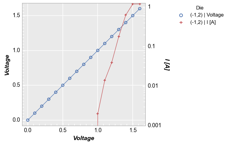
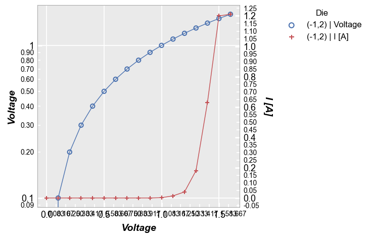
Tick increment
For major tick marks, instead of specifying a number of tick marks to display we specify the tick increment:
fcp.plot(df, x='Voltage', y=['Voltage', 'I [A]'], twin_x=True, legend='Die',
         filter='Substrate=="Si" & Target Wavelength==450 & Boost Level==0.2 & Temperature [C]==25 & Die=="(-1,2)"',
         ticks_major_y_increment=0.2)
For minor ticks however, it is easier to specify the number of minor ticks to use via the ticks_minor_<x|y|x2|y2>_number keyword. The interval between minor ticks will then be calculated automatically. Setting the number of ticks automatically turns on the tick marks without explicitly setting ticks_minor_<x|y|x2|y2>=True.
Note
Note that this option only works for linearly scaled axis. Minor log axis will always have 8 minor ticks with log spacing (notice the number is ignored for the “y2” axis below).
fcp.plot(df, x='Voltage', y=['Voltage', 'I [A]'], twin_x=True, legend='Die', ax2_scale='logy',
         filter='Substrate=="Si" & Target Wavelength==450 & Boost Level==0.2 & Temperature [C]==25 & Die=="(-1,2)"',
         ticks_minor_x_number=5, ticks_minor_y_number=10, ticks_minor_y2_number=4)
Tick labels
General comments
In addition to tick markers, we can control the labels associated with those markers for both major and minor axes. Note the following:
Tick marks are automatically enabled if tick labels are enabled
Tick labels are not automatically enabled when tick marks are enabled, but they are automatically disabled if tick marks are disabled
Major tick labels are always on by default unless shut off intentionally
Minor tick labels are always off by default and must be turned on intentionally
Turn off all ticks (Notice the labels are not affected since they are independent Element objects)
fcp.plot(df, x='Voltage', y=['Voltage', 'I [A]'], twin_x=True, legend='Die',
         filter='Substrate=="Si" & Target Wavelength==450 & Boost Level==0.2 & Temperature [C]==25 & Die=="(-1,2)"',
         ticks_major=False)

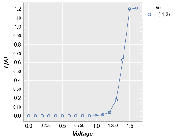
Turn on minor ticks This is done using the tick_labels_minor family of keywords:
fcp.plot(df, x='Voltage', y='I [A]', legend='Die',
         filter='Substrate=="Si" & Target Wavelength==450 & Boost Level==0.2 & Temperature [C]==25 & Die=="(-1,2)"',
         tick_labels_minor=True)
Tick cleanup
One challenge with tick labels is the potential for label to label overlap depending on the number of ticks displayed and the size of the plot. fivecentplots employs algorithms that looks for tick label collision problems within a plot and between subplots and throws out certain labels while leaving the actual tick mark intact. Consider the following example:
fcp.plot(df, x='Voltage', y=['Voltage', 'I [A]'], twin_x=True, legend='Die',
         filter='Substrate=="Si" & Target Wavelength==450 & Boost Level==0.2 & Temperature [C]==25 & Die=="(-1,2)"',
         tick_labels_minor=True, ax_scale='logy', ax2_scale='lin', ticks_minor_x_number=5)
Notice that all tick marks are present, but not all tick marks have labels. For instance, the x-axis has 5 ticks as specified by ticks_minor_x_number=5, but only the 2nd and 4th tick labels are displayed. This is the result of tick cleanup. We can disable the cleanup algorithm by setting the keyword tick_cleanup=False. However, this may produce an undesirable result:
fcp.plot(df, x='Voltage', y=['Voltage', 'I [A]'], twin_x=True, legend='Die',
         filter='Substrate=="Si" & Target Wavelength==450 & Boost Level==0.2 & Temperature [C]==25 & Die=="(-1,2)"',
         tick_labels_minor=True, ax_scale='logy', ax2_scale='lin', ticks_minor_x_number=5, tick_cleanup=False)
To fit more tick labels in, try increasing the axes size, rotating the tick labels (if applicable), and/or changing font sizes:
fcp.plot(df, x='Voltage', y=['Voltage', 'I [A]'], twin_x=True, legend='Die',
         filter='Substrate=="Si" & Target Wavelength==450 & Boost Level==0.2 & Temperature [C]==25 & Die=="(-1,2)"',
         tick_labels_minor=True, ax_scale='logy', ax2_scale='lin', ticks_minor_x_number=5,
         ax_size=[600,400], tick_labels_minor_x_rotation=90, tick_labels_major_y2_font_size=11)

Scientific notation
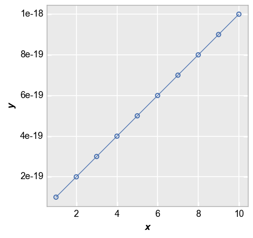
Linear scale axis
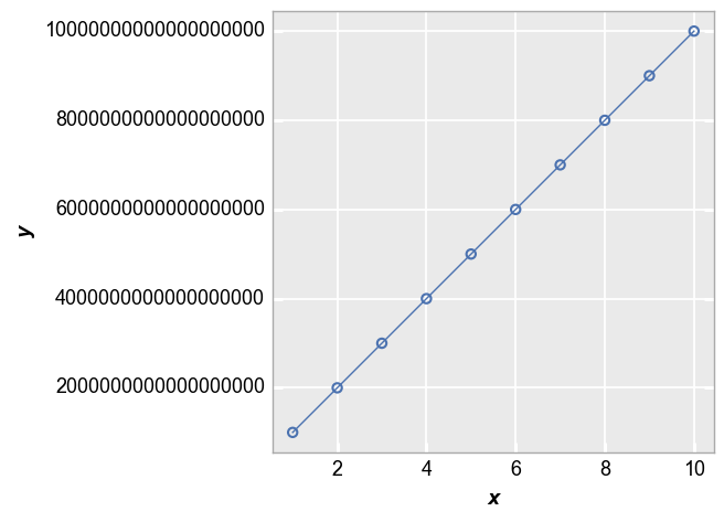
fivecentplots will attempt to make an intelligent decision about how to display tick labels when the range of data and/or the discrete tick values are very small/large. Consider the following example with very small y values. Notice that the values on the y-axis default to exponential notation rather than explicitly writing out 18 zeros after the decimal place.
x = np.linspace(1, 10, 10)
y = np.linspace(1E-19, 1E-18, 10)
fcp.plot(pd.DataFrame({'x': x, 'y': y}), x='x', y='y')
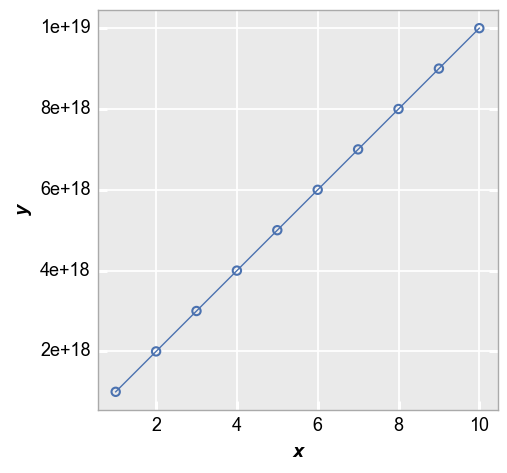
Similarly, for very large values:
x = np.linspace(1, 10, 10)
y = np.linspace(1E18, 1E19, 10)
fcp.plot(pd.DataFrame({'x': x, 'y': y}), x='x', y='y')
You can disable the auto-formatting of ticks by setting the keywords sci_x and/or sci_y to False:
x = np.linspace(1, 10, 10)
y = np.linspace(1E18, 1E19, 10)
fcp.plot(pd.DataFrame({'x': x, 'y': y}), x='x', y='y', sci_y=False)
Log scale axis
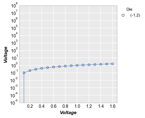
Now consider the following log-scaled plot. By default, the major tick labels for a log axis are powers of 10 if the values are large.
fcp.plot(df, x='Voltage', y='Voltage', legend='Die',
         filter='Substrate=="Si" & Target Wavelength==450 & Boost Level==0.2 & Temperature [C]==25 & Die=="(-1,2)"',
         ax_scale='logy', ymin=0.00001, ymax=100000000)
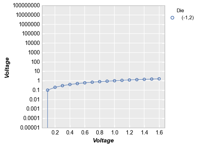
We can force the tick values to regular numerals as we did above by setting the keywords sci_x and/or sci_y to False.
fcp.plot(df, x='Voltage', y='Voltage', legend='Die',
         filter='Substrate=="Si" & Target Wavelength==450 & Boost Level==0.2 & Temperature [C]==25 & Die=="(-1,2)"',
         ax_scale='logy', ymin=0.00001, ymax=100000000, sci_y=False)
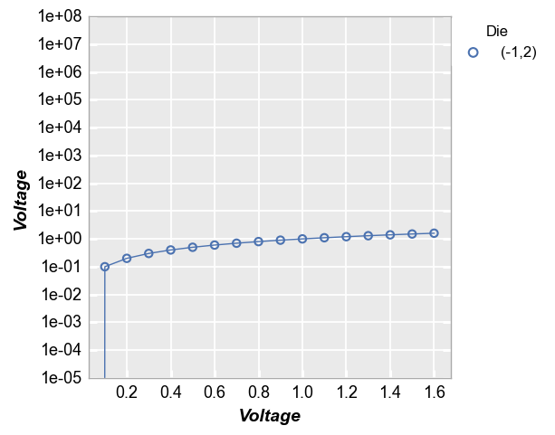
We can force tick marks of a log-scaled axis to exponential notation by setting the keywords sci_x and/or sci_y to True.
fcp.plot(df, x='Voltage', y='Voltage', legend='Die',
         filter='Substrate=="Si" & Target Wavelength==450 & Boost Level==0.2 & Temperature [C]==25 & Die=="(-1,2)"',
         ax_scale='logy', ymin=0.00001, ymax=100000000, sci_y=True)
Colorbar
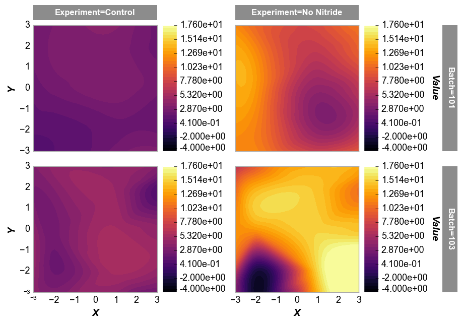
We can also force scientific notation on the color bar axis by setting the kwargs sci_z=True:
df2 = pd.read_csv(Path(fcp.__file__).parent / 'test_data/fake_data_contour.csv')
fcp.contour(df2, x='X', y='Y', z='Value', row='Batch', col='Experiment', filled=True,
            cbar=True, xmin=-3, xmax=3, ymin=-3, ymax=3, ax_size=[250,250],
            label_rc_font_size=12, levels=40, sci_z=True)