fivecentplots
A Python plotting analgesic
Why another Python plotting library?
There is no shortage of quality plotting libraries in Python. While basic plots can be easy, complex plots with custom styling and formatting often involve mastery of a daunting API and many lines of code. This complexity is discouraging to new/casual Python users and may lead them to abandon Python in favor of more comfortable, albeit inferior, plotting tools like Excel.
fivecentplots simplifies the API required to generate complex plots, specifically for data in pandas DataFrames.
Advantages of fivecentplots
- Plots require a single function call with no additional lines of code
- All style, formatting, and grouping is determined using optional keyword arguments or a simple "theme" file
- Data come from DataFrames and can be accessed by simple column names
- All colors, sizes, marker themes, grouping options, etc. can be defined by optional keyword arguments in a single function call
- Repeated kwargs can also be pulled from a simple theme file
- All the complexity of a plotting library's API is managed behind the scenes, simplifying the user's life
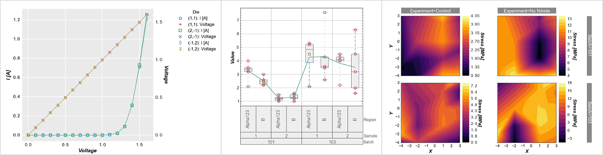
- With pandas, statistical analysis in Python rivals or surpasses that of commercial software packages like JMP. However, JMP has some useful plotting options that are tedious to create in Python. fivencentplots makes it easy to create:
- fivecentplots can wrap any plotting "engine" (or library) with the same API
- Getting the same plot from say matplotlib or bokeh is as easy as chaning one kwarg in the exact same function call (more development is needed here, but conceptually it works)
- Automated bulk plotting is available in fivecentplots using ini-style config files instead of explicit function calls
- This feature is very useful for production environments with standardized measurement data so users do not have to manually create line-health plots
- When using matplotlib as the plotting engine, >fivecentplots shifts the sizing paradigm so the user can define the plot area size instead of the entire figure size
- Plots can now have consistent and controllable plotting area sizes and do not get squished to accomodate other elements (such as labels and legends) in the figure.
Example
Consider the following plot of some fake current vs voltage data contained in a dummy DataFrame, df:
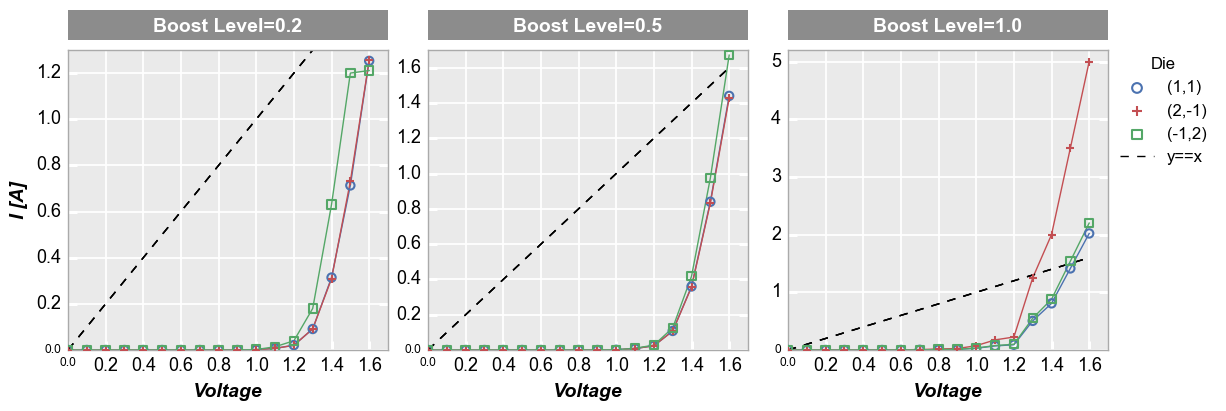
Using fivecentplots, we need a single function call with the some select keyword arguments:
fcp.plot(df, x='Voltage', y='I [A]', legend='Die', col='Boost Level', ax_size=[225, 225], share_y=False,
         filter='Substrate=="Si" & Target Wavelength==450 & Temperature [C]==25',
         ref_line=df['Voltage'], ref_line_legend_text='y==x', ref_line_style='--',
         xmin=0, xmax=1.7, ymin=[0, 0, 0], ymax=[1.3, 1.7, 5.2])
Consider one possible approach to generate a very similar plot using matplotlib only:
import matplotlib.pylab as plt
import matplotlib
import natsort

# Filter the dataframe to get the subset of interest
df_sub = df[(df.Substrate=="Si")&(df['Target Wavelength']==450)&(df['Temperature [C]']==25)]

# Set some defaults
markers = ['o', '+', 's']
colors = ['#4b72b0', '#c34e52', '#54a767']
ymax = [1.3, 1.7, 5.2]
lines = []

# Create the figure and axes
f, axes = plt.subplots(1, 3, sharex=False, sharey=False, figsize=[9.82, 3.46])

# Plot the data and style the axes
for iboost, boost in enumerate(df_sub['Boost Level'].unique()):
   df_boost = df_sub[df_sub['Boost Level']==boost]
   for idie, die in enumerate(natsort.natsorted(df_boost.Die.unique())):
      df_die = df_boost[df_boost.Die==die]
      axes[iboost].set_facecolor('#eaeaea')
      axes[iboost].grid(which='major', axis='both', linestyle='-', color='#ffffff', linewidth=1.3)
      lines += axes[iboost].plot(df_die['Voltage'], df_die['I [A]'], '-', color=colors[idie],
                                 marker=markers[idie], markeredgecolor=colors[idie], markerfacecolor='none',
                                 markeredgewidth=1.5, markersize=6)
      axes[iboost].set_axisbelow(True)
      axes[iboost].spines['bottom'].set_color('#aaaaaa')
      axes[iboost].spines['top'].set_color('#aaaaaa')
      axes[iboost].spines['right'].set_color('#aaaaaa')
      axes[iboost].spines['left'].set_color('#aaaaaa')
      if iboost==0:
            axes[iboost].set_ylabel('I [A]', fontsize=14, fontweight='bold', fontstyle='italic')
      axes[iboost].set_xlabel('Voltage', fontsize=14, fontweight='bold', fontstyle='italic')
   axes[iboost].set_xlim(left=0, right=1.6)
   axes[iboost].set_ylim(bottom=0, top=ymax[iboost])

   # Add the column labels
   rect = matplotlib.patches.Rectangle((0, 1.044), 1, 30/225, fill=True, transform=axes[iboost].transAxes,
                                       facecolor='#8c8c8c', edgecolor='#8c8c8c', clip_on=False)
   axes[iboost].add_patch(rect)
   text = 'Boost Level = {}'.format(boost)
   axes[iboost].text(0.5, 1.111, text, transform=axes[iboost].transAxes,
                     horizontalalignment='center', verticalalignment='center',
                     rotation=0, color='#ffffff', weight='bold', size=16)

   # Customize ticks
   axes[iboost].tick_params(axis='both', which='major', pad=5, colors='#ffffff',
                           labelsize=13, labelcolor='#000000', width=2.2)
   # Add reference line
   ref_line = df_die['Voltage']
   ref = axes[iboost].plot(df_die['Voltage'], ref_line, '-', color='#000000', linestyle='--')
   if iboost == 0 :
      lines = ref + lines

# Style the figure
f.set_facecolor('#ffffff')
f.subplots_adjust(left=0.077, right=0.882, top=0.827, bottom=0.176, hspace=0.133, wspace=0.313)

# Add legend
leg = f.legend(lines[0:4], ['y==x'] + list(df_boost.Die.unique()), title='Die', numpoints=1,
               bbox_to_anchor=(1, 0.85), prop={'size': 12})
leg.get_frame().set_edgecolor('#ffffff')

# Show the plot
plt.show()
This example is obviously a bit contrived as you could simplify things by modifying rc_params or eliminating some of the specific style elments used here, but the general idea should be clear: fivecentplots can reduce the barrier to generate complex plots.
What if we wanted to do the same plot in raw bokeh code? Well, we’d need to learn an entirely
different API! But with fivecentplots we can just change the kwarg defining the plotting engine
(engine) and we are all set:
fcp.plot(df, x='Voltage', y='I [A]', legend='Die', col='Boost Level', ax_size=[225, 225], share_y=False,
         filter='Substrate=="Si" & Target Wavelength==450 & Temperature [C]==25',
         ref_line=df['Voltage'], ref_line_legend_text='y==x', ref_line_style='--',
         xmin=0, xmax=1.7, ymin=[0, 0, 0], ymax=[1.3, 1.7, 5.2], engine='bokeh')
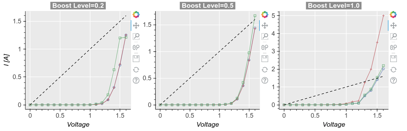
Note
bokeh support is still limited and not all plot types are currently available. It does not currently have as much styling flexibility as matplotlib so plots are not a 1:1 exact replication.
Refer to the topics on the sidebar for more details on plot types and options.
Documentation
Basics
Other