heatmap
This section describes various options available for plotting heatmaps in fivecentplots
Setup
Import packages:
import fivecentplots as fcp
import pandas as pd
from pathlib import Path
Read some fake heatmap data filled with absolutely made-up basketball stats:
df = pd.read_csv(Path(fcp.__file__).parent / 'test_data/fake_data_heatmap.csv')
df.head()
| Player | Category | Average | |
|---|---|---|---|
| 0 | Lebron James | Points | 27.5 |
| 1 | Lebron James | Assists | 9.1 |
| 2 | Lebron James | Rebounds | 8.6 |
| 3 | Lebron James | Blocks | 0.9 |
| 4 | James Harden | Points | 30.4 |
Optionally set the design theme (skipping here and using default):
#fcp.set_theme('gray')
#fcp.set_theme('white')
Categorical heatmap
First consider a case where both the x and y DataFrame columns contain categorical data values:
No data labels
Note that colorbars are enabled by default for heatmaps and must be intentionally disabled with cbar=False to remove.
fcp.heatmap(df, x='Category', y='Player', z='Average')
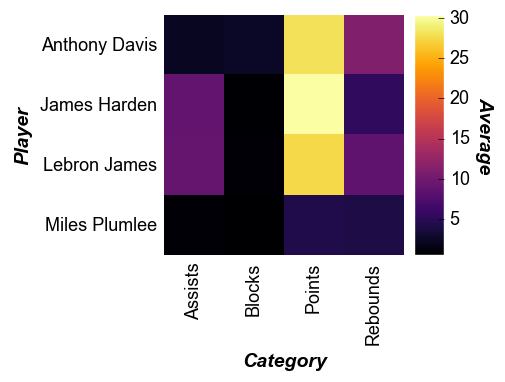
Note that for heatmaps the x tick labels are rotated 90° by default. This can be overridden via the keyword tick_labels_major_x_rotation.
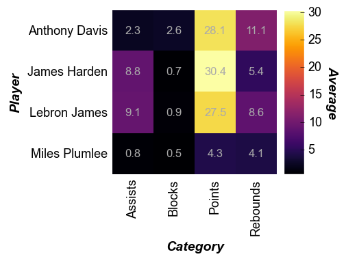
With data labels
Using keyword data_labels=True we can overlay the numerical value of the z column on top of the heatmap cells:
fcp.heatmap(df, x='Category', y='Player', z='Average', data_labels=True,
            heatmap_font_color='#aaaaaa', tick_labels_major_y_edge_width=0, ws_ticks_ax=5)
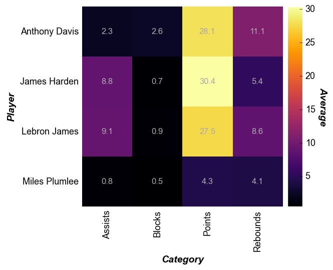
Cell size
The size of the heatmap cell will default to a width of 60 pixels unless: (1) the keyword heatmap_cell_size (or cell_size when directly supplying the value to the function call) is specified; or (2) ax_size is explicitly defined. Note that for a heatmap the cells are always square with width=height.
fcp.heatmap(df, x='Category', y='Player', z='Average', data_labels=True,
            heatmap_font_color='#aaaaaa', tick_labels_major_y_edge_width=0, ws_ticks_ax=5, cell_size=100)
Non-uniform data
A major difference between heatmaps and contour plots is that contour plots assume that the x and y DataFrame column values are numerical and continuous. With a heatmap, we can cast numerical data into categorical form. Note that any missing values get mapped as nan values are not not plotted.
# Read the contour DataFrame
df2 = pd.read_csv(Path(fcp.__file__).parent / 'test_data/fake_data_contour.csv')
fcp.heatmap(df2, x='X', y='Y', z='Value', row='Batch', col='Experiment',
            cbar=True, share_z=True, ax_size=[400, 400], data_labels=False,
            label_rc_font_size=12, filter='Batch==103', cmap='viridis')
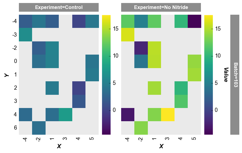
Note that the x-axis width is not 400px as specified by the keyword ax_scale. This occurs because the data set does not have as many values on the x-axis as on the y-axis. fivecentplots applies the axis size to the axis with the most items and scales the other axis accordingly.
imshow alternative
We can also use fcp.heatmap to display images (similar to imshow in matplotlib). Here we will take a random image from the world wide web, place it in a pandas DataFrame, and display.
# Read an image
import imageio
url = 'https://imagesvc.meredithcorp.io/v3/mm/image?q=85&c=sc&rect=0%2C214%2C2000%2C1214&poi=%5B920%2C546%5D&w=2000&h=1000&url=https%3A%2F%2Fstatic.onecms.io%2Fwp-content%2Fuploads%2Fsites%2F47%2F2020%2F10%2F07%2Fcat-in-pirate-costume-380541532-2000.jpg'
imgr = imageio.imread(url)

# Convert to grayscale
r, g, b = imgr[:,:,0], imgr[:,:,1], imgr[:,:,2]
gray = 0.2989 * r + 0.5870 * g + 0.1140 * b

# Convert image data to pandas DataFrame
img = pd.DataFrame(gray)
img.head()
Warning: Starting with ImageIO v3 the behavior of this function will switch to that of iio.v3.imread. To keep the current behavior (and make this warning dissapear) use `import imageio.v2 as imageio` or call `imageio.v2.imread` directly.
| 0 | 1 | 2 | 3 | 4 | 5 | 6 | 7 | 8 | 9 | ... | 1990 | 1991 | 1992 | 1993 | 1994 | 1995 | 1996 | 1997 | 1998 | 1999 | |
|---|---|---|---|---|---|---|---|---|---|---|---|---|---|---|---|---|---|---|---|---|---|
| 0 | 220.907 | 220.907 | 220.907 | 220.907 | 220.907 | 220.907 | 220.907 | 220.907 | 220.9070 | 220.9070 | ... | 219.9071 | 219.9071 | 219.9071 | 219.9071 | 219.9071 | 219.9071 | 219.9071 | 219.9071 | 219.9071 | 219.9071 |
| 1 | 220.907 | 220.907 | 220.907 | 220.907 | 220.907 | 220.907 | 220.907 | 220.907 | 219.9071 | 219.9071 | ... | 219.9071 | 219.9071 | 219.9071 | 219.9071 | 219.9071 | 219.9071 | 219.9071 | 219.9071 | 219.9071 | 219.9071 |
| 2 | 220.907 | 220.907 | 220.907 | 220.907 | 220.907 | 220.907 | 220.907 | 220.907 | 219.9071 | 219.9071 | ... | 219.9071 | 219.9071 | 219.9071 | 219.9071 | 219.9071 | 219.9071 | 219.9071 | 219.9071 | 219.9071 | 219.9071 |
| 3 | 220.907 | 220.907 | 220.907 | 220.907 | 220.907 | 220.907 | 220.907 | 220.907 | 219.9071 | 219.9071 | ... | 219.9071 | 219.9071 | 219.9071 | 219.9071 | 219.9071 | 219.9071 | 219.9071 | 219.9071 | 219.9071 | 219.9071 |
| 4 | 220.907 | 220.907 | 220.907 | 220.907 | 220.907 | 220.907 | 220.907 | 220.907 | 220.9070 | 220.9070 | ... | 219.9071 | 219.9071 | 219.9071 | 219.9071 | 219.9071 | 219.9071 | 219.9071 | 219.9071 | 219.9071 | 219.9071 |
5 rows × 2000 columns
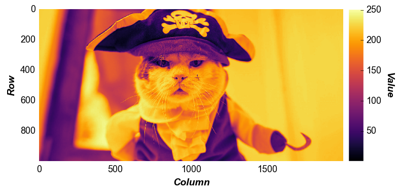
Display the image as a colored heatmap:
fcp.heatmap(img, cmap='inferno', cbar=True, ax_size=[600, 600])
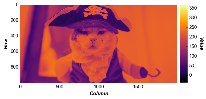
Now let’s adjust the contrast of the same image by limiting our color range to the mean pixel value +/- 3 * sigma:
uu = img.stack().mean()
ss = img.stack().std()
fcp.heatmap(img, cmap='inferno', cbar=True, ax_size=[600, 600], zmin=uu-3*ss, zmax=uu+3*ss)
We can also crop the image by specifying range value for x and y. Unlike imshow, the actual row and column values displayed on the x- and y-axis are preserved after the zoom (not reset to 0, 0):
fcp.heatmap(img, cmap='inferno', cbar=True, ax_size=[600, 600], xmin=700, xmax=1100, ymin=300, ymax=400)
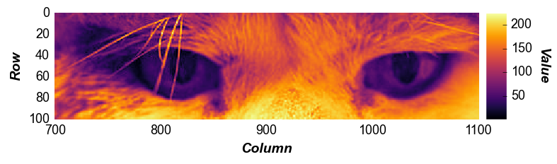
private eyes are watching you…