plot
This section describes various options available for xy plots in fivecentplots
Setup
Import packages
import fivecentplots as fcp
import pandas as pd
from pathlib import Path
Sample data
We will use two fake datasets in this tutorial:
make-believe current vs voltage data for a set of diodes [
df]a time-series dataset for “happiness” data, derived from an undisclosed bodily orifice [
ts].
df = pd.read_csv(Path(fcp.__file__).parent / 'test_data/fake_data.csv')
df.head(10)
| Substrate | Target Wavelength | Boost Level | Temperature [C] | Die | Voltage | I Set | I [A] | |
|---|---|---|---|---|---|---|---|---|
| 0 | Si | 450 | 0.2 | 25 | (1,1) | 0.0 | 0.0 | 0.0 |
| 1 | Si | 450 | 0.2 | 25 | (1,1) | 0.1 | 0.0 | 0.0 |
| 2 | Si | 450 | 0.2 | 25 | (1,1) | 0.2 | 0.0 | 0.0 |
| 3 | Si | 450 | 0.2 | 25 | (1,1) | 0.3 | 0.0 | 0.0 |
| 4 | Si | 450 | 0.2 | 25 | (1,1) | 0.4 | 0.0 | 0.0 |
| 5 | Si | 450 | 0.2 | 25 | (1,1) | 0.5 | 0.0 | 0.0 |
| 6 | Si | 450 | 0.2 | 25 | (1,1) | 0.6 | 0.0 | 0.0 |
| 7 | Si | 450 | 0.2 | 25 | (1,1) | 0.7 | 0.0 | 0.0 |
| 8 | Si | 450 | 0.2 | 25 | (1,1) | 0.8 | 0.0 | 0.0 |
| 9 | Si | 450 | 0.2 | 25 | (1,1) | 0.9 | 0.0 | 0.0 |
ts = pd.read_csv(Path(fcp.__file__).parent / 'test_data/fake_ts.csv')
ts.head()
| Date | Happiness Quotient | |
|---|---|---|
| 0 | 1/1/2015 | 16.088954 |
| 1 | 1/2/2015 | 18.186724 |
| 2 | 1/3/2015 | 35.744313 |
| 3 | 1/4/2015 | 38.134045 |
| 4 | 1/5/2015 | 46.147279 |
Optionally set the design theme (skipping here and using default):
#fcp.set_theme('gray')
#fcp.set_theme('white')
Basic XY Plots
Scatter
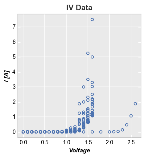
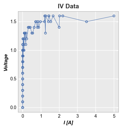
A simple XY plot of current vs voltage is shown below for a sample set of fake diodes.
fcp.plot(df, x='Voltage', y='I [A]', title='IV Data', lines=False)
For better visibility, we can subset the data to show only diodes that meet certain criteria. This is accomplished using the filter kwarg from fivecentplots:
fcp.plot(df, x='Voltage', y='I [A]', title='IV Data', lines=False,
         filter='Substrate=="Si" & Target Wavelength==450 & Boost Level==0.2 & Temperature [C]==25')
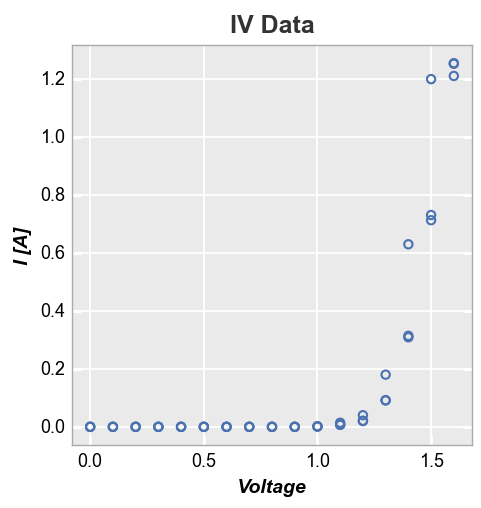
In the example above, we are selecting specific data based on values in four different DataFrame columns (“Substrate”, “Target Wavelength”, “Boost Level”, and “Temperature”). This is conveniently achieved using fivecentplots’s built-in filter tool, which uses an easy, human-readable string to sub-sample a dataset. Alternatively, could also have applied filtering directly to the input DataFrame as shown below, but this feels a bit cumbersome:
df_sub = df[(df['Substrate']=="Si")&(df['Target Wavelength']==450)&(df['Boost Level']==0.2)&(df['Temperature [C]']==25)]
Read more about fivecentplots filtering here.
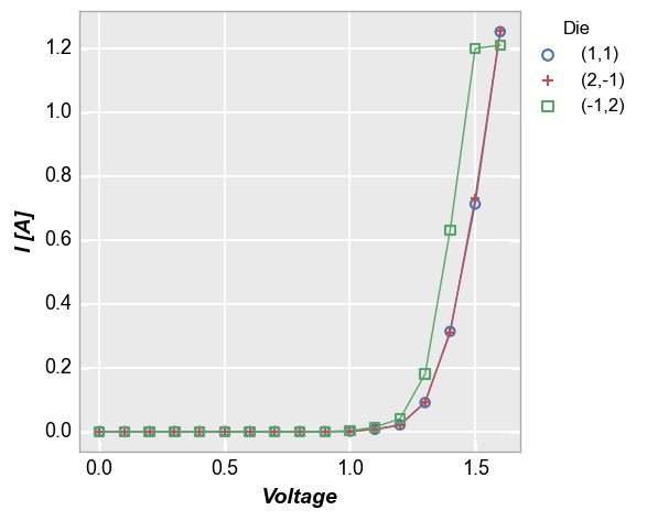
Legend
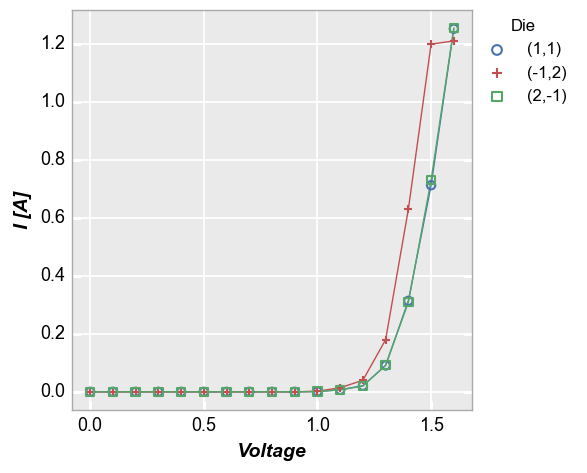
Our sampled data set actually contains IV data for three different diodes, which are named based on their coordinates on a Si wafer. To easily separate them, we add a legend using the column “Die”. Because we are now grouping each die individually, we enable the connecting lines between points.
fcp.plot(df, x='Voltage', y='I [A]', legend='Die',
         filter='Substrate=="Si" & Target Wavelength==450 & Boost Level==0.2 & Temperature [C]==25')
By default, the values in the legend are sorted using so-called “natural” sorting via the natsort library. To disable this and order the legend based on the order in which the group was actually found in the dataframe, add the keyword sort=False:
fcp.plot(df, x='Voltage', y='I [A]', legend='Die', sort=False,
         filter='Substrate=="Si" & Target Wavelength==450 & Boost Level==0.2 & Temperature [C]==25')
Axes scales
Log- and other-scaled axes can be enabled through the kwarg ax_scale. Valid options:
x-only: logx | semilogx
y-only: logy | semilogy
both: loglog | log
symlog: symlog
logit: logit
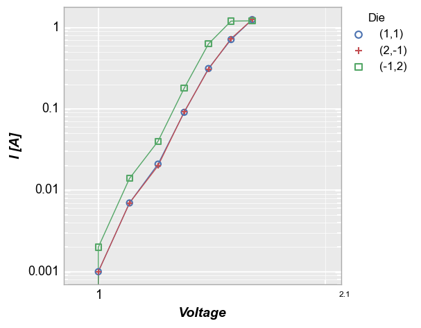
Consider the legend plot from above, now with log-log axes:
fcp.plot(df, x='Voltage', y='I [A]', ax_scale='loglog', legend='Die', xmin=0.9, xmax=2.1, grid_minor=True,
         filter='Substrate=="Si" & Target Wavelength==450 & Boost Level==0.2 & Temperature [C]==25')
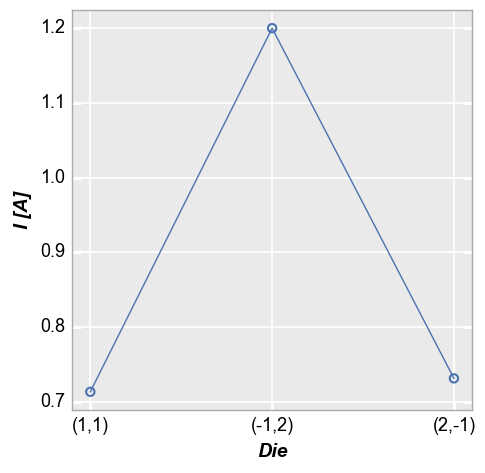
Categorical labels
Categorical DataFrame columns can also be plotted on x and/or y axes. In this example, we take the current values for each of the 3 diodes above at a voltage of 1.5V (using filter) and plot the die location coordinates on the x-axis:
fcp.plot(df, x='Die', y='I [A]', filter='Substrate=="Si" & Target Wavelength==450 & Boost Level==0.2 & Temperature [C]==25 & Voltage==1.5')
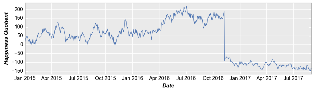
Time series
We can also use plot to visualize time series data. In this example, we use the ts dataset loaded previously and place the “Date” column on the x-axis. For clarity, we disable markers and widen the horizontal size of the plot area.
fcp.plot(ts, x='Date', y='Happiness Quotient', markers=False, ax_size=[1000, 250])
Secondary axes
Secondary x- and y-axes can be added to an xy plot using the twin_[x|y] keyword. We must also provide an additional DataFrame column name for the alternate axes to the kwarg for the axis that is not twinned (i.e., twin_x means two column names are required for y and twin_y means two column names are required for x). Lines and markers will be colored to match the axis label. Grid lines default to the primary axis but secondary gridlines can also be enabled as shown below.
Note: kwargs related to the primary axes are suffixed with _x or _y. Keywords related to the secondary axis are suffixed with _x2 and _y2.
Shared x-axis (twin_x)
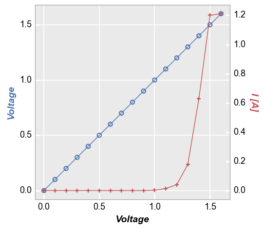
fcp.plot(df, x='Voltage', y=['Voltage', 'I [A]'], twin_x=True,
         filter='Substrate=="Si" & Target Wavelength==450 & Boost Level==0.2 & Temperature [C]==25 & Die=="(-1,2)"')
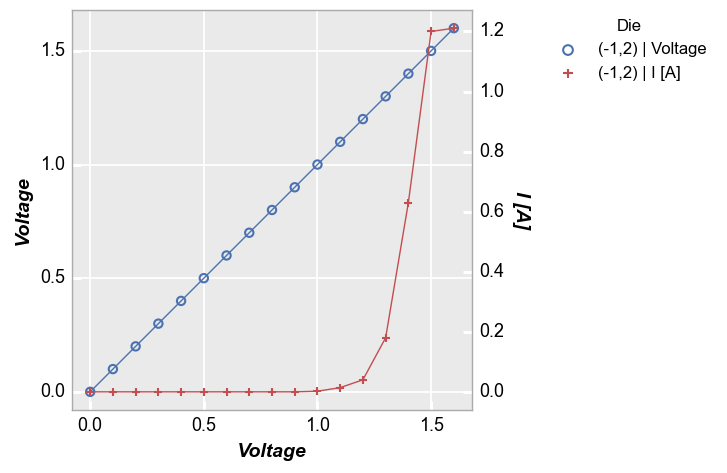
Next, the same plot but with a legend enabled. Note that the legend will describe the value from the legend column and the value associated with the curve (either the primary or the secondary axis):
fcp.plot(df, x='Voltage', y=['Voltage', 'I [A]'], twin_x=True, legend='Die',
         filter='Substrate=="Si" & Target Wavelength==450 & Boost Level==0.2 & Temperature [C]==25 & Die=="(-1,2)"')
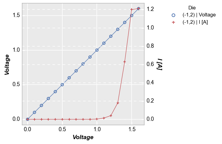
Next, the same plot but with secondary gridlines enabled:
fcp.plot(df, x='Voltage', y=['Voltage', 'I [A]'], twin_x=True, legend='Die',
         grid_major_y2=True, grid_major_y2_style='--',
         filter='Substrate=="Si" & Target Wavelength==450 & Boost Level==0.2 & Temperature [C]==25 & Die=="(-1,2)"')
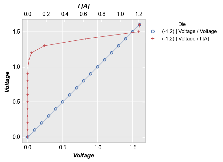
Shared y-axis (twin_y)
We can also twin the y-axis and plot two different x columns:
fcp.plot(df, x=['Voltage', 'I [A]'], y='Voltage', legend='Die', twin_y=True,
         filter='Substrate=="Si" & Target Wavelength==450 & Boost Level==0.2 & Temperature [C]==25 & Die=="(-1,2)"')
Multiple x & y values
Instead of sharing (or twinning) one independent axis across a primary and secondary dependent axis, we can plot multiple columns of data on the same dependent axis. In this case, all dependent values share the same limits on the plot.
Multiple y only
If we supply a list of column names for keyword y, we can plot both response values on the same axis. The y-axis label is automatically updated to list all column names in use (this can be overridden using keyword label_y). Legend values are automatically updated to designate which response column applies to each curve.
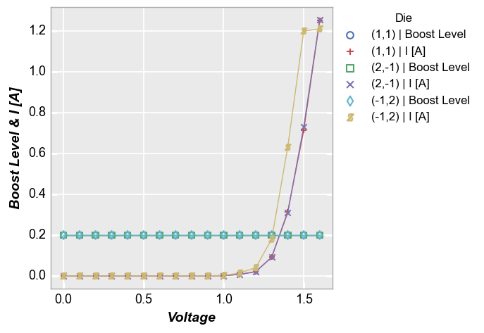
fcp.plot(df, x='Voltage', y=['Boost Level', 'I [A]'], legend='Die',
         filter='Substrate=="Si" & Target Wavelength==450 & Boost Level==0.2 & Temperature [C]==25')
And with a custom label_y:
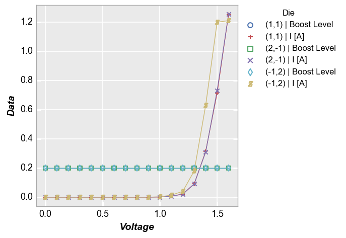
fcp.plot(df, x='Voltage', y=['Boost Level', 'I [A]'], legend='Die', label_y='Data',
         filter='Substrate=="Si" & Target Wavelength==450 & Boost Level==0.2 & Temperature [C]==25')
Multiple x only
We can do the same thing with the x-axis:
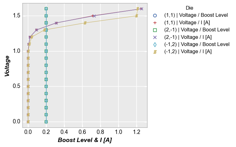
fcp.plot(df, x=['Boost Level', 'I [A]'], y='Voltage', legend='Die',
         filter='Substrate=="Si" & Target Wavelength==450 & Boost Level==0.2 & Temperature [C]==25')
Multiple x and y
We can also add multiple columns to both x and y kwargs:
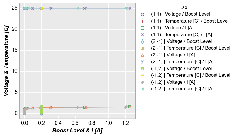
fcp.plot(df, x=['Boost Level', 'I [A]'], y=['Voltage', 'Temperature [C]'], legend='Die',
         filter='Substrate=="Si" & Target Wavelength==450 & Boost Level==0.2 & Temperature [C]==25')
Grouping
As explained in Grouping data, we can group xy plots based on other DataFrame columns to better visualize a dataset. Grouping options include:
row: a single column of subplotscolumn: a single row of subplotsrowxcolumn: a 2D grid of subplots based on two different DataFrame columnswrap: a 2D grid of subplots wrapped in sequence (based on one or more DataFrame columns)
These grouped plots share a legend (if enabled) and will share common ranges unless sharing is explicity disabled
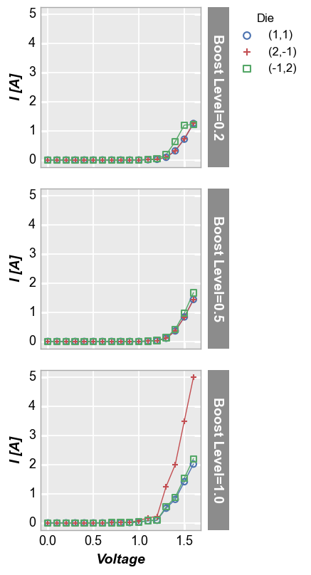
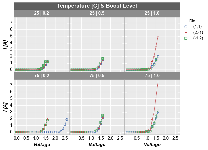
Row plot
Row plots create multiple subplots in a single column. Each unique value in the DataFrame column provided for keyword row creates a new row in the subplot grid. Plot order is defined alphabetically from top to bottom. Each row contains a row label indicating the unique value of the row column.
fcp.plot(df, x='Voltage', y='I [A]', legend='Die', row='Boost Level', ax_size=[225, 225],
         filter='Substrate=="Si" & Target Wavelength==450 & Temperature [C]==25')
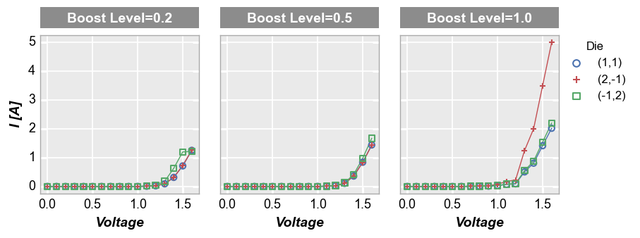
Column plot
Column plots create multiple subplots in a single row. Each unique value in the DataFrame column provided for keyword col creates a new column in the subplot grid. Plot order is defined alphabetically from left to right. Each column contains a column label indicating the unique value of the col column.
fcp.plot(df, x='Voltage', y='I [A]', legend='Die', col='Boost Level', ax_size=[225, 225],
         filter='Substrate=="Si" & Target Wavelength==450 & Temperature [C]==25')
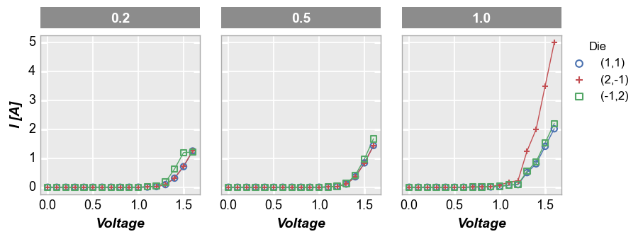
If desired, the DataFrame column names which are automatically added to the row/column labels can be dropped using one of the following kwargs:
label_rc_names=False: disable both row and column label nameslabel_col_names=False: disable column label nameslabel_row_names=False: disable row label names
fcp.plot(df, x='Voltage', y='I [A]', legend='Die', col='Boost Level', ax_size=[225, 225], label_col_names=False,
         filter='Substrate=="Si" & Target Wavelength==450 & Temperature [C]==25')
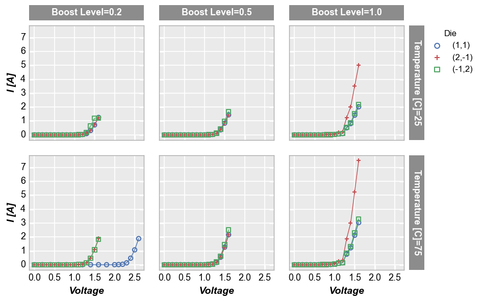
Row x column grid
If we provide DataFrame column names for both row and col keywords, we create a grid of subplots where each combination of unique values is used to make a subplot.
fcp.plot(df, x='Voltage', y='I [A]', legend='Die', col='Boost Level', row='Temperature [C]',
         ax_size=[225, 225], filter='Substrate=="Si" & Target Wavelength==450', label_rc_font_size=13)
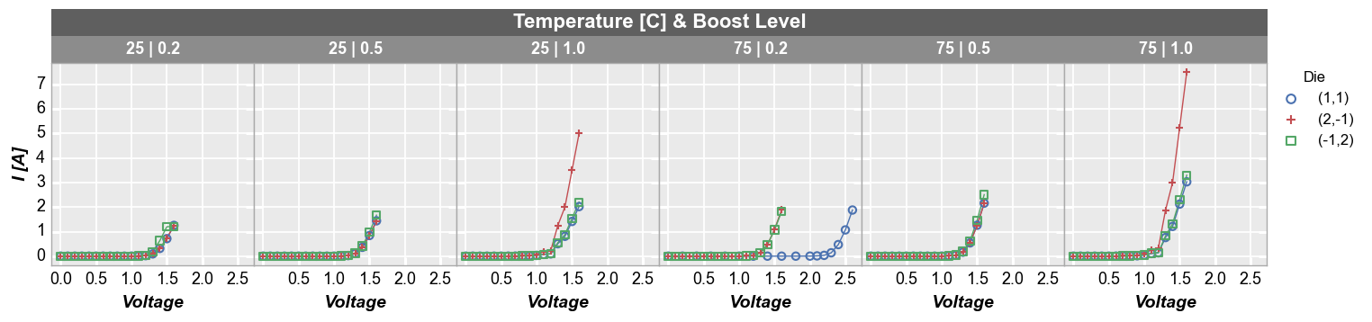
Wrap plot
A wrap plot is an alternate view of the row by column grid. For wrap plots, each subplot contains the unique values or combination of values from one or more DataFrame columns. The actual values plotted are condensed into a single label above each plot window. By default, spacing between plots is removed, unlike the row x column grouping option (this default can be overriden by keyword ws_col). Additionally, the default number of columns in this grid are determined by the square root of the
total number of subplot windows. However, the number of columns in a wrap plot can be controlled via keyword ncol. In wrap plots, x and y axes ranges must be shared.
Default number of columns:
fcp.plot(df, x='Voltage', y='I [A]', legend='Die', wrap=['Temperature [C]', 'Boost Level'],
         ax_size=[225, 225], filter='Substrate=="Si" & Target Wavelength==450', label_rc_font_size=13)
Custom number of columns:
fcp.plot(df, x='Voltage', y='I [A]', legend='Die', wrap=['Temperature [C]', 'Boost Level'], ncol=6,
         ax_size=[225, 225], filter='Substrate=="Si" & Target Wavelength==450', label_rc_font_size=13)
Other options
Several additional options available to enhance data analysis in xy plots are describe below.
Horizontal & vertical lines
We can add horizontal and vertical reference lines to a plot using one or more of the following keywords: ax_hlines, ax_vlines, ax2_hlines, ax2_vlines where “h” stands for “horizontal”, “v” stands for “vertical”, “ax” stands for primary axes, and “ax2” stands for secondary axes (if they exists). The keywords except several different types of inputs:
a single float number
a list of float numbers
or a variable-length list of tuples (only first value is required):
item 1 (required) = x or y axis value of the line or the name of a DataFrame column from which the first entry in the column will be used
item 2: line color
item 3: line style
item 4: line width
item 5: line alpha
item 6: legend text (added automatically is using a DataFrame column name for the value)
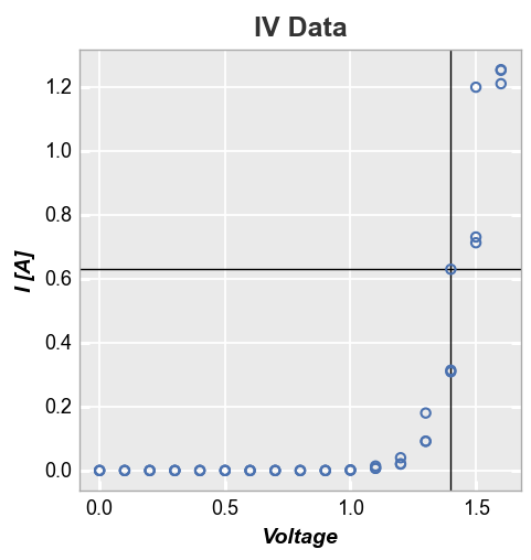
First we add a single horizontal and vertical line using default styles (determined by the current theme):
fcp.plot(df, x='Voltage', y='I [A]', title='IV Data', lines=False, legend=True,
         filter='Substrate=="Si" & Target Wavelength==450 & Boost Level==0.2 & Temperature [C]==25',
         ax_hlines=0.63, ax_vlines=1.4)
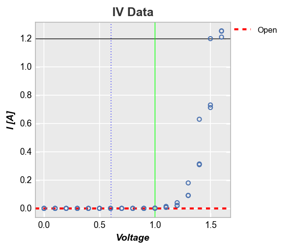
Next we plot multiple horizontal and vertical lines at the same time and use the tuple formulation to style them independently (note one line contains the tuple value for legend name and thus is shown in the legend):
fcp.plot(df, x='Voltage', y='I [A]', title='IV Data', lines=False, legend=True,
         filter='Substrate=="Si" & Target Wavelength==450 & Boost Level==0.2 & Temperature [C]==25',
         ax_hlines=[(0, '#FF0000', '--', 3, 1, 'Open', '#555555', 0.25), 1.2],
         ax_vlines=[(0.6, '#0000ff', ':'), (1, '#00FF00')])
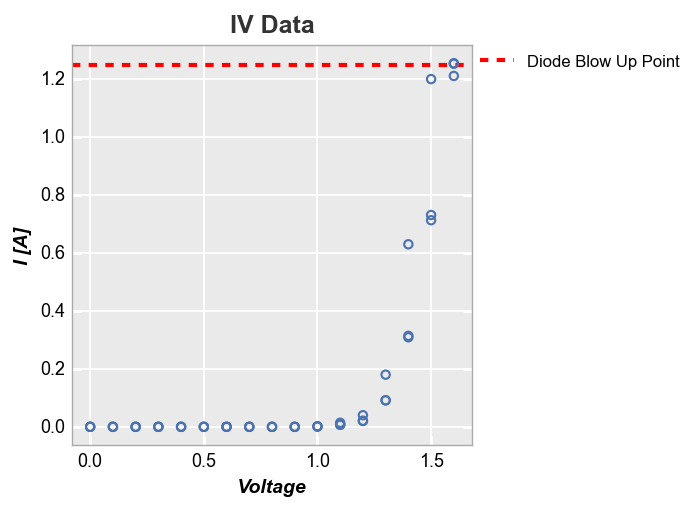
We can also plot ax_lines using data from a DataFrame column. Below we define a new column and plot the value from the first row as a horizontal line:
df['Diode Blow Up Point'] = 1.25
fcp.plot(df, x='Voltage', y='I [A]', title='IV Data', lines=False, legend=True,
         filter='Substrate=="Si" & Target Wavelength==450 & Boost Level==0.2 & Temperature [C]==25',
         ax_hlines=[('Diode Blow Up Point', '#FF0000', '--', 3, 1)])
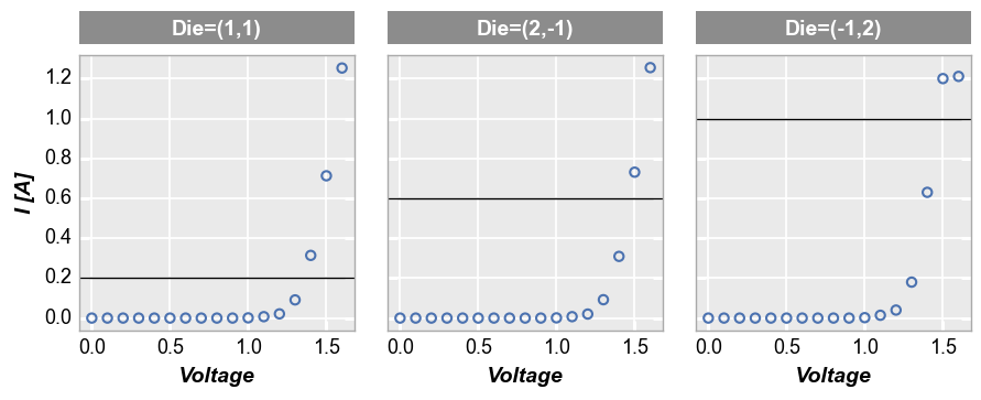
For row/col/wrap plots, we can also apply the keyword ax_[h|v]lines_by_plot=True to pass a different value to each subplot:
fcp.plot(df, x='Voltage', y='I [A]', col='Die', lines=False, legend=True, ax_size=[250, 250],
         filter='Substrate=="Si" & Target Wavelength==450 & Boost Level==0.2 & Temperature [C]==25',
         ax_hlines=[0.2, 0.6, 1.0], ax_hlines_by_plot=True)
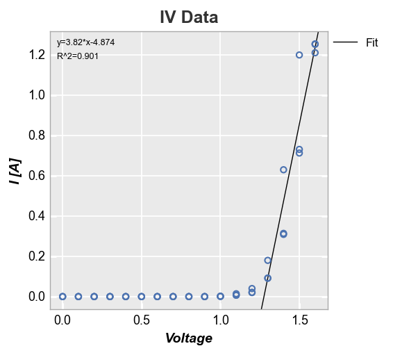
Curve fitting
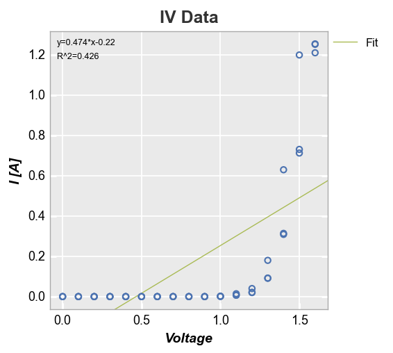
fivecentplots provide automatic curve fitting using kwargs starting with fit. The value of fit specifies the degree and style parameters follow the normal pattern but are prefixed by fit_. We can display the fit equation and R^2 values via keywords fit_eqn=True and fit_rsq==True, respectively. By default, a legend is displayed to designate the style of the fit line (this can be disabled by supplying keyword legend=False).
fcp.plot(df, x='Voltage', y='I [A]', title='IV Data', lines=False,
         filter='Substrate=="Si" & Target Wavelength==450 & Boost Level==0.2 & Temperature [C]==25',
         fit=1, fit_eqn=True, fit_rsq=True, fit_font_size=9, fit_color='#AABB55')
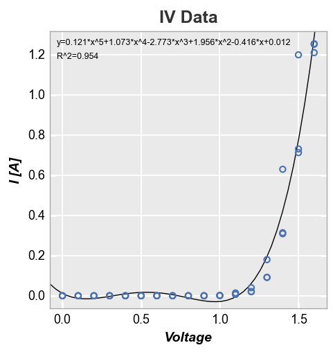
Since this fit is garbage, let’s make it a polynomial of degree 5. We’ll also disable the legend just because:
fcp.plot(df, x='Voltage', y='I [A]', title='IV Data', lines=False, legend=False,
         filter='Substrate=="Si" & Target Wavelength==450 & Boost Level==0.2 & Temperature [C]==25',
         fit=5, fit_eqn=True, fit_rsq=True, fit_font_size=9)
Let’s return to our linear fit example. After about Voltage = 1.3V, the response looks somewhat linear. We can constrain the region of interest for the fit by supplying a start and stop value to the keywords fit_range_x (which selects data points that fall within this range on the x-axis) or fit_range_y (which selects data points that fall within this range on the y-axis). The R^2 of this fit looks much better than before.
fcp.plot(df, x='Voltage', y='I [A]', title='IV Data', lines=False,
         filter='Substrate=="Si" & Target Wavelength==450 & Boost Level==0.2 & Temperature [C]==25',
         fit=1, fit_eqn=True, fit_rsq=True, fit_font_size=9, fit_range_x=[1.3, 2])
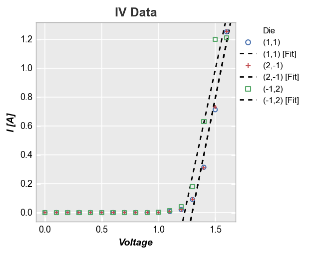
In the case of multiple datasets, we can also add a line of fit for each item in a legend by specifying a DataFrame column in the legend keyword:
fcp.plot(df, x='Voltage', y='I [A]', title='IV Data', lines=False, legend='Die',
         filter='Substrate=="Si" & Target Wavelength==450 & Boost Level==0.2 & Temperature [C]==25',
         fit=1, fit_range_x=[1.3, 2], fit_width=2, fit_style='--')
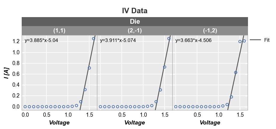
Fits also work with subplot grouping:
fcp.plot(df, x='Voltage', y='I [A]', title='IV Data', lines=False, wrap='Die', ncol=3,
         filter='Substrate=="Si" & Target Wavelength==450 & Boost Level==0.2 & Temperature [C]==25',
         fit=1, fit_range_x=[1.3, 2], fit_eqn=True, fit_width=2, fit_color='#555555', ax_size=[250, 250])
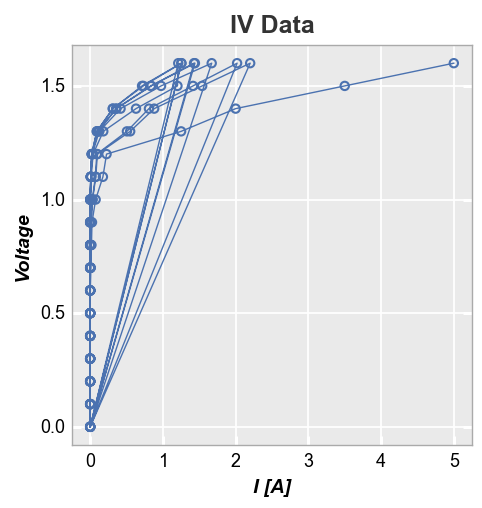
Stat lines
If lines are enabled in an xy plot, they are drawn from point to point based on the order in which they appear in a DataFrame column. If multiple groups are included in the dataset and not separated by grouping or legending, the lines will circle back on each other (from the end of one group to the start of the next) as shown below:
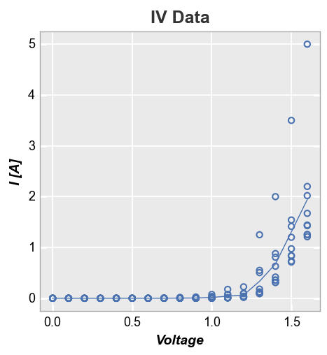
fcp.plot(df, x='I [A]', y='Voltage', title='IV Data',
         filter='Substrate=="Si" & Target Wavelength==450 & Temperature [C]==25')
One option to deal with this is to sort the DataFrame by x-value. Unfortunately, this can result in a very jagged mess as lines are drawn between points with similar x-value but different y-value.
df2 = df.copy()
df2 = df2.sort_values('I [A]')
fcp.plot(df2, x='I [A]', y='Voltage', title='IV Data',
         filter='Substrate=="Si" & Target Wavelength==450 & Temperature [C]==25')
Rather than drawing connecting lines between all points, fivecentplots allows you to select a representative statistic of the data at each value (such as the median) and plot a line based on this value instead. This is accomplished using the stat keyword (any stats that can be applied to a pandas groupby object are valid).
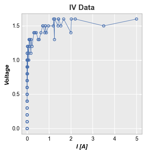
First consider a plot of Voltage vs Current with a “mean” stat line. The result is clean because the voltage values in our dataset are at fixed and common values between datasets.
fcp.plot(df, y='I [A]', x='Voltage', title='IV Data', stat='mean',
         filter='Substrate=="Si" & Target Wavelength==450 & Temperature [C]==25')
Alternatively, if we plot Current vs Voltage, our mean stat line becomes jagged and nasty. This is due to the fact that the current values for each voltage point vary between datasets. This is not any better than just plotting a simple connecting line between points.
fcp.plot(df, x='I [A]', y='Voltage', title='IV Data', stat='mean',
         filter='Substrate=="Si" & Target Wavelength==450 & Temperature [C]==25')
For cases where the x-values are not identical and have some jitter from one dataset to the next, you can use the keyword stat_val and specify an alternative DataFrame column to use for the statistical calculation (the actual plotted x-axis will still be whatever is specified for the x keyword). Here we use a column called “I Set” which represents the setpoint current while “I [A]” represents the actual measured current. We still have some jaggedness in the stat line but it is now
representative of the actual dataset and not overwhelmed by minor jitter in the x-values.
fcp.plot(df, x='I [A]', y='Voltage', title='IV Data', stat='mean', stat_val='I Set',
         filter='Substrate=="Si" & Target Wavelength==450 & Temperature [C]==25')

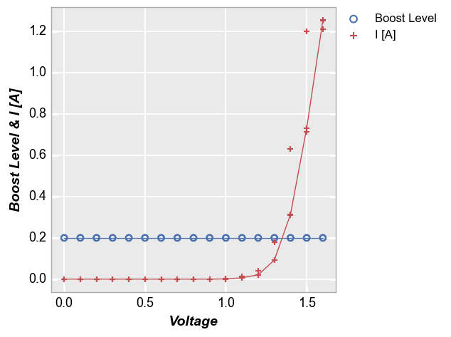
Stat lines also work with multiple DataFrame columns are plotted on a given axis. For example, consider the following with two values on the y-axis:
fcp.plot(df, x='Voltage', y=['Boost Level', 'I [A]'], legend=True, stat='median',
         filter='Substrate=="Si" & Target Wavelength==450 & Boost Level==0.2 & Temperature [C]==25')
Confidence intervals
fivecentplots can display confidence intervals around a data set. Three different methods are available to calculate these intervals:
conf_int: upper and lower bounds based on a single confidence value between 0-1 (typical = 0.95)perc_int: upper and lower bounds based on percentiles between 0-1nq_int: upper and lower bounds based on values of sigma (where the mean of a distribution is sigma=0)
By default these intervals are shown as partially transparent filled regions around a curve. These intervals are calculated point-by-point so they are different than confidence bands that are computed from a regression. These intervals are useful mainly for datasets where multiple points exist at each x-value.
To demonstrate this feature we will use a special dataset:
df_interval = pd.read_csv(Path(fcp.__file__).parent / 'test_data/fake_data_interval.csv')
df_interval.head()
| x | y | |
|---|---|---|
| 0 | -1.0 | -10.715459 |
| 1 | -1.0 | -9.972410 |
| 2 | -1.0 | -30.740532 |
| 3 | -1.0 | -31.368963 |
| 4 | -1.0 | -29.058633 |
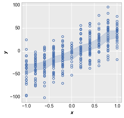
First we show the 95% confidence interval:
fcp.plot(df_interval, x='x', y='y', lines=False, conf_int=0.95)
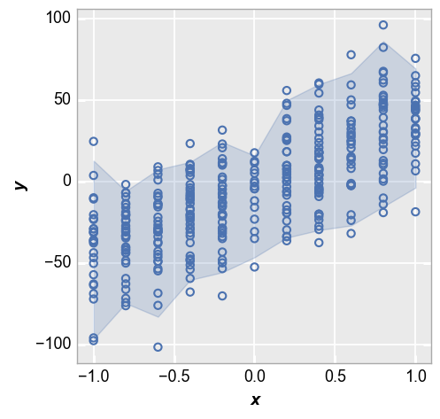
Next we show the IQR around each point based on the 25th and 75th percentiles:
fcp.plot(df_interval, x='x', y='y', lines=False, perc_int=[0.25, 0.75])

Lastly we show the +/-2 sigma range of each data point:
fcp.plot(df_interval, x='x', y='y', lines=False, nq_int=[-2, 2])
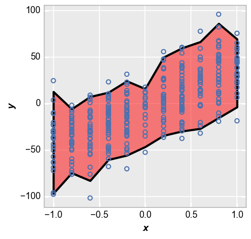
We can style the shaded interval region using kwargs that relate to the type of interval. Here is an example for the nq_int option:
fcp.plot(df_interval, x='x', y='y', lines=False, nq_int=[-2, 2],
         nq_int_fill_color='#FF0000', nq_int_fill_alpha=0.5, nq_int_edge_color='#000000', nq_int_edge_width=3, nq_int_edge_alpha=1)
Control limits
fivecentplots can display upper and lower control limts for a plot via keywords ucl and lcl respectively. This is a convenient way to show what a target values or target ranges for a dataset.
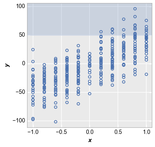
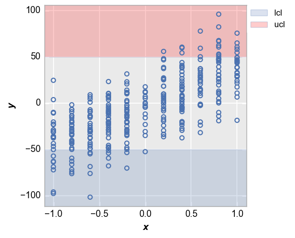
First we show an example with an upper control limit only. Notice the region outside of the upper limit is shaded to show data points that fail to meet this target.
fcp.plot(df_interval, x='x', y='y', lines=False, ucl=50)
Now consider the case where we have both an upper and a lower control limit. Again, notice that the ranges outside of the limits are shaded. We will also enable a legend to make the meaning of the shaded region obvious.
fcp.plot(df_interval, x='x', y='y', lines=False, ucl=50, lcl=-50, ucl_fill_color='#FF0000', legend=True)
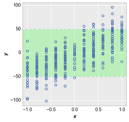
We can invert the shading behavior to show points that fall within our target range using the keyword control_limit_side="inside" (“outside” is used by default). If both ucl and lcl are defined, use kwargs for lcl to style the shaded region):
fcp.plot(df_interval, x='x', y='y', lines=False, ucl=50, lcl=-50,
         control_limit_side='inside', lcl_fill_color='#00FF00', lcl_edge_width=2, lcl_edge_style='--')
Reference line
We can add an arbitrary reference line to the plot using the keyword ref_line. The value of this keyword is: (1) the name of one or more columns in the DataFrame; or (2) a pandas Series with the same number of rows as the x column. These data will be plotted against the values for x so there must be a matching number of rows.
y=x reference
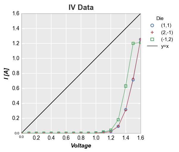
fcp.plot(df, x='Voltage', y='I [A]', title='IV Data', legend='Die',
         filter='Substrate=="Si" & Target Wavelength==450 & Boost Level==0.2 & Temperature [C]==25',
         ref_line=df['Voltage'], ref_line_legend_text='y=x', xmin=0, ymin=0, xmax=1.6, ymax=1.6)
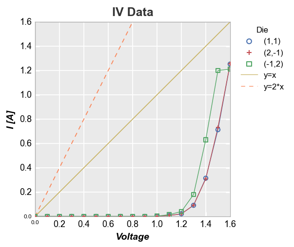
We can also add multiple reference lines to a single plot:
df['2*Voltage'] = 2*df['Voltage']
fcp.plot(df, x='Voltage', y='I [A]', title='IV Data', legend='Die',
         filter='Substrate=="Si" & Target Wavelength==450 & Boost Level==0.2 & Temperature [C]==25',
         xmin=0, ymin=0, xmax=1.6, ymax=1.6,
         ref_line=['Voltage', '2*Voltage'], ref_line_legend_text=['y=x', 'y=2*x'],
         ref_line_style=['-', '--'], ref_line_color=[5,6])
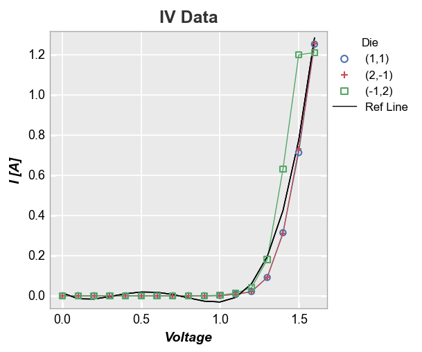
More complex calculation
Now let’s use a 4-factor polynomial fit equation and add it as a reference line (notice that because we are not specifying an exisiting column in the DataFrame as the ref_line and we are not specifying ref_line_legend_text, the legend defaults to a generic label “Ref Line”):
fcp.plot(df, x='Voltage', y='I [A]', title='IV Data', legend='Die',
         filter='Substrate=="Si" & Target Wavelength==450 & Boost Level==0.2 & Temperature [C]==25',
         ref_line=1.555*df['Voltage']**4-3.451*df['Voltage']**3+2.347*df['Voltage']**2-0.496*df['Voltage']+0.014)