pie
This section describes various options available for pie charts in fivecentplots
Setup
Import packages
import fivecentplots as fcp
import pandas as pd
import numpy as np
from pathlib import Path
Read some fake bar chart data to use in the pie chart:
df = pd.read_csv(Path(fcp.__file__).parent / 'test_data/fake_data_bar.csv')
df.loc[df.pH < 0, 'pH'] = -df.pH
df.head()
| Liquid | pH | Measurement | T [C] | |
|---|---|---|---|---|
| 0 | Lemon juice | 2.4 | A | 25 |
| 1 | Orange juice | 3.5 | A | 25 |
| 2 | Battery acid | 1.0 | A | 25 |
| 3 | Bottled water | 6.7 | A | 25 |
| 4 | Coke | 3.0 | A | 25 |
Optionally set the design theme (skipping here and using default):
#fcp.set_theme('gray')
#fcp.set_theme('white')
Basic plot
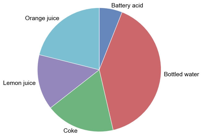
Consider a DataFrame that contains several sets of measured pH data for various liquids. First, we filter to plot only one set of measured data:
fcp.pie(df, x='Liquid', y='pH', filter='Measurement=="A" & T [C]==25')
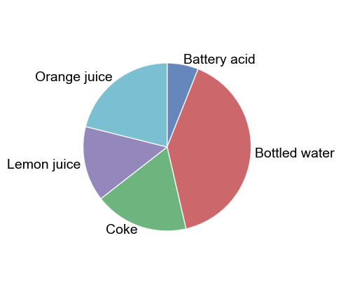
The size of the pie chart is controlled by the keyword pie_radius (or shorthand radius):
fcp.pie(df, x='Liquid', y='pH', filter='Measurement=="A" & T [C]==25', pie_radius=0.6)
Donut
We can turn our pie chart into a donut chart by using the keyword pie_inner_radius (or shorthand innerradius). This command is akin to thee width attribute in matplotlibs wedgeprops. The inner radius should be lower than the main radius parameter, which is set to 1 by default.
fcp.pie(df, x='Liquid', y='pH', filter='Measurement=="A" & T [C]==25', inner_radius=0.5)
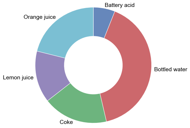
Note that if pie_inner_radius is not explicitly set by keyword or in a theme file, it will be set to equal radius. Be mindful that if you have pie_inner_radius set in a custom theme file and then change only pie_radius you will get an unintended result!
Grouping
Like other plot types, pie charts can grouped in various ways to provide further insight into the data set. This includes legends, row/col, and wrap plots.
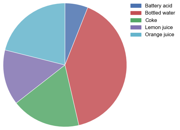
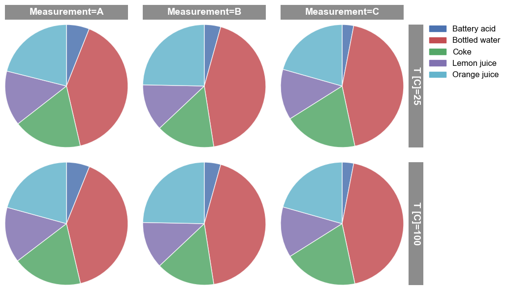
Row/column plot
We can separate different conditions using row/col plots as shown below:
fcp.pie(df, x='Liquid', y='pH', col='Measurement', row='T [C]', legend=True, ax_size=[250, 250])
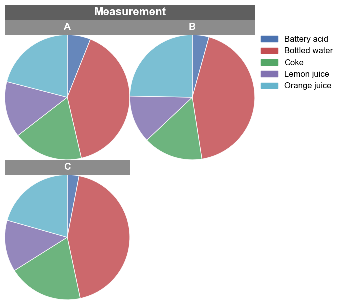
Wrap plot
Alternatively, we can use a wrap plot to visualize:
fcp.pie(df, x='Liquid', y='pH', wrap='Measurement', ax_size=[250, 250], legend=True)
Other options
Wedge labels
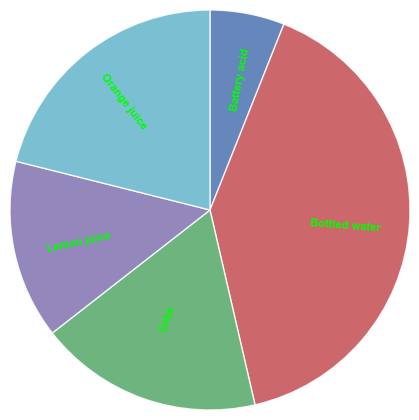
Wedge labels can be positioned relative to the center of the pie using keyword pie_label_distance. All other font parameters are controlled using pie_font_xxx keywords (or the shorthand versions with drop “pie_”). The position is based on a bisection line through the center of the pie chart and the wedge.
We can also change the rotation of the labels to follow the bisection line using keyword pie_rotate_labels (or rotate_labels).
fcp.pie(df, x='Liquid', y='pH', filter='Measurement=="A" & T [C]==25', pie_label_distance=0.5, pie_font_size=8,
        pie_font_weight='heavy', font_color='#00FF00', rotate_labels=True)
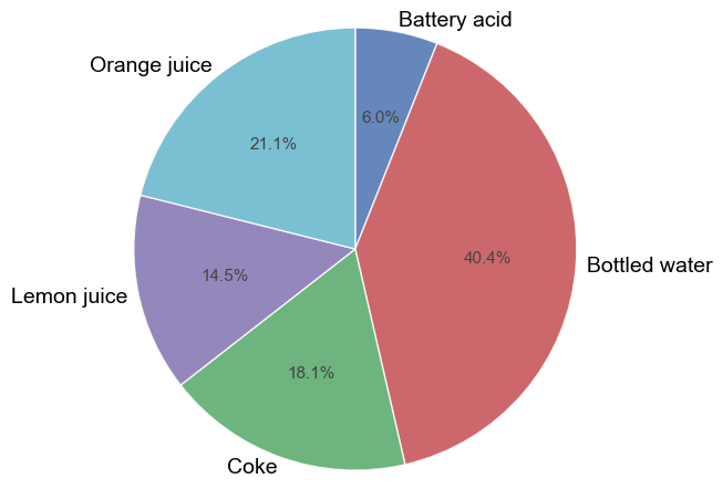
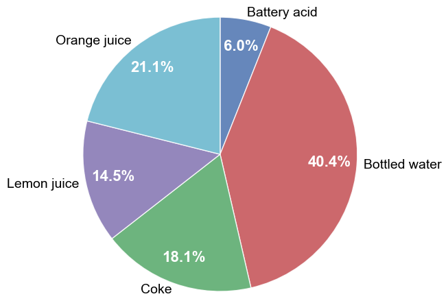
Labeled percents
Using the keyword pie_percents=True (or shorthand percents), we can label each pie wedge with the percentage for that category:
fcp.pie(df, x='Liquid', y='pH', filter='Measurement=="A" & T [C]==25', pie_percents=True)
We can style the percent labels using any combination of the following keywords (shortcuts in parentheses):
pie_percents_distance (percents_distance)
pie_percents_font_color (percents_font_color)
pie_percents_font_size (percents_font_size)
pie_percents_font_weight (percents_font_weight)
fcp.pie(df, x='Liquid', y='pH', filter='Measurement=="A" & T [C]==25', pie_percents=True,
        percents_distance=0.8, percents_font_color='#ffffff', percents_font_size=16, percents_font_weight='bold')
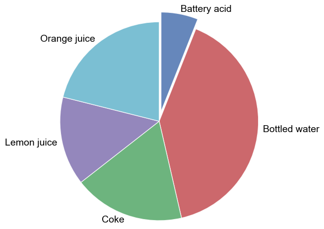
Explode
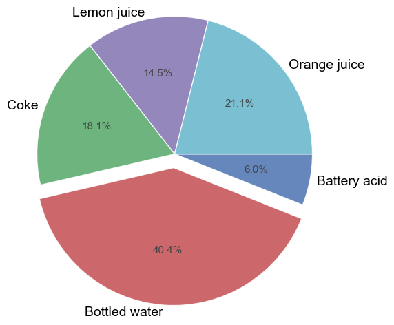
To emphasize a particular wedge in the pie chart, use the pie_explode (or explode) keyword. This keyword takes a list of offset values for the wedge(s) that is(are) exploded. The explode list is ordered alphabetically and you only need to define up to the last wedge that will be exploded. For example, if we want to emphasize the first wedge (“Battery acid”) we use:
fcp.pie(df, x='Liquid', y='pH', filter='Measurement=="A" & T [C]==25', explode=[0.1])
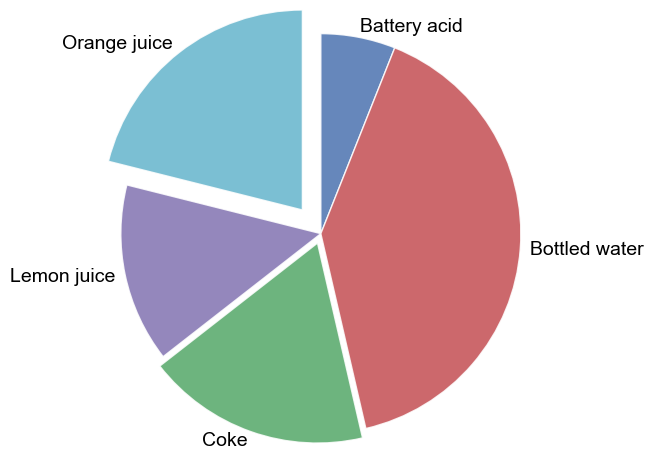
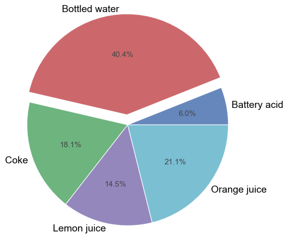
However, if we want to explode the third (“Coke”) and fifth (“Orange juice”) wedges and explode them different amounts, we use:
fcp.pie(df, x='Liquid', y='pH', filter='Measurement=="A" & T [C]==25', explode=[0, 0, 0.05, 0, 0.15])
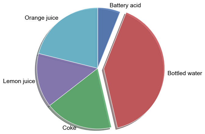
Shadow
We can apply a really ugly shadow to the pie using keyword pie_shadow (or shadow). Please don’t ever use this feature unless you are intentionally wanting a bad-looking plot.
fcp.pie(df, x='Liquid', y='pH', filter='Measurement=="A" & T [C]==25', explode=(0,0.1), shadow=True)
Start angle
By default, the pie wedges will start referenced from 12 o’clock and be positioned in a clockwise fashion. You can change the starting position using keyword pie_start_angle (or start_angle) which defaults to 90.
fcp.pie(df, x='Liquid', y='pH', filter='Measurement=="A" & T [C]==25', explode=(0,0.1), start_angle=0, percents=True)
Counter clockwise
We can force pie wedges to be arranged in a counter-clockwise fashion using keyword pie_counter_clock (or counter_clock):
fcp.pie(df, x='Liquid', y='pH', filter='Measurement=="A" & T [C]==25', explode=(0,0.1), start_angle=0, percents=True, counter_clock=True)
Colors
We can control the wedge colors using the following keywords (shorthand in parentheses):
pie_colors (colors)
pie_edge_color (edge_color)
pie_edge_style (edge_style)
pie_edge_width (edge_width)
fcp.pie(df, x='Liquid', y='pH', filter='Measurement=="A" & T [C]==25',
        colors=['#FF0000', '#00FF00', '#0000FF', '#F0F0F0', '#0F0F0F'],
        pie_edge_color='#FFFF00', pie_edge_style='--', pie_edge_width=3)
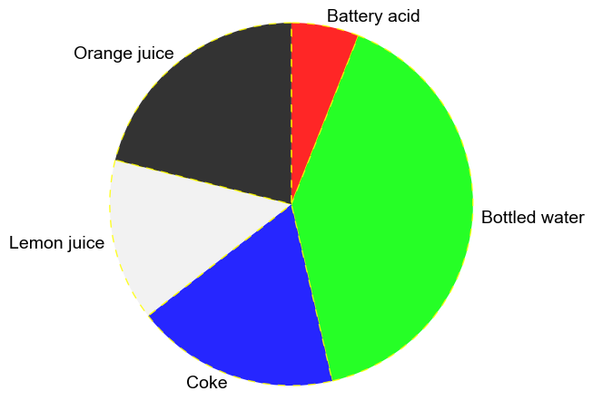
Looks like trash…yay!