gantt charts
This section describes various options available for gantt charts in fivecentplots
Setup
Import packages:
import fivecentplots as fcp
import pandas as pd
from pathlib import Path
Read some made-up Gantt chart data for the recording schedule of one of the greatest albums of one of the greatest bands:
df = pd.read_csv(Path(fcp.__file__).parent / 'test_data/fake_data_gantt.csv')
df.head()
| Task | Assigned | Start | Stop | Category | |
|---|---|---|---|---|---|
| 0 | Record drums | Taylor | 2010-09-01 | 2010-09-05 | Recording |
| 1 | Record bass | Nate | 2010-09-04 | 2010-09-06 | Recording |
| 2 | Record rhythm guitar | Pat | 2010-09-06 | 2010-09-08 | Recording |
| 3 | Record rhythm guitar | Dave | 2010-09-06 | 2010-09-08 | Recording |
| 4 | Record lead guitar | Chris | 2010-09-07 | 2010-09-09 | Recording |
Optionally set the design theme (skipping here and using default):
#fcp.set_theme('gray')
#fcp.set_theme('white')
Basic chart
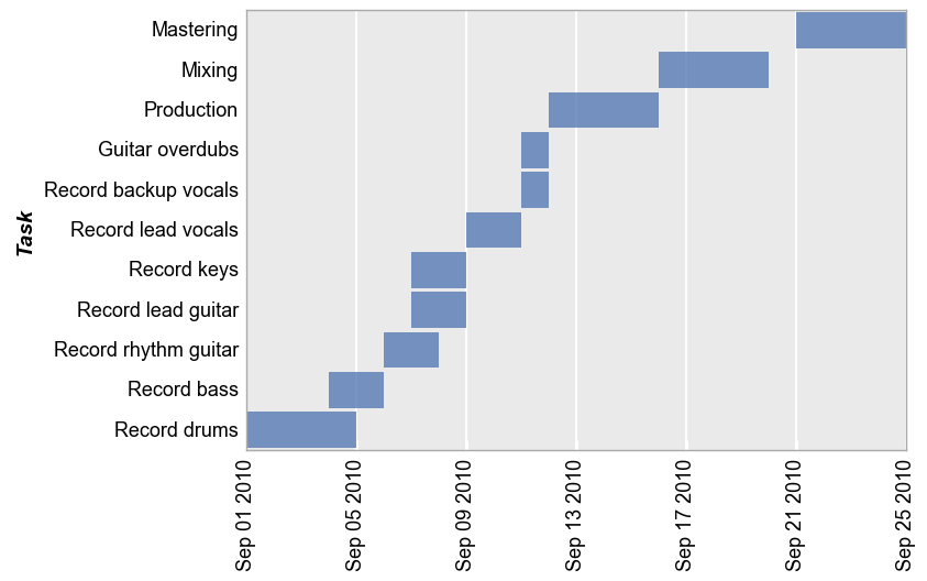
We create a basic Gantt chart showing tasks across a time axis specified by start and stop column containing Datetime values:
fcp.gantt(df, x=['Start', 'Stop'], y='Task', ax_size=[600, 400])

As with other plots, tick label fonts, sizes, and rotations can all be controlled using the correct kwarg. See Grids and ticks for more details.
Grouping
Like all other plots in fivecentplots, Gantt charts can grouped in various ways to provide further insight into the data set. This includes:
legendrowcolwrap
keyword options. A couple of examples are shown below.
Legends
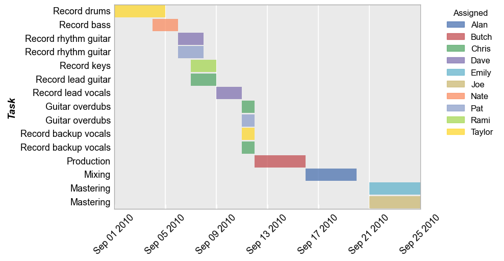
Legends can be used to further distinguish various tasks by assignee or other factors. If the same task has multiple assignees, they will be split into two different bars in the chart.
fcp.gantt(df, x=['Start', 'Stop'], y='Task', legend='Assigned', ax_size=[600, 400], gantt_tick_labels_x_rotation=45)
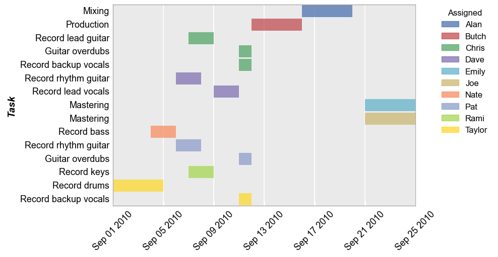
When using a legend, we can also sort the y-axis values based on the order in the legend using keyword order_by_legend=True:
fcp.gantt(df, x=['Start', 'Stop'], y='Task', legend='Assigned', ax_size=[600, 400], gantt_tick_labels_x_rotation=45, order_by_legend=True)
Row/column plot
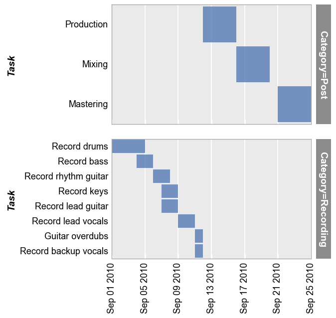
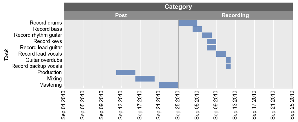
Row grouping (share_y is automatically disabled):
fcp.gantt(df, x=['Start', 'Stop'], y='Task', row='Category', ax_size=[400, 240])
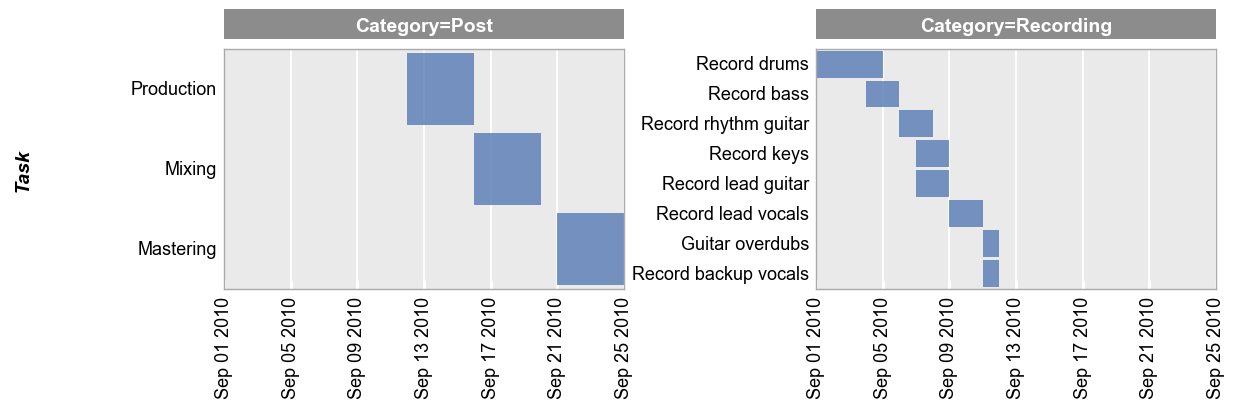
Column grouping (share_y is automatically disabled):
fcp.gantt(df, x=['Start', 'Stop'], y='Task', col='Category', ax_size=[400, 240])
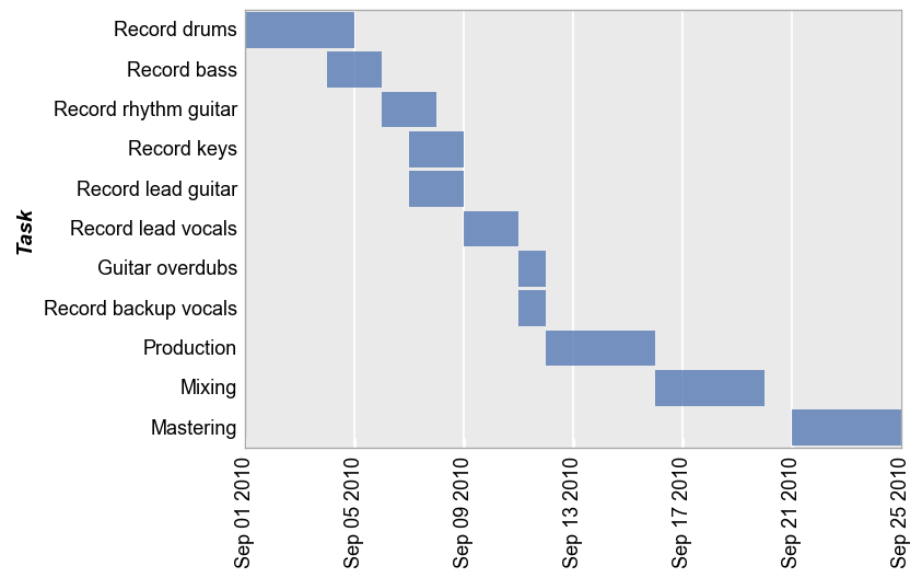
Wrap plot
Notice that share_y is enabled for this type of grouping:
fcp.gantt(df, x=['Start', 'Stop'], y='Task', wrap='Category', ax_size=[400, 240])
Styling
Default style:
fcp.gantt(df, x=['Start', 'Stop'], y='Task', ax_size=[600, 400])
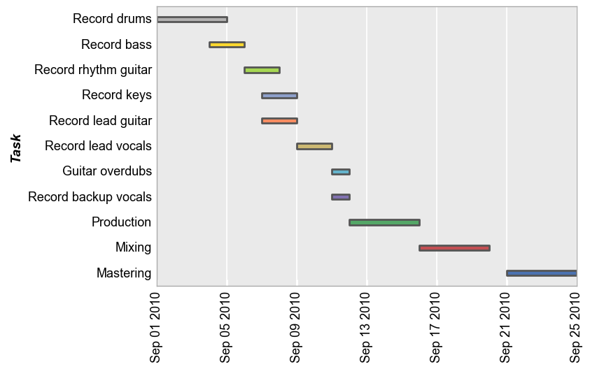
Now with various style modifications:
fcp.gantt(df, x=['Start', 'Stop'], y='Task', ax_size=[600, 400], color_by_bar=True,
          gantt_edge_width=2, gantt_edge_color='#555555', gantt_height=0.2, gantt_fill_alpha=1)
Sorting
By default, the sorting order of tasks is “descending” from top to bottom by date. We can flip that behavior with the keyword sort='ascending':
fcp.gantt(df, x=['Start', 'Stop'], y='Task', sort='ascending', ax_size=[600, 400])