contour
This section describes various options available for contour plots in fivecentplots
Setup
Import packages:
import fivecentplots as fcp
import pandas as pd
from pathlib import Path
Read some fake contour data:
df = pd.read_csv(Path(fcp.__file__).parent / 'test_data/fake_data_contour.csv')
df.head()
| Experiment | Batch | X | Y | Value | |
|---|---|---|---|---|---|
| 0 | Control | 101 | 1 | -4 | 3.5 |
| 1 | Control | 101 | 1 | -2 | 2.1 |
| 2 | Control | 101 | 1 | 0 | 3.3 |
| 3 | Control | 101 | 1 | 2 | 3.2 |
| 4 | Control | 101 | 1 | 4 | 4.0 |
Optionally set the design theme (skipping here and using default):
#fcp.set_theme('gray')
#fcp.set_theme('white')
Basic contour
A basic contour plot without fill can be generated using keyword filled=False. We can disable a colorbar using keyword cbar=False:
fcp.contour(df, x='X', y='Y', z='Value', filled=False, cbar=False)
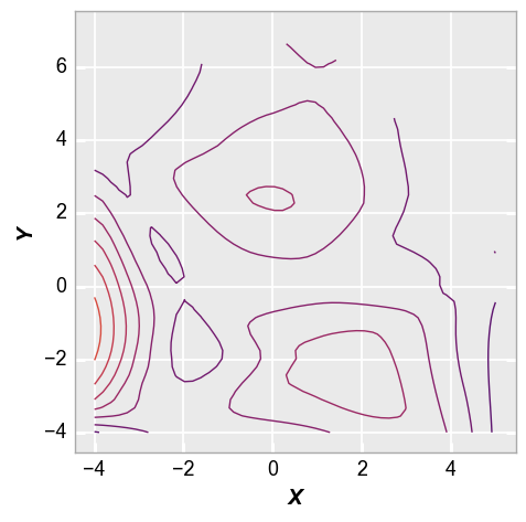
Contour lines
We can control the style and number of the contour lines as shown below to get a better result:
fcp.contour(df, x='X', y='Y', z='Value', filled=False, cbar=False, levels=40, contour_width=2,
            xmin=-4, xmax=5, ymin=-4, ymax=6)
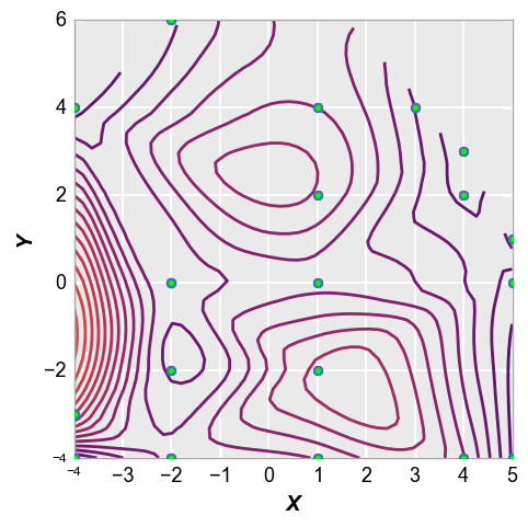
Contour points
The x and y points used to make the contour can also be overlaid on the contour lines, using keyword show_points=True. Markers can be styled according to typical keywords for the markers Element class:
fcp.contour(df, x='X', y='Y', z='Value', filled=False, cbar=False, levels=40, contour_width=2,
            xmin=-4, xmax=5, ymin=-4, ymax=6, show_points=True, marker_size=26, marker_fill_color='#00FF00')
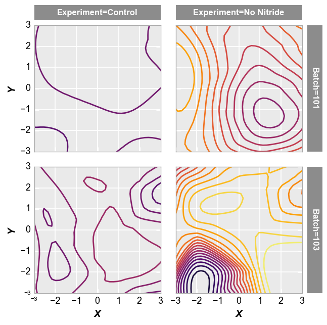
Grouping
We can also use other columns in the DataFrame to easily group the data into multiple contour subplots:
fcp.contour(df, x='X', y='Y', z='Value', row='Batch', col='Experiment', filled=False,
            cbar=False, xmin=-3, xmax=3, ymin=-3, ymax=3, ax_size=[250,250], contour_width=2,
            label_rc_font_size=12)
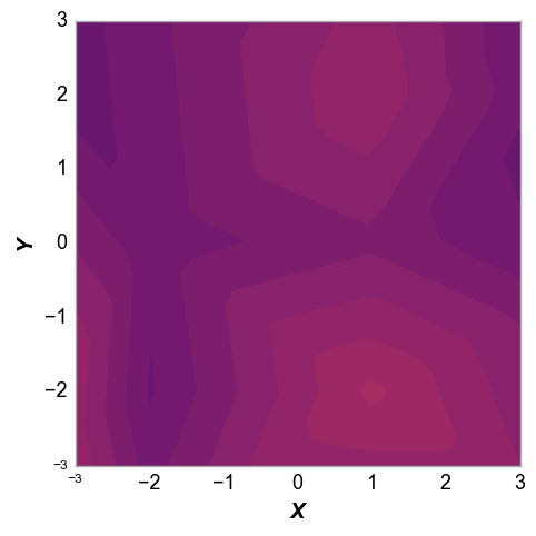
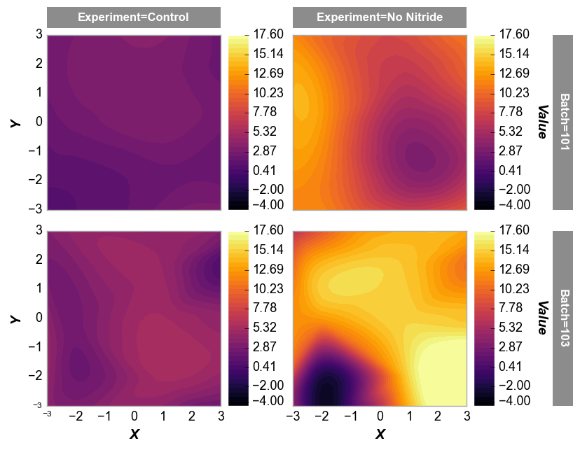
Filled contour
Next we can fill the contours using the keyword filled or contour_filled. We can also add a colorbar to show the range of z-values in the plot using the keyword cmap=True:
fcp.contour(df, x='X', y='Y', z='Value', row='Batch', col='Experiment', filled=True,
            cbar=True, xmin=-3, xmax=3, ymin=-3, ymax=3, ax_size=[250,250],
            label_rc_font_size=12, levels=40)
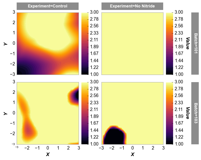
And with a fixed z-range:
fcp.contour(df, x='X', y='Y', z='Value', row='Batch', col='Experiment', filled=True,
            cbar=True, xmin=-3, xmax=3, ymin=-3, ymax=3, ax_size=[250,250],
            label_rc_font_size=12, zmin=1, zmax=3, levels=40)
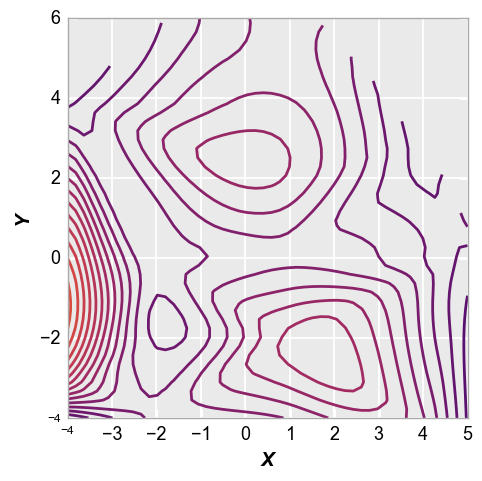
Data interpolation
The x, y, and z data provided in the DataFrame needs to be transformed into a grid for the contour. This is done using numpy and scipy modules:
xi = np.linspace(min(xx), max(xx))
yi = np.linspace(min(yy), max(yy))
zi = scipy.interpolate.griddata((xx, yy), zz, (xi[None, :], yi[:, None]), method=method)
where the method is supplied using the keyword interp. Any standard scipy argument is allowed but a default of “cubic” is used. Observe the differences between “cubic” and “linear” below:
fcp.contour(df, x='X', y='Y', z='Value', cbar=False, levels=40, contour_width=2,
            xmin=-3, xmax=3, ymin=-3, ymax=3, interp='cubic')
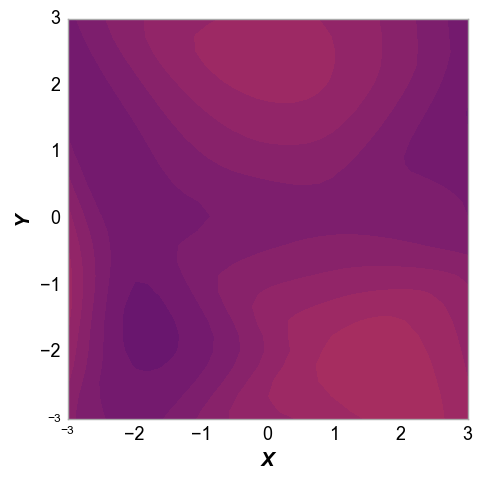
fcp.contour(df, x='X', y='Y', z='Value', cbar=False, levels=40, contour_width=2,
            xmin=-3, xmax=3, ymin=-3, ymax=3, interp='linear')