hist#
This section describes various options available for histogram plots in fivecentplots
Setup#
Import packages:
import fivecentplots as fcp
import pandas as pd
import numpy as np
from pathlib import Path
import matplotlib.pylab as plt
import imageio.v3 as imageio
Read some fake data to generate plots:
df = pd.read_csv(Path(fcp.__file__).parent / 'test_data/fake_data_box.csv')
df.head()
| Batch | Sample | Region | Value | ID | |
|---|---|---|---|---|---|
| 0 | 101 | 1 | Alpha123 | 3.5 | ID701223A |
| 1 | 101 | 1 | Alpha123 | 0.0 | ID7700-1222B |
| 2 | 101 | 1 | Alpha123 | 3.3 | ID701223A |
| 3 | 101 | 1 | Alpha123 | 3.2 | ID7700-1222B |
| 4 | 101 | 1 | Alpha123 | 4.0 | ID701223A |
Optionally set the design theme (skipping here and using default):
#fcp.set_theme('gray')
#fcp.set_theme('white')
Input data format#
fcp.hist supports input data of two formats:
tabular data found in a
pd.DataFrame(with or without grouping columns)image data, either as a single
np.arrayor adictofnp.arrays with apd.DataFrameconsisting of grouping information (see imshow documentation for a more detailed explanation of this format)
Simple histogram#
Vertical bars#
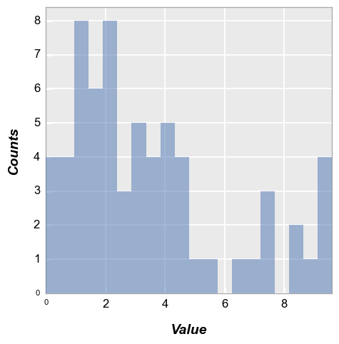
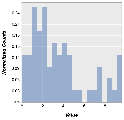
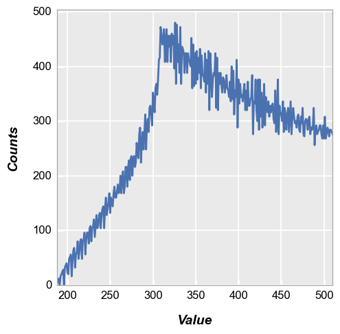
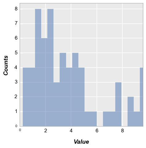
We calculate a simple histogram with default bin size of 20:
fcp.hist(df, x='Value')
Note
“Counts” are automatically calculated based on the data in the “x” column
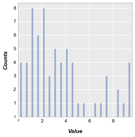
Horizontal bars#
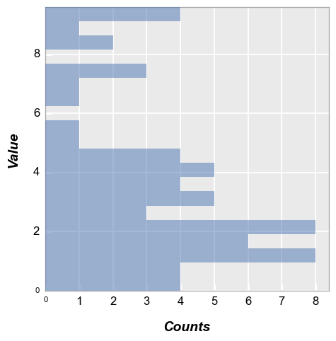
Same data as above but with histogram bars oriented horizontally:
fcp.hist(df, x='Value', horizontal=True)
Bin counts#
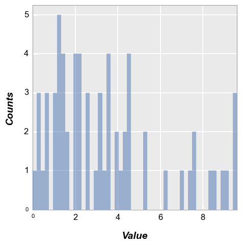
We can change the number of bins used via the keyword hist_bins or bins:
fcp.hist(df, x='Value', bins=50)
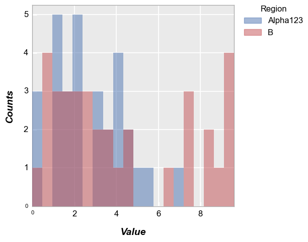
Grouping#
Legend#
Add a legend:
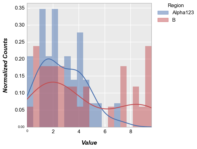
fcp.hist(df, x='Value', legend='Region')
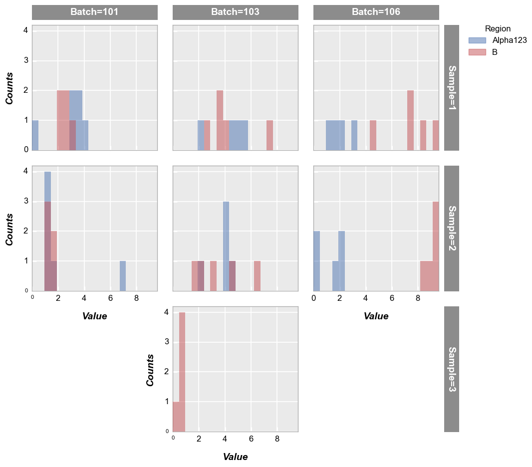
Row/column plot#
Make multiple subplots with different row/column values:
fcp.hist(df, x='Value', legend='Region', col='Batch', row='Sample', ax_size=[250, 250])
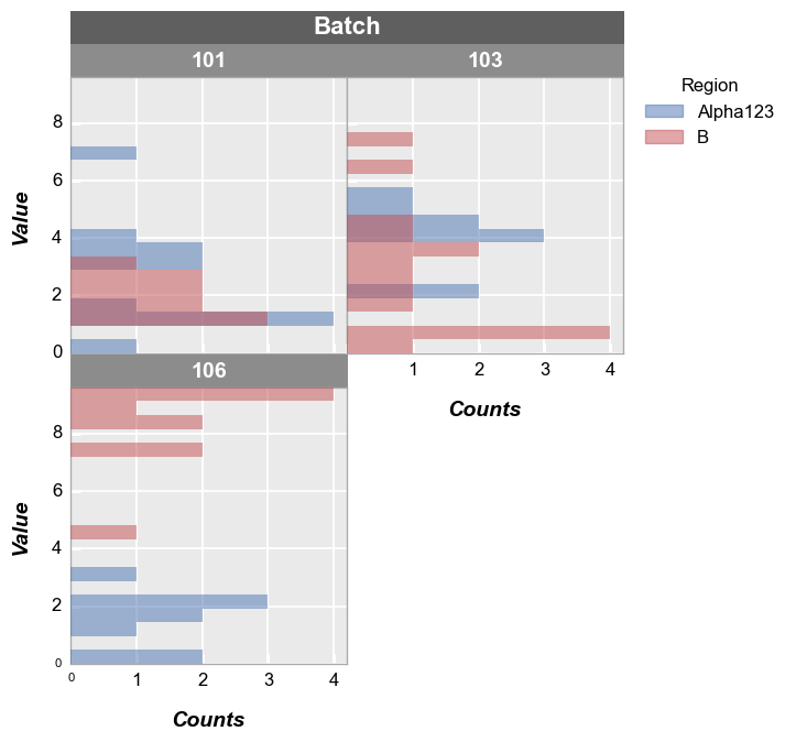
Wrap plot#
First we wrap the data using a column from the DataFrame:
[ ]:
fcp.hist(df, x='Value', legend='Region', wrap='Batch', ax_size=[250, 250], horizontal=True)
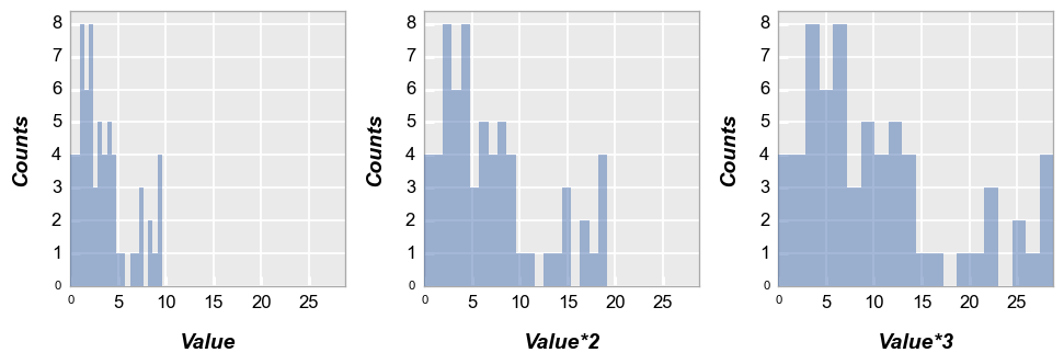
Next we wrap by x which means we make a subplot for each x-column name provided. To illustrate this, we create a couple of new columns in the DataFrame that are just multiples of the “Value” column:
df['Value*2'] = 2*df['Value']
df['Value*3'] = 3*df['Value']
fcp.hist(df, x=['Value', 'Value*2', 'Value*3'], wrap='x', ncol=3, ax_size=[250, 250])
Kernel density estimator#
We can overlay a kernel density estimation curve on the histogram using keyword kde=True. These curves can be styled using standard line Element parameters prefixed by kde_:
fcp.hist(df, x='Value', legend='Region', kde=True, kde_width=2)
Other options#
A couple of other options are available to present histogram data. Starting with our basic example from section 2:
fcp.hist(df, x='Value')

Cumulative#
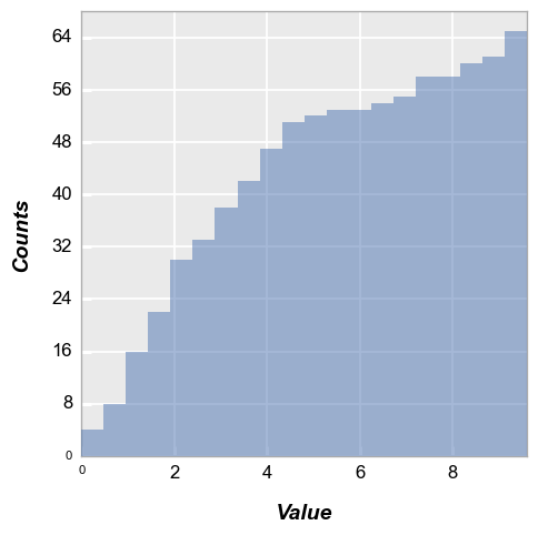
Now we enable “cumulative” mode so that each subsequent bin contains the total number of counts from the previous bins:
[ ]:
fcp.hist(df, x='Value', cumulative=True) # or hist_cumulative to be more specific
Normalize#
Histogram normalization divides each bin’s raw count the total number of counts and sets the bin width so that the area under the histogram integrates to 1.
fcp.hist(df, x='Value', normalize=True) # or hist_normalize to be more specific
Images#
fcp.hist is a powerful tool for data analysis of RAW and color images in image sensor / camera engineering activities. By default, image histograms are automatically converted to line plots with a histogram bin for each digital code from 0 to 2**bit_depth - 1. Additional options are also provided to split RAW images by color-filter array (CFA) pattern and color images by channel.
Warning
For images with high bit-depth and thus a very high number of bins, user of np.histogram can be slow. However, if the image data is of integer data type, fivecentplots will use np.bincount which is insanely faster. Therefore, we recommend using integer-type image data wherever possible
RAW#
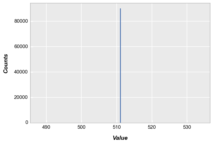
First, consider a simple example of a 300x300 gray patch with all pixel values near the mid-level of a 16-bit camera with no color-filter array.
h, w = 300, 300
img = (np.ones([h, w]) * (2**10 - 1) / 2).astype(np.uint16)
img
array([[511, 511, 511, ..., 511, 511, 511],
       [511, 511, 511, ..., 511, 511, 511],
       [511, 511, 511, ..., 511, 511, 511],
       ...,
       [511, 511, 511, ..., 511, 511, 511],
       [511, 511, 511, ..., 511, 511, 511],
       [511, 511, 511, ..., 511, 511, 511]], dtype=uint16)
fcp.imshow(img, cmap='gray', zmin=0, zmax=2**10)

In this case, our histogram is a single point with 300 * 300 counts:
fcp.hist(img, markers=False, ax_size=[600, 400], line_width=2)
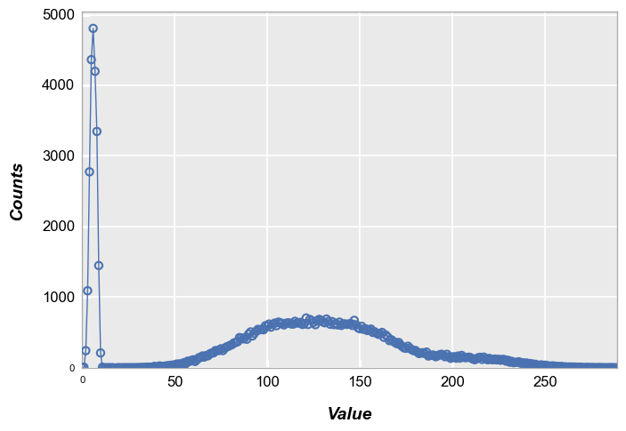
Now let’s multiplying our patch by a 2D Gaussian to approximate lens shading:
[ ]:
x, y = np.meshgrid(np.linspace(-1, 1, 300), np.linspace(-1, 1, 300))
dst = np.sqrt(x*x+y*y)
sigma = 1
muu = 0.001

gauss = np.exp(-((dst-muu)**2 / (2.0 * sigma**2 )))
img2 = (gauss * img).astype(np.uint16)
fcp.imshow(img2, cmap='gray', zmin=0, zmax=2**10)

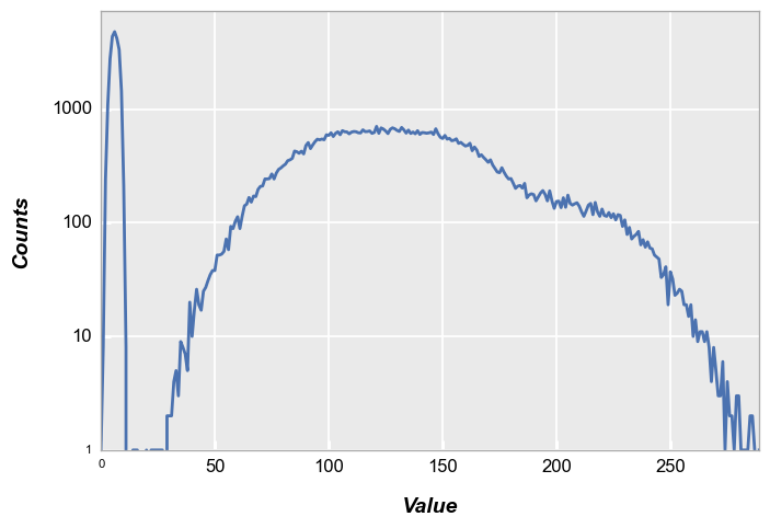
The resulting histogram is shown below:
fcp.hist(img2, markers=False, line_width=2)
Bayer#
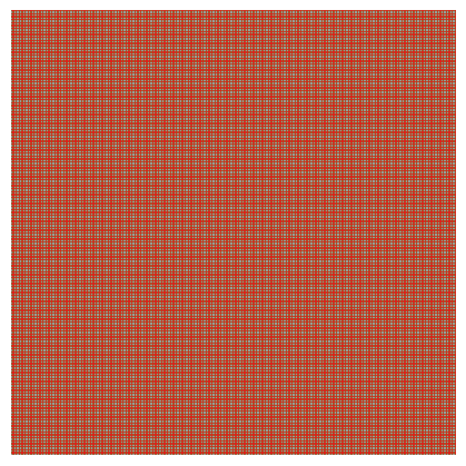
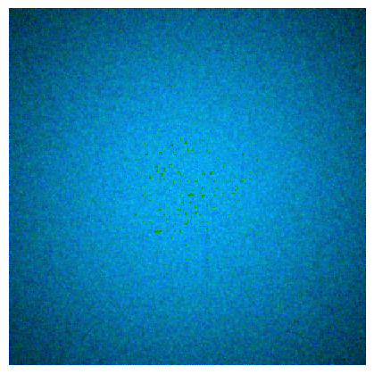
Now lets mock-up a Bayer array for a light blue color patch and demonstrate how fivecentplots allows you to easily split the histogram into distinct color planes (based on a CFA pattern). Here we’ll assume “GRBG” CFA:
img_rgb = np.zeros([300, 300]).astype(np.uint16)
img_rgb[::2, ::2] = 180  # green_red
img_rgb[1::2, 1::2] = 180  # green_blue
img_rgb[::2, 1::2] = 10
img_rgb[1::2, ::2] = 255
fcp.imshow(img_rgb, cmap='Set1')
Which after basic demosaicing (no edge treatment) would give :
import colour_demosaicing
fcp.imshow(colour_demosaicing.demosaicing_CFA_Bayer_bilinear(np.array(img_rgb), 'GRBG').astype(np.uint8))

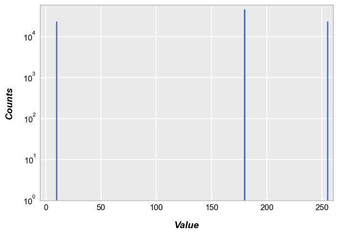
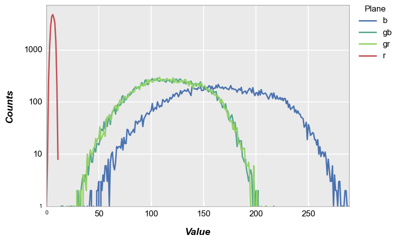
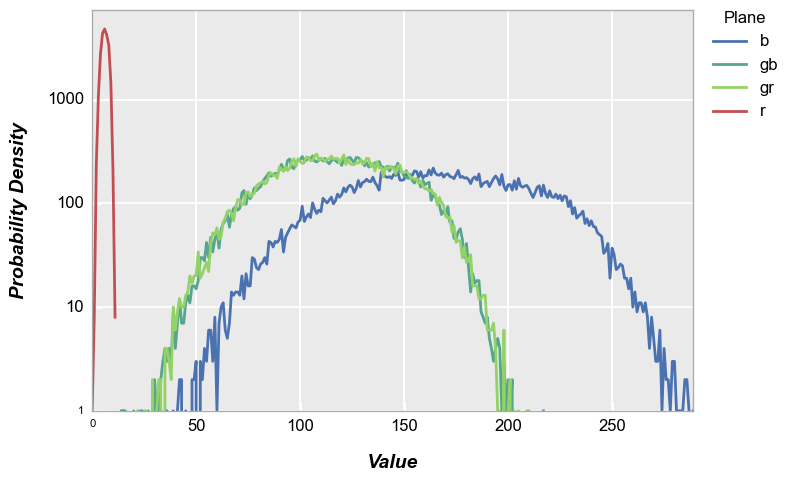
By default, the fcp.hist does not distinguish between pixel CFA type, so we end up with three distinct histogram peaks:
fcp.hist(img_rgb, markers=False, ax_scale='logy', ax_size=[600, 400], line_width=2, xmin=-5, xmax=260, ymin=1, ymax=60000)
However, if we specify the CFA via the keyword cfa, a new column in the grouping data named “Plane” is created. We can then legend by this color plane. Notice in this example that the “gr” and “gb” pixels overlap.
[ ]:
fcp.hist(img_rgb, markers=False, ax_scale='logy', ax_size=[600, 400], legend='Plane', cfa='grbg', line_width=2, xmin=-5, xmax=260,
         colors=fcp.RGGB)
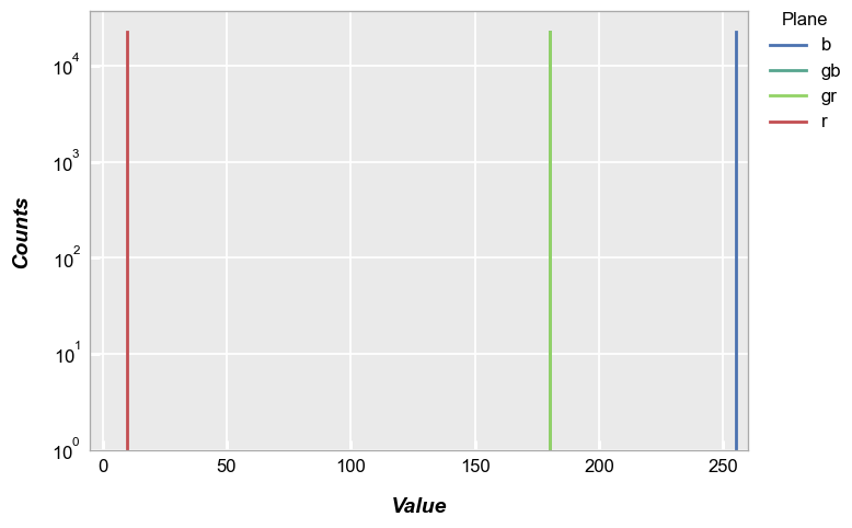
..note:: For better visualization above, we also invoke a special color scheme shortcut fcp.RGGB to color the histograms for each plane according to their filter color
Now lets add some shading and noise to make a more meaningful histogram. This results in the color patch below.
# Gaussian shading
x, y = np.meshgrid(np.linspace(-1, 1, 300), np.linspace(-1, 1, 300))
dst = np.sqrt(x*x+y*y)
sigma = 1
muu = 0.001
gauss = np.exp(-((dst-muu)**2 / (2.0 * sigma**2)))
img_rgb2 = (gauss * img_rgb).astype(float)

# Random noise
img_rgb2[::2, ::2] += np.random.normal(-0.1*img_rgb2[::2, ::2].mean(), 0.1*img_rgb2[::2, ::2].mean(), img_rgb2[::2, ::2].shape)
img_rgb2[1::2, ::2] += np.random.normal(-0.1*img_rgb2[1::2, ::2].mean(), 0.1*img_rgb2[1::2, ::2].mean(), img_rgb2[1::2, ::2].shape)
img_rgb2[1::2, 1::2] += np.random.normal(-0.1*img_rgb2[1::2, 1::2].mean(), 0.1*img_rgb2[1::2, 1::2].mean(), img_rgb2[1::2, 1::2].shape)
img_rgb2[::2, 1::2] += np.random.normal(-0.1*img_rgb2[::2, 1::2].mean(), 0.1*img_rgb2[::2, 1::2].mean(), img_rgb2[::2, 1::2].shape)
img_rgb2 = img_rgb2.astype(np.uint16)
fcp.imshow(colour_demosaicing.demosaicing_CFA_Bayer_bilinear(img_rgb2, 'GRBG').astype(np.uint8))
Again, invoking the cfa keyword with legends we get the following:
fcp.hist(img_rgb2, markers=False, ax_scale='logy', ax_size=[600, 400], legend='Plane', cfa='grbg', line_width=2, colors=fcp.RGGB)
RGB images#
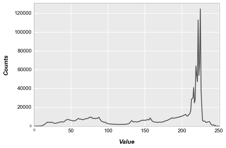
fcp.hist also provides support for RGB data:
img_rgb = imageio.imread(Path(fcp.__file__).parent / 'test_data/imshow_cat_pirate.png')
fcp.imshow(img_rgb)

If no, color channel information is provided to fcp.hist, the luminosity histogram of the grayscale representation of the RGB image is provided:
fcp.hist(img_rgb, markers=False, ax_size=[600, 400], line_width=2, line_color='#555555')
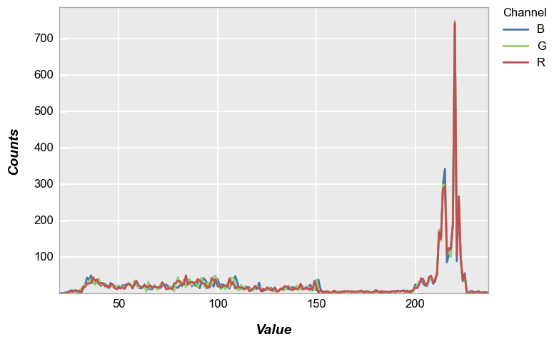
If color channel separation is desired, use the grouping label “Channel” (which is automatically calculated by fivecentplots) with a grouping kwarg:
fcp.hist(img_rgb, legend='Channel', markers=False, ax_size=[600, 400], line_width=2, colors=fcp.RGB)
Note
For better visualization above, we also invoke a special color scheme shortcut fcp.RGB to color the histograms according to the specific color channel
PDF#
fivecentplots histograms can be converted to probability density functions inline using the keyword pdf=True. Here we use the shaded color patch with noise from above for our input.
fcp.hist(img_rgb2, markers=False, ax_scale='logy', ax_size=[600, 400], legend='Plane', cfa='grbg', line_width=2, colors=fcp.RGGB, pdf=True)
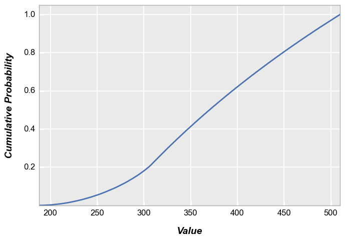
CDF#
fivecentplots histograms can also be converted to cumulative distribution functions inline using the keyword pdf=True. Again, we use the shaded color patch with noise from above for our input. With no color plane separation:
fcp.hist(img2, markers=False, ax_size=[600, 400], line_width=2, colors=fcp.RGGB, cdf=True)
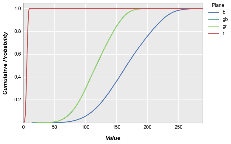
With color plane separation:
fcp.hist(img_rgb2, markers=False, ax_size=[600, 400], legend='Plane', cfa='grbg', line_width=2, colors=fcp.RGGB, cdf=True)
Styles#
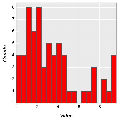
Bar style#
Colors#
The bar edge and fill colors can be controlled by kwargs:
fcp.hist(df, x='Value', hist_edge_color='#555555', hist_edge_width=2, hist_fill_alpha=1, hist_fill_color='#FF0000')
Alignment#
The alignment of the bars relative to the ticks on the x-axis can be adjusted. Options include: {‘left’, ‘mid’ [default], ‘right’}
fcp.hist(df, x='Value', hist_align='right')
fcp.hist(df, x='Value', hist_align='mid')

Width#
The relative width (i.e., the percentage of the overall bin width) of the bars can be controlled by the keyword hist_rwidth:
fcp.hist(df, x='Value', hist_rwidth=0.3)
fcp.HIST preset#
For more convenient styling of histogram plots from image data, we provide a “preset” dictionary with some common kwargs already defined:
fcp.HIST
{'ax_scale': 'logy', 'markers': False, 'line_width': 2, 'preset': 'HIST'}
Without the preset:
fcp.hist(img_rgb2, ax_size=[600, 400])
With the preset:
fcp.hist(img_rgb2, ax_size=[600, 400], **fcp.HIST)