fivecentplots: a Python Plotting Analgesic#
Spend more time analyzing your data than analyzing how to plot your data
Another Python plotting library, really??
There is no shortage of quality plotting libraries in Python. Basic plots with default styling are often easy, but acheiving complex figures with subplots, legends, overlays, and custom styling can require a mastery of a daunting API and many lines of code. This complexity is discouraging to the new/casual Python user and can lead them to abandon Python in favor of more comfortable, albeit inferior, plotting tools like Excel.
fivecentplots exists to drastically simplify the API required to generate complex plots, specifically for data within pandas DataFrames.
Advantages of fivecentplots
- Plots are generated from a single function call
- Plot contents and design defined by optional keyword arguments with defaults in a simple "theme" file
- Simple data access using DataFrame column names and text-based filtering
- Colors, sizes, marker styles, subplot grouping, you name it--everything is defined by keyword arguments
- Keyword names follow a basic naming convention (ex: legend_title_font_size defines the font size of the legend title)
- Behind the scenes, keywords translated into the complex code / API of the underlying plotting package (like matplotlib)
- pandas enables statistical analysis in Python comparable to that of commercial software packages like JMP. However, JMP offers easy creation of many useful charts that are tedious to create in Python. fivencentplots solves this, making it easy to create:
- Need a high-quality static image in matplotlib style? No problem! Prefer an interactive web plot from plotly? No problem! fivecentplots can wrap any plotting "engine" (or package)
- Most importantly, fivecentplots maintains the same API regardless of plotting library. The same function call invoked for matplotlib can be used for plotly--no need to learn a new syntax and API
- Automated bulk plotting is easy since all plot parameters can be accessed from dictionary-like structures (yaml, json, ini)
- Useful for production environments with standardized measurement data so users do not have to manually create line-health plots
- Most plotting libraries define size based on the overall figure, leaving you to guess an appropriate size to properly fit your desired contents. fivecentplots shifts the sizing paradigm by automatically determining the figure size based on the internal contents
- Axes areas are more consistent and contents are less likely to get squished to fit in the figure
Example
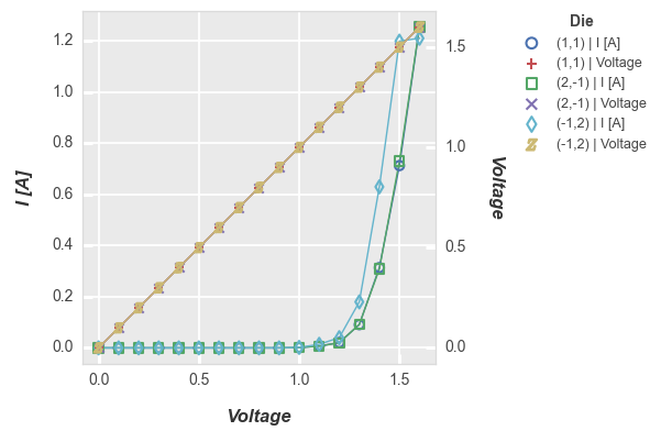
Consider the following plot of some fake current vs voltage data contained in a dummy DataFrame, df:
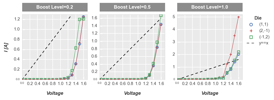
Using fivecentplots, we need a single function call with the some select keyword arguments:
fcp.plot(df, x='Voltage', y='I [A]', legend='Die', col='Boost Level', ax_size=[225, 225], share_y=False,
         filter='Substrate=="Si" & Target Wavelength==450 & Temperature [C]==25',
         ref_line=df['Voltage'], ref_line_legend_text='y==x', ref_line_style='--',
         xmin=0, xmax=1.7, ymin=[0, 0, 0], ymax=[1.3, 1.7, 5.2])
Consider one possible approach to generate a very similar plot using pure matplotlib syntax:
import matplotlib.pylab as plt
import matplotlib
import natsort

# Filter the DataFrame to get the subset of interest
df_sub = df[(df.Substrate=="Si")&(df['Target Wavelength']==450)&(df['Temperature [C]']==25)]

# Set some defaults
markers = ['o', '+', 's']
colors = ['#4b72b0', '#c34e52', '#54a767']
ymax = [1.3, 1.7, 5.2]
lines = []

# Create the figure and axes
f, axes = plt.subplots(1, 3, sharex=False, sharey=False, figsize=[9.82, 3.46])

# Plot the data and style the axes
for iboost, boost in enumerate(df_sub['Boost Level'].unique()):
   df_boost = df_sub[df_sub['Boost Level']==boost]
   for idie, die in enumerate(natsort.natsorted(df_boost.Die.unique())):
      df_die = df_boost[df_boost.Die==die]
      axes[iboost].set_facecolor('#eaeaea')
      axes[iboost].grid(which='major', axis='both', linestyle='-', color='#ffffff', linewidth=1.3)
      lines += axes[iboost].plot(df_die['Voltage'], df_die['I [A]'], '-', color=colors[idie],
                                 marker=markers[idie], markeredgecolor=colors[idie], markerfacecolor='none',
                                 markeredgewidth=1.5, markersize=6)
      axes[iboost].set_axisbelow(True)
      axes[iboost].spines['bottom'].set_color('#aaaaaa')
      axes[iboost].spines['top'].set_color('#aaaaaa')
      axes[iboost].spines['right'].set_color('#aaaaaa')
      axes[iboost].spines['left'].set_color('#aaaaaa')
      if iboost==0:
            axes[iboost].set_ylabel('I [A]', fontsize=14, fontweight='bold', fontstyle='italic')
      axes[iboost].set_xlabel('Voltage', fontsize=14, fontweight='bold', fontstyle='italic')
   axes[iboost].set_xlim(left=0, right=1.6)
   axes[iboost].set_ylim(bottom=0, top=ymax[iboost])

   # Add the column labels
   rect = matplotlib.patches.Rectangle((0, 1.044), 1, 30/225, fill=True, transform=axes[iboost].transAxes,
                                       facecolor='#8c8c8c', edgecolor='#8c8c8c', clip_on=False)
   axes[iboost].add_patch(rect)
   text = 'Boost Level = {}'.format(boost)
   axes[iboost].text(0.5, 1.111, text, transform=axes[iboost].transAxes,
                     horizontalalignment='center', verticalalignment='center',
                     rotation=0, color='#ffffff', weight='bold', size=16)

   # Customize ticks
   axes[iboost].tick_params(axis='both', which='major', pad=5, colors='#ffffff',
                           labelsize=13, labelcolor='#000000', width=2.2)
   # Add reference line
   ref_line = df_die['Voltage']
   ref = axes[iboost].plot(df_die['Voltage'], ref_line, '-', color='#000000', linestyle='--')
   if iboost == 0 :
      lines = ref + lines

# Style the figure
f.set_facecolor('#ffffff')
f.subplots_adjust(left=0.077, right=0.882, top=0.827, bottom=0.176, hspace=0.133, wspace=0.313)

# Add legend
leg = f.legend(lines[0:4], ['y==x'] + list(df_boost.Die.unique()), title='Die', numpoints=1,
               bbox_to_anchor=(1, 0.85), prop={'size': 12})
leg.get_frame().set_edgecolor('#ffffff')

# Show the plot
plt.show()
This example is obviously a bit contrived as you could simplify things by modifying rc_params or eliminating some of the specific style elements used here, but the general idea should be clear: fivecentplots can reduce the barrier to generate complex plots.
What if we wanted to do the same plot using code for plotly or bokeh? Well, we’d need to learn an entirely
different API! But with fivecentplots we can just change the kwarg defining the plotting engine
(engine) and we are all set:
fcp.plot(df, x='Voltage', y='I [A]', legend='Die', col='Boost Level', ax_size=[225, 225], share_y=False,
         filter='Substrate=="Si" & Target Wavelength==450 & Temperature [C]==25',
         ref_line=df['Voltage'], ref_line_legend_text='y==x', ref_line_style='--',
         xmin=0, xmax=1.7, ymin=[0, 0, 0], ymax=[1.3, 1.7, 5.2], engine='plotly')
Note
As of v0.6 matplotlib has the richest available plotting feature set. plotly supports most plot types and many of the same style features. bokeh support is limited to only scatter plots at this time.
Refer to the topics on the sidebar for more details on plot types and options.
Contents#
Basics: installation, basic figure construction, introduction to Element objects, data grouping, etc
Plot types: tutorials on various plot types supported by fivecentplots
Engines: description of how to use different plotting engines (matplotlib, bokeh, plotly) with fivecentplots
API: description of various keyword arguments supported by fivecentplots