heatmap#
This section describes various options available for plotting heatmaps in fivecentplots
Setup#
Import packages:
import fivecentplots as fcp
import pandas as pd
from pathlib import Path
Read some fake heatmap data filled with absolutely made-up basketball stats:
df = pd.read_csv(Path(fcp.__file__).parent / 'test_data/fake_data_heatmap.csv')
df.head()
| Player | Category | Average | |
|---|---|---|---|
| 0 | Lebron James | Points | 27.5 |
| 1 | Lebron James | Assists | 9.1 |
| 2 | Lebron James | Rebounds | 8.6 |
| 3 | Lebron James | Blocks | 0.9 |
| 4 | James Harden | Points | 30.4 |
Optionally set the design theme (skipping here and using default):
#fcp.set_theme('gray')
#fcp.set_theme('white')
Categorical heatmap#
First consider a case where both the x and y DataFrame columns contain categorical data values:
No data labels#
fcp.heatmap(df, x='Category', y='Player', z='Average')
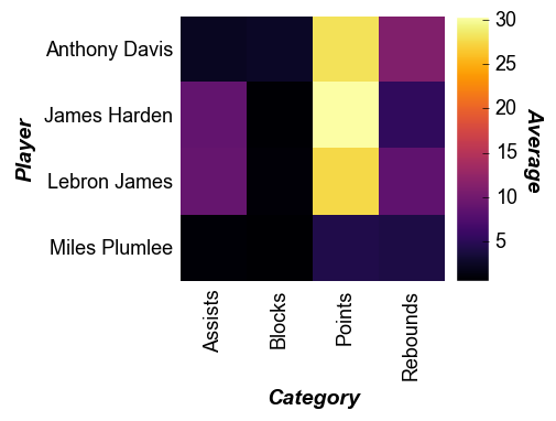
Note
Colorbars are enabled by default for heatmaps and must be intentionally disabled with cbar=False to remove
Note
heatmaps with x-axis tick labels are rotated 90° by default. This can be overridden via the keyword tick_labels_major_x_rotation
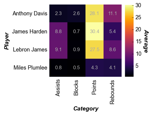
With data labels#
Using keyword data_labels=True we can overlay the numerical value of the z column on top of the heatmap cells:
[ ]:
fcp.heatmap(df, x='Category', y='Player', z='Average', data_labels=True,
            heatmap_font_color='#aaaaaa', tick_labels_major_y_edge_width=0, ws_ticks_ax=5)
Cell size#
The size of the heatmap cell will default to a width of 60 pixels unless: (1) the keyword heatmap_cell_size (or cell_size when directly supplying the value to the function call) is specified; or (2) ax_size is explicitly defined:
[ ]:
fcp.heatmap(df, x='Category', y='Player', z='Average', data_labels=True,
            heatmap_font_color='#aaaaaa', tick_labels_major_y_edge_width=0, ws_ticks_ax=5, cell_size=100)
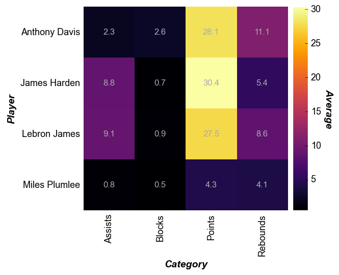
Note
Heatmap cells are always square with width = height
Non-uniform data#
A major difference between heatmaps and contour plots is that contour plots assume that the x and y DataFrame column values are numerical and continuous. With a heatmap, we can cast numerical data into categorical form
# Read the contour DataFrame
df2 = pd.read_csv(Path(fcp.__file__).parent / 'test_data/fake_data_contour.csv')
[ ]:
fcp.heatmap(df2, x='X', y='Y', z='Value', row='Batch', col='Experiment',
            cbar=True, share_z=True, ax_size=[400, 400], data_labels=False,
            label_rc_font_size=12, filter='Batch==103', cmap='viridis')
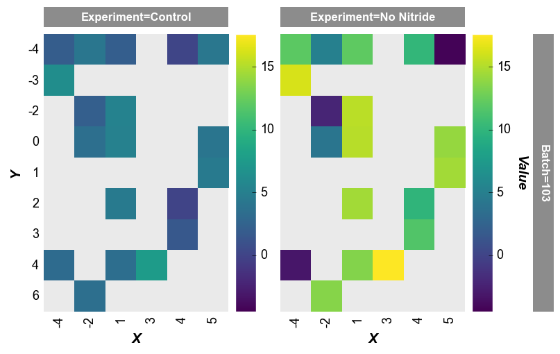
any missing values get mapped as
nanvalues are not not plottedthe x-axis width is not 400px as specified by the keyword
ax_scale. This occurs because the data set does not have as many values on the x-axis as on the y-axis. fivecentplots applies the axis size to the axis with the most items and scales the other axis accordingly
imshow alternative#
As of v0.6, fcp.heatmap no longer supports image display. Please use imshow instead (link to docs)