Grouping data
A single pandas DataFrame can often be decomposed into smaller subsets of data that need to be visualized. fivecentplots contains multiple grouping levels to expose unique subsets of data:
legend: color lines and markers according to unique values in a DataFrame column
groups:
for xy plots: separates unique subsets so plot lines are not continuously looped back to the origin (useful for replicates of similar data)
for boxplots: groups boxes by unique values in one or more DataFrame columns
row | column: makes a grid of subplots for each unique value of the DataFrame column names specified for these keyword arguments within a single figure
wrap:
Option 1: similar to row and column grouping, wrap makes a grid of subplots for each unique value of the DataFrame column names specified for these keyword arguments within a single figure
Option 2: wrap by
xoryto create a uniqe subplot for each column name listed
figure: makes a unique figure for each unique value of a DataFrame column
It is also possible to filter data inline sets via the keyword filter.
Setup
Imports
[1]:
%load_ext autoreload
%autoreload 2
%matplotlib inline
import fivecentplots as fcp
import pandas as pd
import numpy as np
import os, sys, pdb
osjoin = os.path.join
db = pdb.set_trace
Sample data
[2]:
df1 = pd.read_csv(osjoin(os.path.dirname(fcp.__file__), 'tests', 'fake_data.csv'))
df2 = pd.read_csv(osjoin(os.path.dirname(fcp.__file__), 'tests', 'fake_data_box.csv'))
Other
[4]:
SHOW = False
legend
The legend keyword can be a single DataFrame column name or a list of column names. The data set will then be grouped according to each unique value of the legend column and a separate plot for each value will be added to the figure. A different color and marker type will be used to display each value.
Single legend column
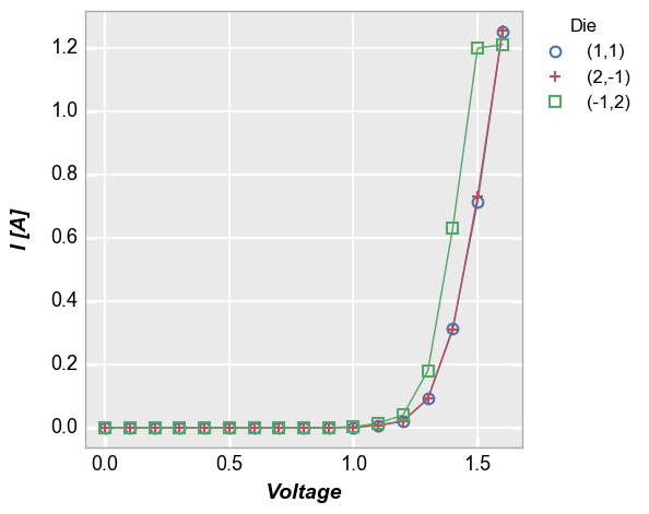
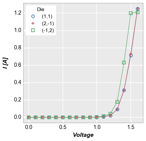
In our sample data set, we have repeats of the same current vs. voltage measurement at three different “Die” locations. By setting the legend keyword equal to the name of the DataFrame column containing the “Die” value, we can distinctly visualize the measurement for each site.
[5]:
fcp.plot(df1, x='Voltage', y='I [A]', legend='Die', show=SHOW,
         filter='Substrate=="Si" & Target Wavelength==450 & Boost Level==0.2 & Temperature [C]==25')
Multiple legend columns
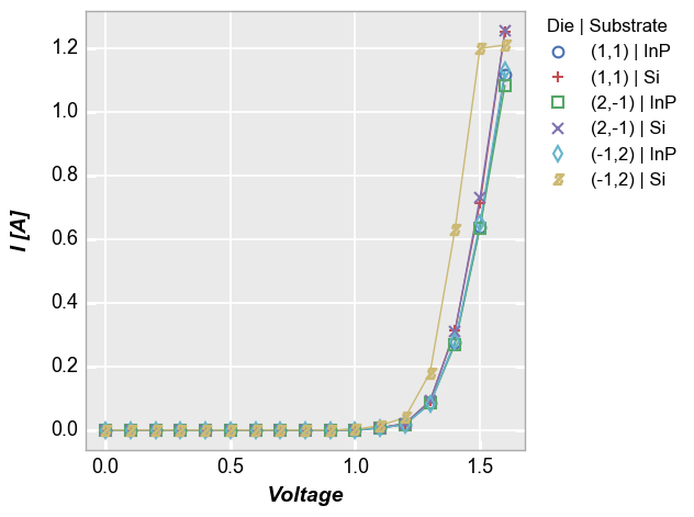
fivecentplots also supports legending by multiple DataFrame columns. When a list of column names is passed to the legend keyword, a dummy column is created in the DataFrame that concatenates the values from each column listed in legend. This new column is used for legending.
[6]:
fcp.plot(df1, x='Voltage', y='I [A]', legend=['Die', 'Substrate'], show=SHOW,
         filter='Target Wavelength==450 & Boost Level==0.2 & Temperature [C]==25')
Multiple x & y values
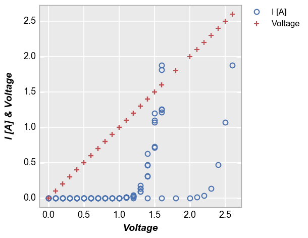
When plotting more than one DataFrame column on the y axis without a specific grouping column, a legend is also enabled to improve visualization of the data. The legend can be disabled by setting legend=False.
[7]:
fcp.plot(df1, x='Voltage', y=['I [A]', 'Voltage'], lines=False, show=SHOW,
         filter='Substrate=="Si" & Target Wavelength==450 & Boost Level==0.2')
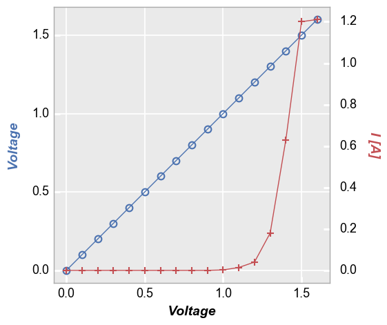
Secondary x|y plots
Three options are available for legending are available for plots with a secondary axis: (1) no legend; (2) legend based on the values of the primary/secondary axes; or (3) legend based on another column.
No legend
[8]:
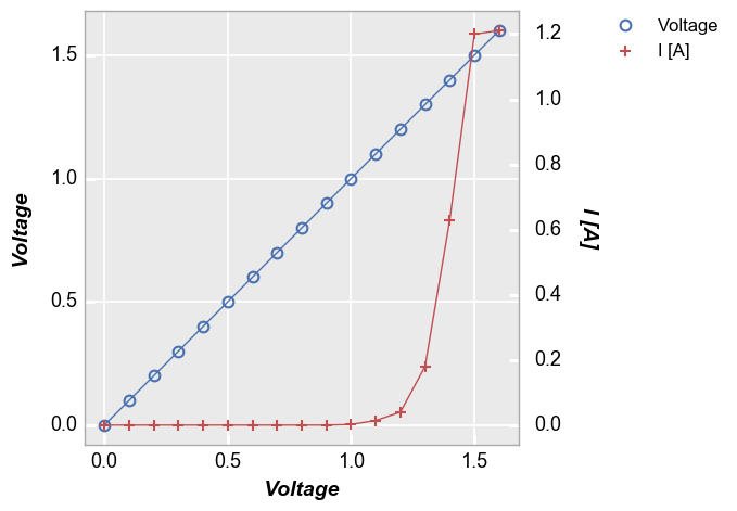
fcp.plot(df1, x='Voltage', y=['Voltage', 'I [A]'], twin_x=True, show=SHOW,
         filter='Substrate=="Si" & Target Wavelength==450 & Boost Level==0.2 & Temperature [C]==25 & Die=="(-1,2)"')
Axis legend
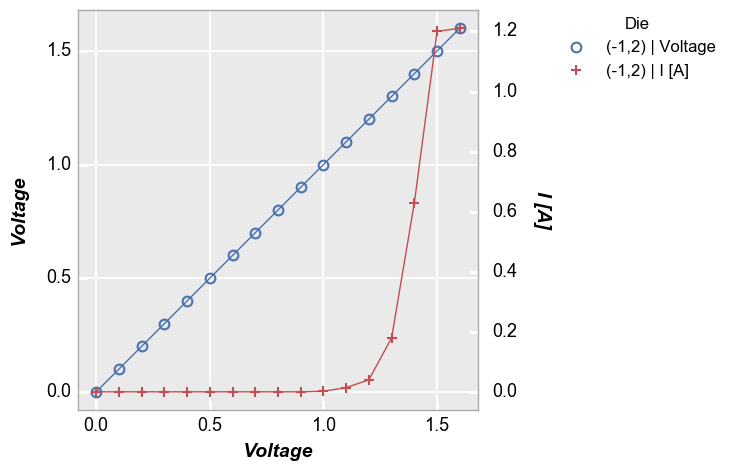
[9]:
fcp.plot(df1, x='Voltage', y=['Voltage', 'I [A]'], twin_x=True, legend=True, show=SHOW,
         filter='Substrate=="Si" & Target Wavelength==450 & Boost Level==0.2 & Temperature [C]==25 & Die=="(-1,2)"')
Legend by another column
[10]:
fcp.plot(df1, x='Voltage', y=['Voltage', 'I [A]'], twin_x=True, legend='Die', show=SHOW,
         filter='Substrate=="Si" & Target Wavelength==450 & Boost Level==0.2 & Temperature [C]==25 & Die=="(-1,2)"')
Location
By default, fivecentplots places the legend in the upper right corner of a figure, outside of the plot axes as this is the only way to be certain the legend will never obscure the actual data. However, the legend can be placed inside the axes area by specifying the keyword legend_location with one of the following values (which align roughly matplotlib syntax):
‘outside’ or 0
‘upper right’ or 1
‘upper left’ or 2
‘lower left’ or 3
‘lower right’ or 4
‘right’ or 5
‘center left’ or 6
‘center right’ or 7
‘lower center’ or 8
‘upper center’ or 9
‘center’ or 10
‘below’ or 11
Note this feature is not currently supported with the bokeh plotting engine
Outside right
Placing the legend on the outside right of the plot ensures that the legend will overlap the plotted data. fivecentplots uses this as a convenient default (i.e., no legend_location is required). There is no need to mess with bbox_to_anchor arguments as would be required with a pure matplotlib solution.
[11]:
fcp.plot(df1, x='Voltage', y='I [A]', legend='Die', show=SHOW,
         filter='Substrate=="Si" & Target Wavelength==450 & Boost Level==0.2 & Temperature [C]==25')

Inside the plot
Locations 1 through 10 will place the legend within the plot window. While this can result in a more compact figure, there is a also a risk that the legend will obscure the data in the plot. Care should be exercised when placing the legend inside the plot.
[12]:
fcp.plot(df1, x='Voltage', y='I [A]', legend='Die', show=SHOW,
         filter='Substrate=="Si" & Target Wavelength==450 & Boost Level==0.2 & Temperature [C]==25', legend_location=2)
Below the plot
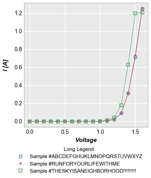
Long legend values can by annoying to deal with. If the legend is placed outside the axis, the figure size will have a large width. If the legend is placed within the axis window, it can extend longer than the axis itself. fivecentplots provides the option of placing the legend “below” the plot:
[13]:
df1.loc[df1.Die=='(1,1)', 'Long Legend'] = 'Sample #ABCDEFGHIJKLMNOPQRSTUVWXYZ'
df1.loc[df1.Die=='(2,-1)', 'Long Legend'] = 'Sample #RUNFORYOURLIFEWITHME'
df1.loc[df1.Die=='(-1,2)', 'Long Legend'] = 'Sample #THESKYISANEIGHBORHOOD!!!!!!!!!'
fcp.plot(df1, x='Voltage', y='I [A]', legend='Long Legend', show=SHOW,
         filter='Substrate=="Si" & Target Wavelength==450 & Boost Level==0.2 & Temperature [C]==25', legend_location='below')
Note on location
Relocating the legend is straightforward when dealing with a single plot axes, but the ideal situation is a bit murky when dealing with grid plots with legends (see examples below). By default, the legend will be placed in each subplot window. However, if the keyword nleg is included and set equal to 1, the legend will appear in the new location but only within the upper right subplot.
groups
The groups keyword requires a column name or list of column names from the DataFrame. These columns are used to identify subsets in the data and make sure they are properly visualize in the plot. Unlike legend, group values are not added to a legend on the plot.
xy plots
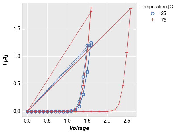
Some data sets contain multiple sets of similar data. Consider the following example where we plot all the data together and connect the points with lines. Notice how the line loops from the end of the data back to the begining for each “group” of the data. This occurs because we have provided no information about how to segment the data set.
[14]:
fcp.plot(df1, x='Voltage', y='I [A]', show=SHOW, legend='Temperature [C]',
         filter='Substrate=="Si" & Target Wavelength==450 & Boost Level==0.2')
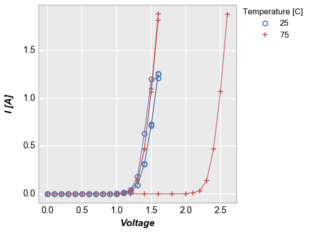
To handle cases like this, we can add the keyword groups and specify another DataFrame column name that indicates how the data are grouped (in this case by “Die”). Now we get distinct lines for each instance of the measurement data. The groups keyword can still be combined with a legend from a different DataFrame column.
[15]:
fcp.plot(df1, x='Voltage', y='I [A]', groups='Die', legend='Temperature [C]', show=SHOW,
         filter='Substrate=="Si" & Target Wavelength==450 & Boost Level==0.2')
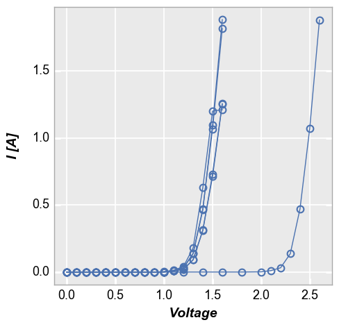
groups also supports multiple column names. Here is the above plot without legending by “Temperature [C]”:
[16]:
fcp.plot(df1, x='Voltage', y='I [A]', groups=['Die', 'Temperature [C]'], show=SHOW,
         filter='Substrate=="Si" & Target Wavelength==450 & Boost Level==0.2')
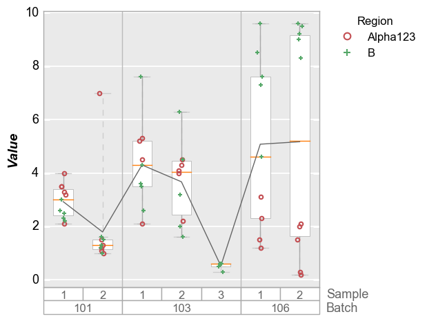
boxplots
Like x-y plots, the groups keyword is used to break the data set into subsets. However, for boxplots the group column names and values are actually displayed along the x-axis:
[17]:
df_box = pd.read_csv(osjoin(os.path.dirname(fcp.__file__), 'tests', 'fake_data_box.csv'))
fcp.boxplot(df=df_box, y='Value', groups=['Batch', 'Sample'], legend='Region', show=SHOW)
row | col subplots
By unique values
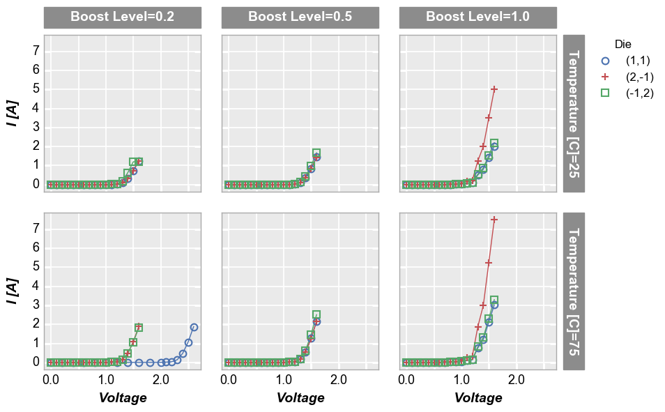
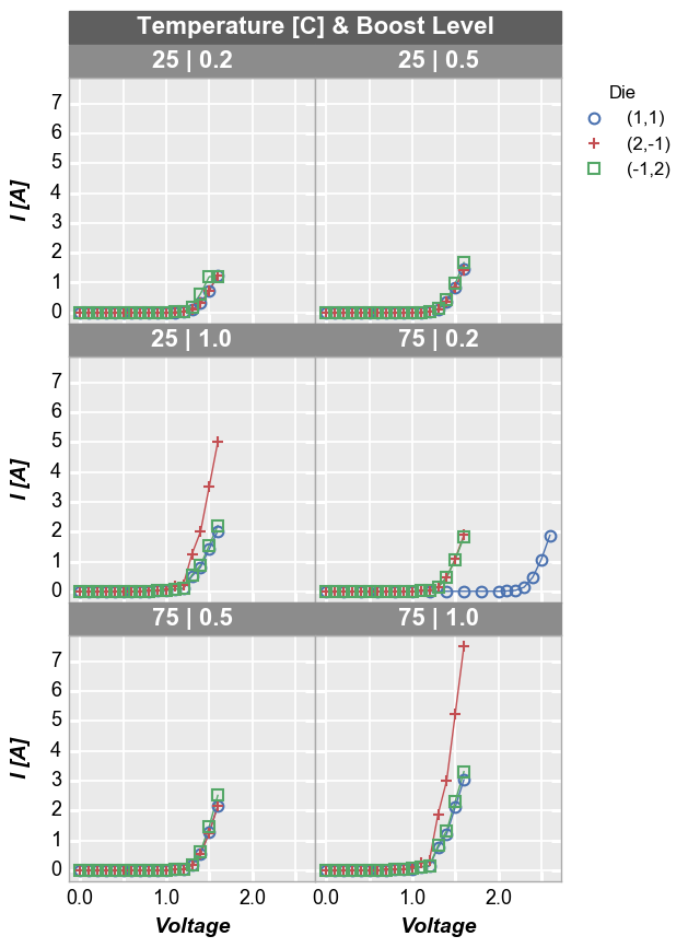
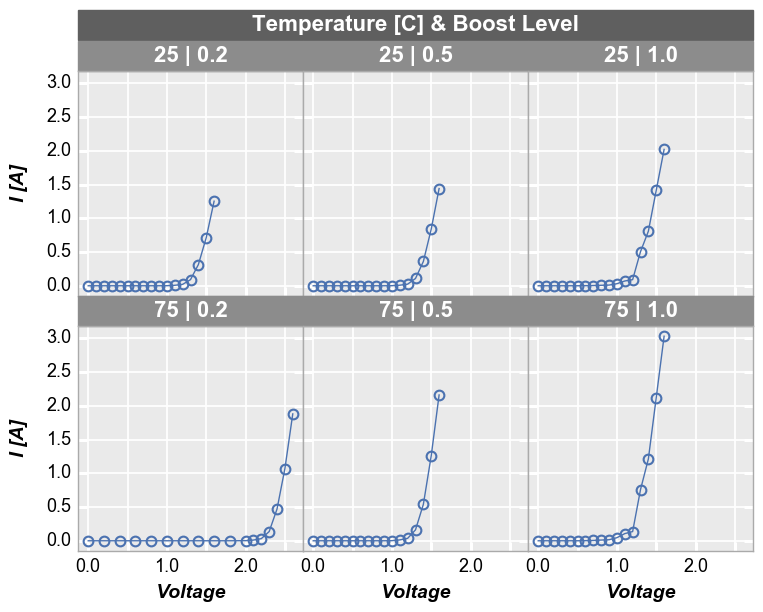
To see a larger subset of the main DataFrame, we can make a grid of subplots based on the unique values within DataFrame columns other than the primary x and y columns we are using. In this case, we remove the “Temperature [C]” and “Boost Level” columns from the filter keyword and add them to the row and column commands, respectively. This gives a grid of plots where each plot represents the intersection of a unique Boost Level and Temperature.
[18]:
fcp.plot(df1, x='Voltage', y='I [A]', legend='Die', col='Boost Level', row='Temperature [C]', show=SHOW,
         ax_size=[225, 225], filter='Substrate=="Si" & Target Wavelength==450', label_rc_font_size=14)
By x or y
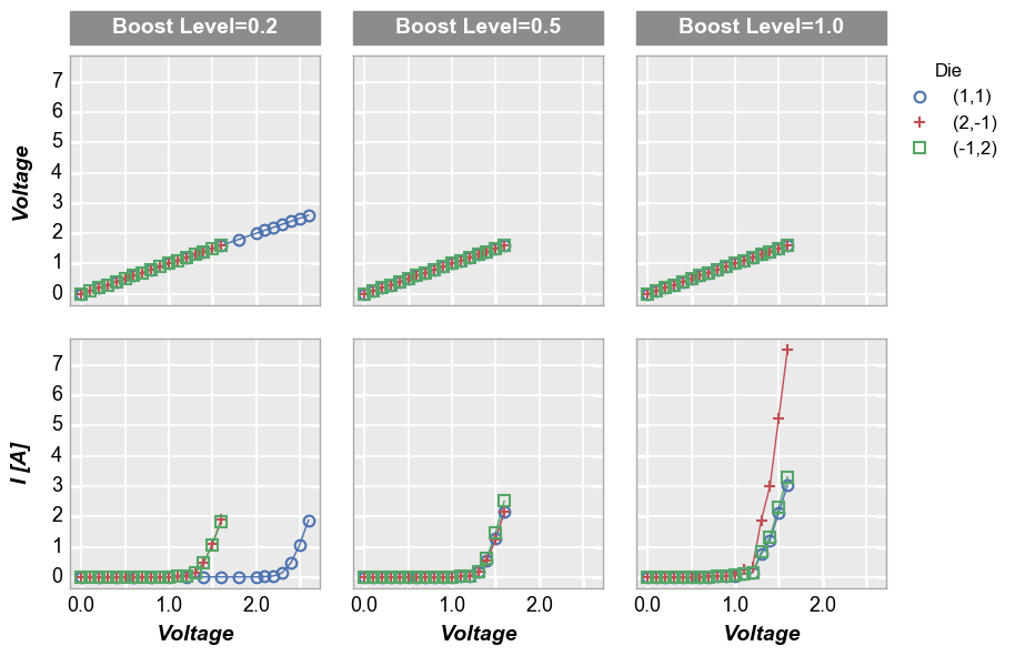
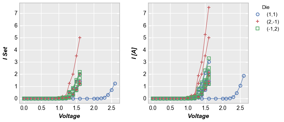
Alternatively, we can use row vs column grids to compare different x or y values. For example, we can plot two y-columns (one per row) by adding the keyword "y" to the row parameter. Each column in this plot shares the same x-axis variable.
[19]:
fcp.plot(df1, x='Voltage', y=['Voltage', 'I [A]'], legend='Die', col='Boost Level', row='y', show=SHOW,
         ax_size=[225, 225], filter='Substrate=="Si" & Target Wavelength==450 & Temperature [C]==75',
         label_rc_font_size=14)
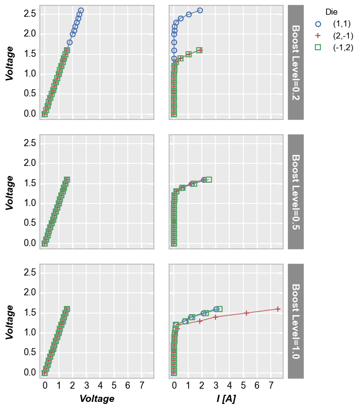
We can make a similar plot with common row values and different x-axes by setting col='x':
[20]:
fcp.plot(df1, x=['Voltage', 'I [A]'], y='Voltage', legend='Die', row='Boost Level', col='x', show=SHOW,
         ax_size=[225, 225], filter='Substrate=="Si" & Target Wavelength==450 & Temperature [C]==75', label_rc_font_size=14)
wrap subplots
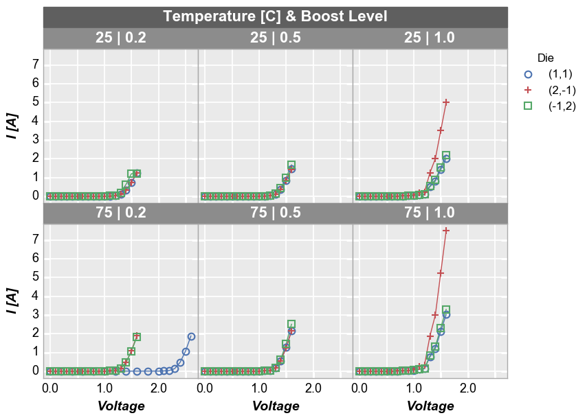
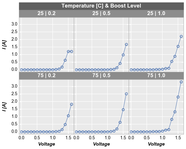
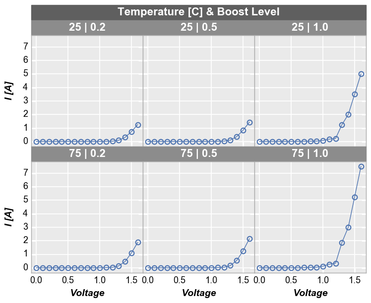
By unique values
We can create a plot similar to the row/column plot above using the wrap keyword. The key differences are that spacing and ticks between subplots is removed by default (can be changed via keywords), axis sharing is forced (cannot override), and the row/column value labels are condensed to a single label above each subplot. To do this, remove the row and column keywords from the previous function call and pass the “Temperature [C]” and “Boost Level” column names as a list to the
wrap keyword.
[21]:
fcp.plot(df1, x='Voltage', y='I [A]', legend='Die', wrap=['Temperature [C]', 'Boost Level'], show=SHOW,
         ax_size=[225, 225], filter='Substrate=="Si" & Target Wavelength==450')
By default, wrap plots will be arranged in a square grid. If the number of subplots does not match a perfectly square grid, you will have an incomplete row of subplots in the grid. All tick and axes labels are handled appropriately for this case. If you want to override the default grid size, specify the keyword ncol which sets the number of columns. The number of rows will be automatically determined from the number of subplots.
[22]:
fcp.plot(df1, x='Voltage', y='I [A]', legend='Die', wrap=['Temperature [C]', 'Boost Level'], show=SHOW,
         ax_size=[225, 225], filter='Substrate=="Si" & Target Wavelength==450', ncol=2)
By x and y
We can also “wrap” by column names instead of unique column values. In this case we list the columns to plot in the x or y keywords as usual but we add “x” or “y” to the wrap keyword. This will create a unique subplot in a grid for each wrap value. Unlike the case of wrapping column values, this plot will not have wrap labels and axis sharing can be overriden. As before, used ncol to override the default gridding. Unlike a row vs column plot by x and y, a wrap plot by x and y
can be displayed without the extra grouping factor.
[23]:
fcp.plot(df1, x='Voltage', y=['I Set', 'I [A]'], legend='Die', wrap='y', show=SHOW, groups=['Boost Level', 'Temperature [C]'],
         ax_size=[325, 325], filter='Substrate=="Si" & Target Wavelength==450')
Or an alternatively styled version of this plot with tick and label sharing off:
[24]:
fcp.plot(df1, x='Voltage', y=['I Set', 'I [A]'], legend='Die', wrap='y', show=SHOW, groups=['Boost Level', 'Temperature [C]'],
         ax_size=[525, 170], filter='Substrate=="Si" & Target Wavelength==450', ncol=1, ws_row=0,
         separate_labels=False, separate_ticks=False)
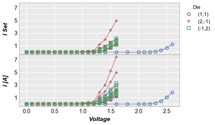
figure plots
To add another dimension of grouping, fivecentplots supports grouping by figure. In this case, a separate figure (i.e., a separate png) is created for each unique value in the DataFrame column(s) listed in the fig_groups keyword. Here we will plot a single figure for each value of the “Die” column.
[25]:
fcp.plot(df1, x='Voltage', y='I [A]', fig_groups='Die', wrap=['Temperature [C]', 'Boost Level'], show=SHOW,
         ax_size=[225, 225], filter='Substrate=="Si" & Target Wavelength==450', show_filename=True,
         filename=r'C:\GitHub\fivecentplots\fivecentplots\tests\test_images\grouping.py\figure.png')
[ ]: