boxplot
Boxplots in fivecentplots are modeled after the “Variability Chart” in JMP which provides convenient, multi-level group labels automatically along the x-axis. Data can be broken into multiple subsets for easy visualization by simply listing the DataFrame column names of interest in the groups keyword. At a minimum, the boxplot function requires the following keywords:
df: a pandas DataFramey: the name of the DataFrame column containing the y-axis data
Setup
Imports
[1]:
%load_ext autoreload
%autoreload 2
%matplotlib inline
import fivecentplots as fcp
import pandas as pd
import numpy as np
import os, sys, pdb
osjoin = os.path.join
db = pdb.set_trace
Sample data
Read some fake boxplot data
[2]:
df = pd.read_csv(osjoin(os.path.dirname(fcp.__file__), 'tests', 'fake_data_box.csv'))
df.head()
[2]:
| Batch | Sample | Region | Value | ID | |
|---|---|---|---|---|---|
| 0 | 101 | 1 | Alpha123 | 3.5 | ID701223A |
| 1 | 101 | 1 | Alpha123 | 2.1 | ID7700-1222B |
| 2 | 101 | 1 | Alpha123 | 3.3 | ID701223A |
| 3 | 101 | 1 | Alpha123 | 3.2 | ID7700-1222B |
| 4 | 101 | 1 | Alpha123 | 4.0 | ID701223A |
Other
[4]:
SHOW = False
Groups
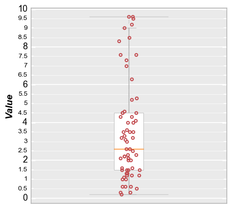
Consider the following boxplot of made-up data:
[5]:
fcp.boxplot(df=df, y='Value', show=SHOW, tick_labels_minor=True, grid_minor=True)
Single group
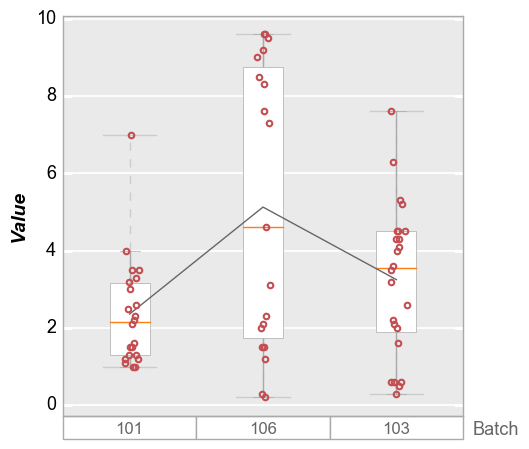
Rather than lumping the data into a single box, we can separate them into categories to get more information. First, set a single group column of “Batch”:
[6]:
fcp.boxplot(df=df, y='Value', groups='Batch', show=SHOW, sort=False)
Multiple groups
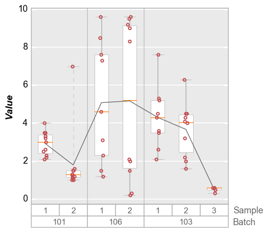
We can dive deeper by specifying more than one value for groups:
[7]:
fcp.boxplot(df=df, y='Value', groups=['Batch', 'Sample'], show=SHOW)
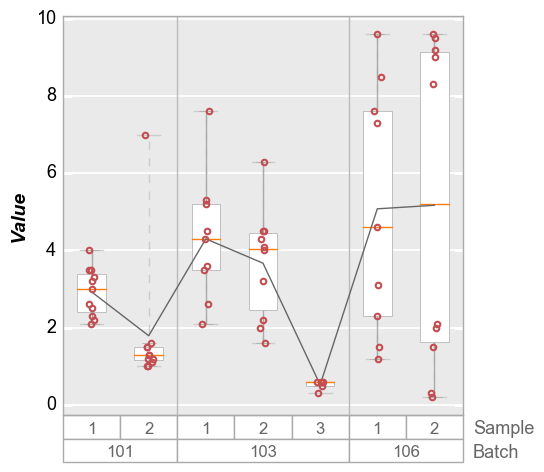
By default, the groups are sorted alphanumerically. To preserve the order of the input DataFrame, add the keyword sort=False:
[8]:
fcp.boxplot(df=df, y='Value', groups=['Batch', 'Sample'], sort=False, show=SHOW)
Groups + legend
Boxplots also support legending for another level of visualization:
[9]:
fcp.boxplot(df=df, y='Value', groups=['Batch', 'Sample'], legend='Region', show=SHOW)
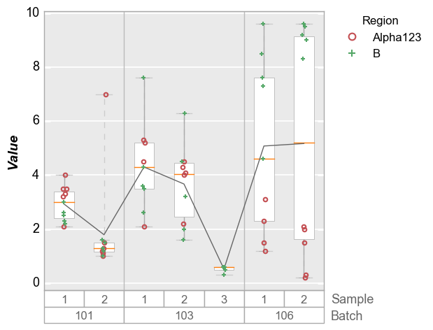
Note: if there are a lot of legend items, the position of the legend will be automatically adjusted to avoid rendering over the box group titles.
[10]:
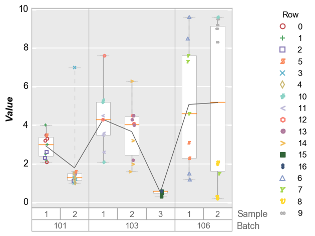
df['Row'] = [int(f) for f in df.index / 4]
fcp.boxplot(df=df, y='Value', groups=['Batch', 'Sample'], legend='Row', show=SHOW)
Grid plots
Like the plot function, boxplots can be broken into subplots based on “row” and/or “col” values or “wrap” values.
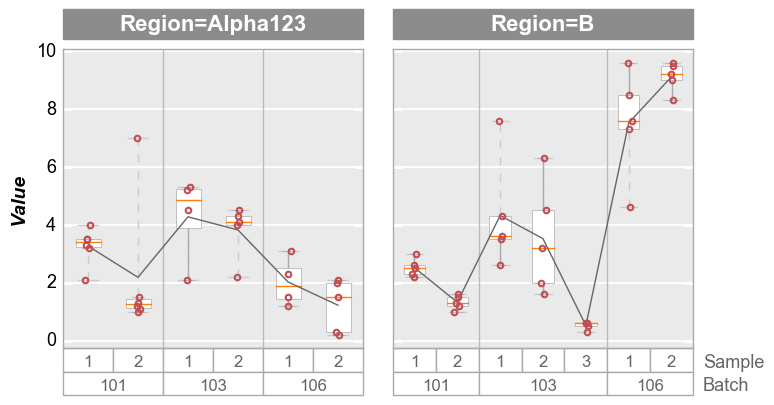
Column plots
[11]:
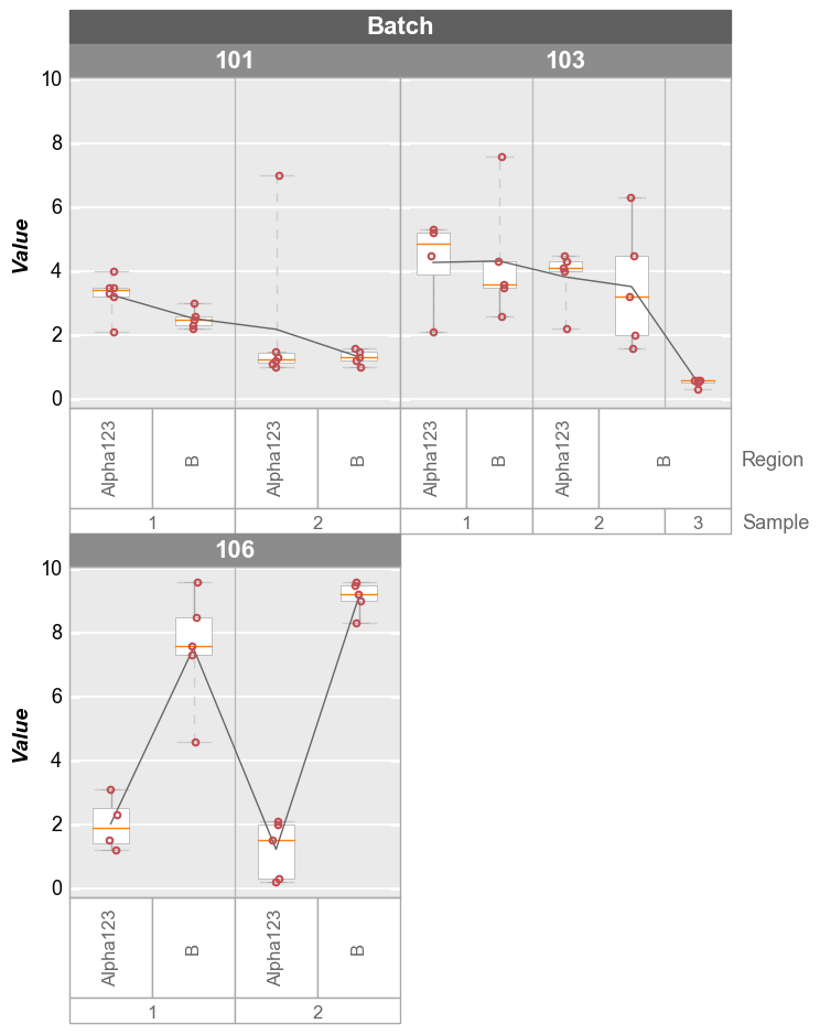
fcp.boxplot(df=df, y='Value', groups=['Batch', 'Sample'], col='Region', show=SHOW, ax_size=[300, 300])
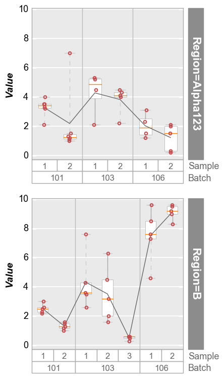
Row plots
[12]:
fcp.boxplot(df=df, y='Value', groups=['Batch', 'Sample'], row='Region', show=SHOW, ax_size=[300, 300])
Wrap plots
[13]:
fcp.boxplot(df=df, y='Value', groups=['Sample', 'Region'], wrap='Batch', show=SHOW, ax_size=[300, 300])
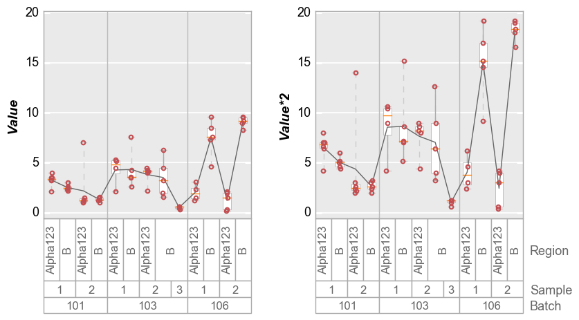
Alternatively, we can wrap multiple y column values and create a unique subplot for each column:
[14]:
# Make a new y column
df['Value*2'] = 2*df['Value']

# Plot
fcp.boxplot(df=df, y=['Value', 'Value*2'], groups=['Batch', 'Sample', 'Region'], wrap='y', show=SHOW,
            ax_size=[300, 300])
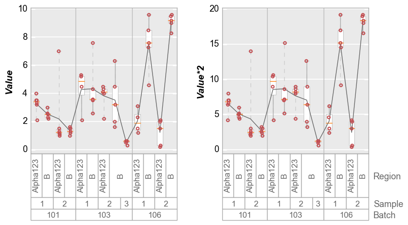
Or if we disable y-axis range sharing:
[15]:
fcp.boxplot(df=df, y=['Value', 'Value*2'], groups=['Batch', 'Sample', 'Region'], wrap='y', show=SHOW,
            ax_size=[300, 300], share_y=False)
Other options
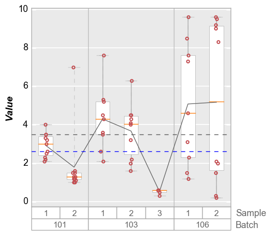
Grand Mean/Median
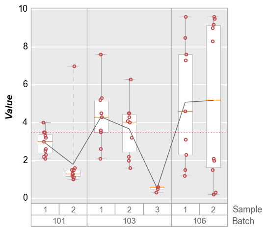
The “grand mean” or “grand median” is the mean/median value for the entire data set in a given plot window. By default, the “grand mean” line is a dashed gray line and the “grand median” is a dashed blue line. Individual line color, styles, and widths can be controlled via the typically-named keywords.
[16]:
fcp.boxplot(df=df, y='Value', groups=['Batch', 'Sample'], show=SHOW, grand_mean=True, grand_median=True)
Both long form and short form keywords are available: i.e., box_grand_mean_ATTRIBUTENAME or grand_mean_ATTRIBUTENAME
[17]:
fcp.boxplot(df=df, y='Value', groups=['Batch', 'Sample'], show=SHOW, grand_mean=True,
            grand_mean_style=':', grand_mean_color='#FF0000', box_grand_mean_width=0.5)
Group Means
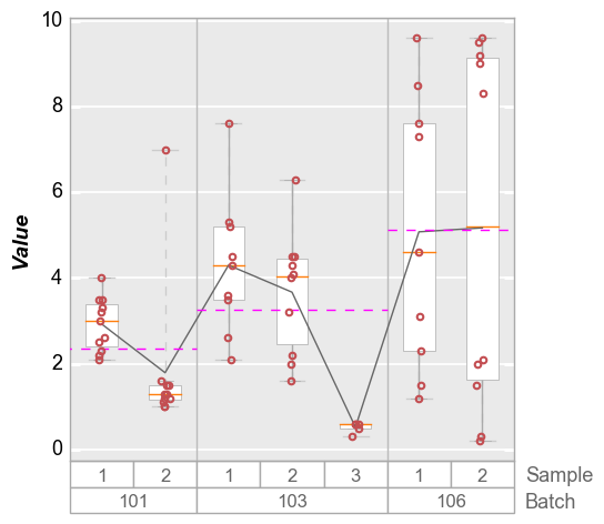
Group means that correspond to the first level of grouping (i.e., same as the vertical divider lines). By default, the mean values are depicted with horizontal dashed magenta lines. Style are controlled by box_group_means_ATTRIBUTENAME or group_means_ATTRIBUTENAME.
[18]:
fcp.boxplot(df=df, y='Value', groups=['Batch', 'Sample'], show=SHOW, group_means=True)
Mean Diamonds
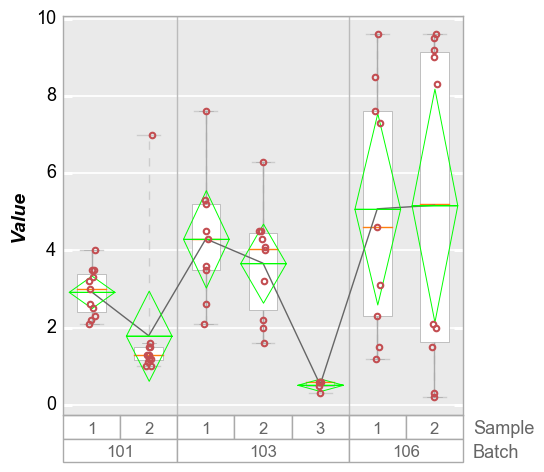
The box_mean_diamonds or mean_diamonds keyword allows you to overlay a diamond on the box which shows vertically the span of the data for a given confidence interval (default = 95%) and a horizontal line for the mean value of each group. The following keywords are available to modify the diamond from its default style:
box_mean_diamonds_alpha|mean_diamonds_alpha: transparency of the diamond 0 to 1 (default: 1)conf_coeff: confidence interval from 0 to 1 (default: 0.95)box_mean_diamonds_edge_color|mean_diamonds_edge_color: edge color of the diamond (default: ‘#FF0000’)box_mean_diamonds_edge_style|mean_diamonds_edge_style: edge style of the diamond (default: ‘-’)box_mean_diamonds_edge_width|mean_diamonds_edge_width: edge width of the diamond (default: 0.6)box_mean_diamonds_fill_color|mean_diamonds_fill_color: fill color of the diamond (default:None)box_mean_diamonds_width|mean_diamonds_width: width of the diamond from 0 to 1 (default: 0.8)
[19]:
fcp.boxplot(df=df, y='Value', groups=['Batch', 'Sample'], show=SHOW, mean_diamonds=True, conf_coeff=0.95)
Violins
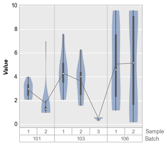
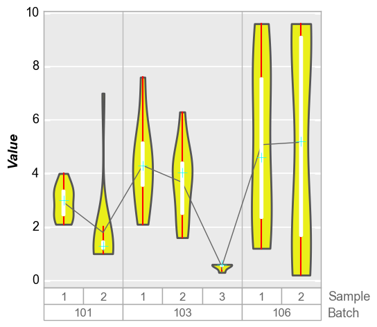
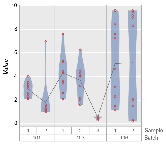
We can also plot distributions with violin plots that show kernal density estimates of the data. By default, these violin plots also contain a small boxes with whiskers to indicate Q1, Q3, 1.5 * IQR and the median of the distribution. Discrete data points are disabled by default but can be turned on with the keyword violin_markers=True (box style shamelessly appropriated from seaborn).
[20]:
fcp.boxplot(df=df, y='Value', groups=['Batch', 'Sample'], show=SHOW, violin=True)
We can change the style of the violin density profiles and the associated boxplot using keywords starting with violin. Note that the standard box styling attributes are ignored when adding the violin plot. The reason for this is to make it possilbe to maintain different default settings for regular box plots and violin plots in the same theme file.
[21]:
fcp.boxplot(df=df, y='Value', groups=['Batch', 'Sample'], show=SHOW, violin=True,
            violin_fill_color='#eaef1a', violin_fill_alpha=1, violin_edge_color='#555555', violin_edge_width=2,
            violin_box_color='#ffffff', violin_whisker_color='#ff0000',
            violin_median_marker='+', violin_median_color='#00ffff', violin_median_size=10)
We can also disable the box overlay on the violin plot as follows:
[22]:
fcp.boxplot(df=df, y='Value', groups=['Batch', 'Sample'], show=SHOW, violin=True, violin_box_on=False, violin_markers=True, jitter=False)
Stat line
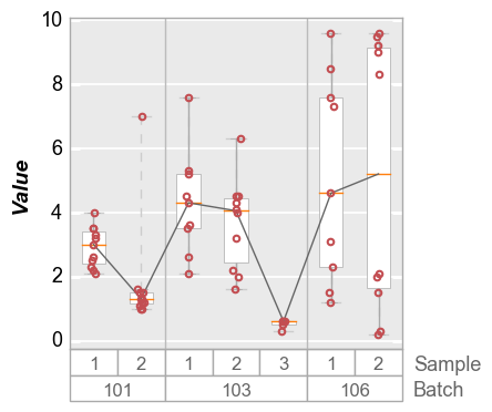
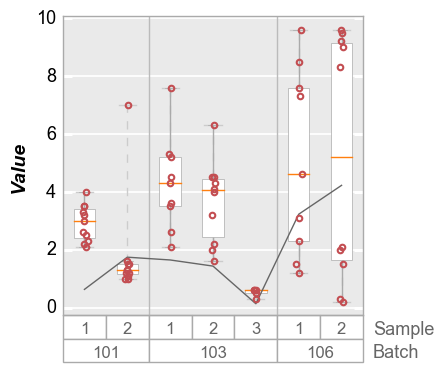
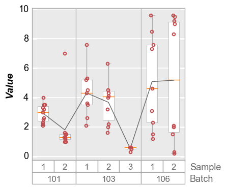
In addition to displaying boxes with a median line and interquartile ranges, a connecting line can be drawn between boxes at some statistical value. By default, the line connects the mean value of each distribution but other DataFrame stat values can be selected. The stat line accepts the typical styling keywords of any line object with the prefix box_stat_line_ (i.e., box_stat_line_color or box_stat_line_width)
Mean
[23]:
fcp.boxplot(df=df, y='Value', groups=['Batch', 'Sample'], show=SHOW, box_stat_line='mean', ax_size=[300, 300])

Median
[24]:
fcp.boxplot(df=df, y='Value', groups=['Batch', 'Sample'], show=SHOW, box_stat_line='median', ax_size=[300, 300])
Std dev
[25]:
fcp.boxplot(df=df, y='Value', groups=['Batch', 'Sample'], show=SHOW, box_stat_line='std', ax_size=[300, 300])
Dividers
Using the keyword box_divider, lines can be drawn on the boxplot to visually segrate main groups of boxes. These lines are enabled by default but can be turned off easily:
[26]:
fcp.boxplot(df=df, y='Value', groups=['Batch', 'Sample'], show=SHOW, box_divider=False, ax_size=[300, 300])

Range lines
Because outlier points by definition fall outside of the span of the box, we can draw lines that span the entire range of the data. This is particularly useful to indicate when there are data points that fall outside of the limits of the y-axis. These lines are enabled by default but can be disabled or styled through keywords with the prefix box_range_lines_:
[27]:
fcp.boxplot(df=df, y='Value', groups=['Batch', 'Sample'], show=SHOW, box_range_lines=False, ax_size=[300, 300])
[ ]: