plot
The plot function is the primary vehicle for visualizing x-y data.
At a minimum, the plot function requires the following keywords:
df: a pandas DataFramex: the name of the DataFrame column containing the x-axis datay: the name of the DataFrame column containing the y-axis data
Other optional keywords are described in Keyword Arguments.
Setup
Imports
In [1]:
%load_ext autoreload
%autoreload 2
%matplotlib inline
import fivecentplots as fcp
import pandas as pd
import numpy as np
import os, sys, pdb
osjoin = os.path.join
st = pdb.set_trace
Sample data
In [2]:
df = pd.read_csv(osjoin(os.path.dirname(fcp.__file__), 'tests', 'fake_data.csv'))
df.head()
Out[2]:
| Substrate | Target Wavelength | Boost Level | Temperature [C] | Die | Voltage | I Set | I [A] | |
|---|---|---|---|---|---|---|---|---|
| 0 | Si | 450 | 0.2 | 25 | (1,1) | 0.0 | 0.0 | 0.0 |
| 1 | Si | 450 | 0.2 | 25 | (1,1) | 0.1 | 0.0 | 0.0 |
| 2 | Si | 450 | 0.2 | 25 | (1,1) | 0.2 | 0.0 | 0.0 |
| 3 | Si | 450 | 0.2 | 25 | (1,1) | 0.3 | 0.0 | 0.0 |
| 4 | Si | 450 | 0.2 | 25 | (1,1) | 0.4 | 0.0 | 0.0 |
In [3]:
ts = pd.read_csv(osjoin(os.path.dirname(fcp.__file__), 'tests', 'fake_ts.csv'))
Set theme
(Only needs to be run once)
In [4]:
fcp.set_theme('gray')
#fcp.set_theme('white')
Previous theme file found! Renaming to "defaults_old.py" and copying new theme...done!
Other
In [5]:
SHOW = False
XY Plots
Scatter
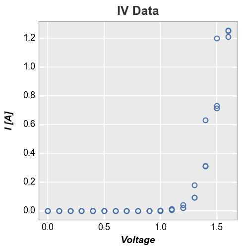
A simple XY plot with no lines or legend
In [6]:
fcp.plot(df, x='Voltage', y='I [A]', title='IV Data', lines=False, show=SHOW,
         filter='Substrate=="Si" & Target Wavelength==450 & Boost Level==0.2 & Temperature [C]==25')
Legend
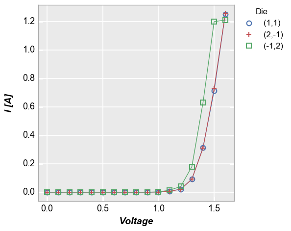
Add a legend by the column “Die”
In [7]:
fcp.plot(df, x='Voltage', y='I [A]', legend='Die', show=SHOW,
         filter='Substrate=="Si" & Target Wavelength==450 & Boost Level==0.2 & Temperature [C]==25')
Log scale
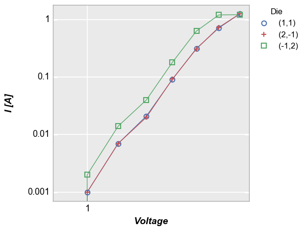
Log-scaled axes can be enabled through the kwargs “ax_scale”. Valid options:
x-only: logx | semilogx
y-only: logy | semilogy
both: loglog | log
symlog: symlog (doesn’t work in matploblib 1.5.1)
logit: logit
In [8]:
fcp.plot(df, x='Voltage', y='I [A]', ax_scale='loglog', legend='Die', show=SHOW, xmin=0.9,
         filter='Substrate=="Si" & Target Wavelength==450 & Boost Level==0.2 & Temperature [C]==25')
Categorical labels
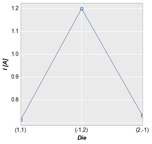
Categorical DataFrame columns can also be plotted on x and/or y axes:
In [9]:
fcp.plot(df, x='Die', y='I [A]', show=SHOW,
         filter='Substrate=="Si" & Target Wavelength==450 & Boost Level==0.2 & Temperature [C]==25 & Voltage==1.5')
Time series
Similarly, a DataFrame containing time series data can be plotted:
In [10]:
fcp.plot(ts, x='Date', y='Happiness Quotient', markers=False, ax_size=[1000, 250])

Secondary x|y plots
Multiple x & y values
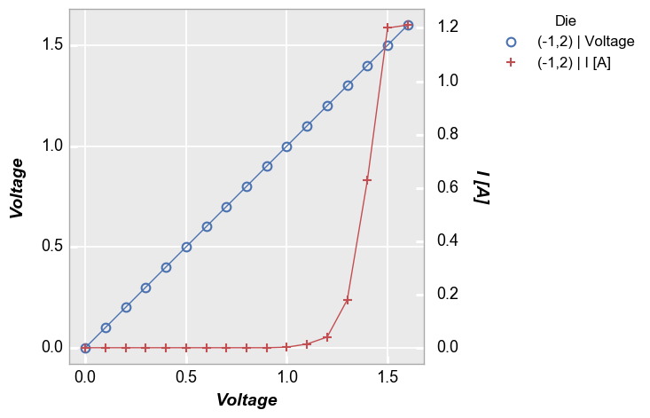
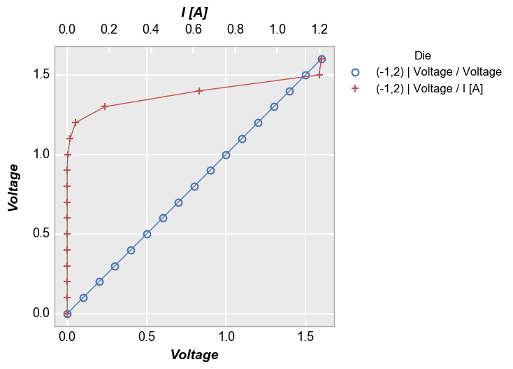
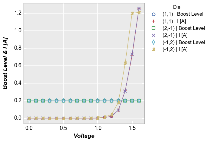
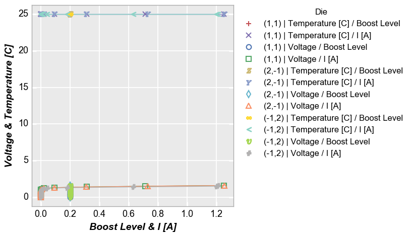
Instead of sharing (or twinning) one independent axis across a primary and secondary dependent axis, we can plot multiple columns of data on the same dependent axis. In this case, all dependent values share the same limits on the plot.
Multiple y only
In [13]:
fcp.plot(df, x='Voltage', y=['Boost Level', 'I [A]'], legend='Die', show=SHOW,
         filter='Substrate=="Si" & Target Wavelength==450 & Boost Level==0.2 & Temperature [C]==25')
Multiple x only
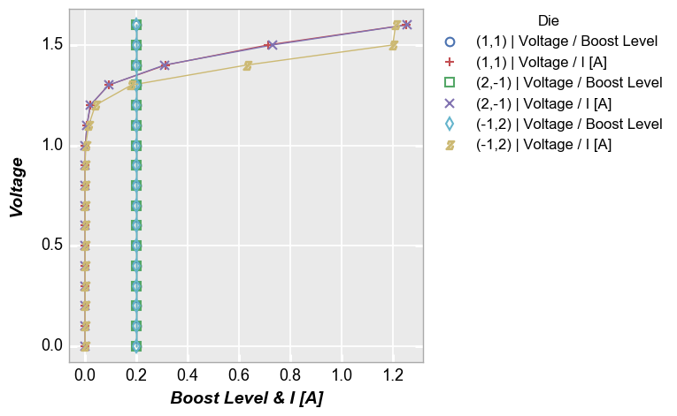
In [14]:
fcp.plot(df, x=['Boost Level', 'I [A]'], y='Voltage', legend='Die', show=SHOW,
         filter='Substrate=="Si" & Target Wavelength==450 & Boost Level==0.2 & Temperature [C]==25')
Both
In [15]:
fcp.plot(df, x=['Boost Level', 'I [A]'], y=['Voltage', 'Temperature [C]'], legend='Die', show=SHOW,
         filter='Substrate=="Si" & Target Wavelength==450 & Boost Level==0.2 & Temperature [C]==25')
Grid plots
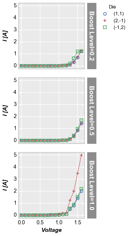
Row plot
Create a unique plot for each unique value of the “row” column in the specified DataFrame. Plots are arranged row by row in a single column. Each row contains a label indicating the unique value of the “row” column.
In [16]:
fcp.plot(df, x='Voltage', y='I [A]', legend='Die', row='Boost Level', show=SHOW, ax_size=[225, 225],
         filter='Substrate=="Si" & Target Wavelength==450 & Temperature [C]==25')
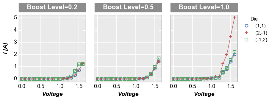
Column plot
Create a unique plot for each unique value of the “col” column in the specified DataFrame. Plots are arranged in a single row, column by column. Each column contains a label indicating the unique value of the “col” column.
In [17]:
fcp.plot(df, x='Voltage', y='I [A]', legend='Die', col='Boost Level', show=SHOW, ax_size=[225, 225],
         filter='Substrate=="Si" & Target Wavelength==450 & Temperature [C]==25')
Row x column grid
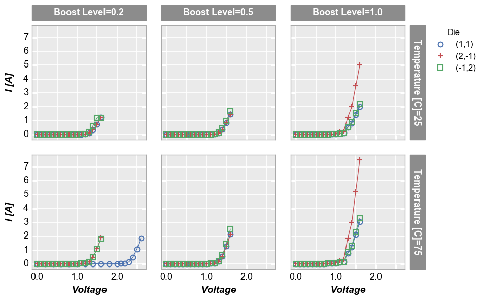
Remove “Temperature [C]” from the DataFrame subset and make a grid of plots for each unique combination of “row” and “col” values. Both “row” and “col” labels are included.
In [18]:
fcp.plot(df, x='Voltage', y='I [A]', legend='Die', col='Boost Level', row='Temperature [C]', show=SHOW,
         ax_size=[225, 225], filter='Substrate=="Si" & Target Wavelength==450', label_rc_font_size=13)
Wrap plot
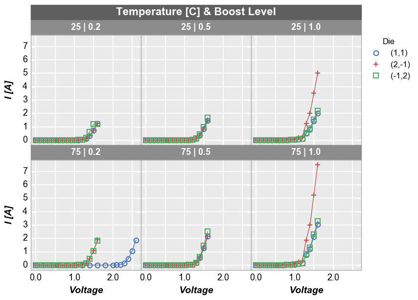
A wrap plot is an alternate view of the row x column plot. For wrap plots, the row and column labels are condensed into a single label above each plot window and the spacing between plots is eliminated (by default; can be overriden). The x and y sizes of the grid are determined by the square root of the total number of plot windows. x and y axes ranges are shared.
In [19]:
fcp.plot(df, x='Voltage', y='I [A]', legend='Die', wrap=['Temperature [C]', 'Boost Level'], show=SHOW,
         ax_size=[225, 225], filter='Substrate=="Si" & Target Wavelength==450', label_rc_font_size=13)
Other options
Horizontal and vertical lines
We can add horizontal and vertical reference lines to a plot using one
or more of the following keywords: ax_hlines, ax_vlines,
ax2_hlines, ax2_vlines where “hlines” are horizontal, “vlines”
are vertical, “ax” lines are applied to the primary axis, and “ax2”
lines are applied to a secondary axis, if it exists. The value of these
keywords is:
- a single float number
- a list of float numbers
- or a variable-length list of tuples (only first value is required):
- item 1 (required) = x or y axis value of the line or the name of a DataFrame column from which the first entry in the column will be used
- item 2: line color
- item 3: line style
- item 4: line width
- item 5: line alpha
- item 6: legend text (won’t appear in legend without this unless item 1 is a name of a DataFrame column)
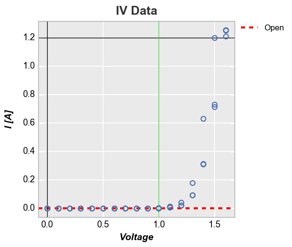
Explicitly defined horizontal and vertical lines:
In [20]:
fcp.plot(df, x='Voltage', y='I [A]', title='IV Data', lines=False, show=SHOW, legend=True,
         filter='Substrate=="Si" & Target Wavelength==450 & Boost Level==0.2 & Temperature [C]==25',
         ax_hlines=[(0, '#FF0000', '--', 3, 1, 'Open'), 1.2], ax_vlines=[0, (1, '#00FF00')])
Horizontal line using the first value of a DataFrame column:
In [21]:
df['Open'] = 0
fcp.plot(df, x='Voltage', y='I [A]', title='IV Data', lines=False, show=SHOW, legend=True,
         filter='Substrate=="Si" & Target Wavelength==450 & Boost Level==0.2 & Temperature [C]==25',
         ax_hlines=[('Open', '#FF0000', '--', 3, 1), 1.2], ax_vlines=[0, (1, '#00FF00')])

Curve fitting
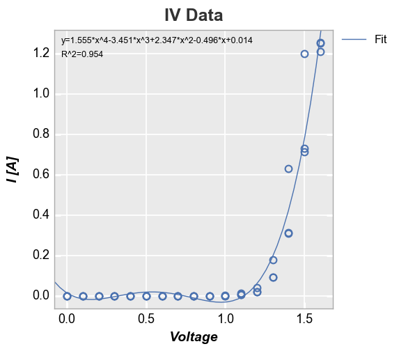
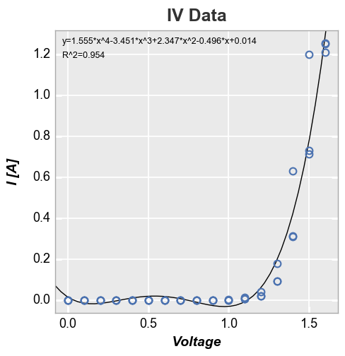
We can add a polynomial line of fit of some degree to the plot with the
keyword fit with an option to display the fit equation and R^2
value:
In [22]:
fcp.plot(df, x='Voltage', y='I [A]', title='IV Data', lines=False, show=SHOW,
         filter='Substrate=="Si" & Target Wavelength==450 & Boost Level==0.2 & Temperature [C]==25',
         fit=4, fit_eqn=True, fit_rsq=True, fit_font_size=9)
We can disable the legend using legend=False:
In [23]:
fcp.plot(df, x='Voltage', y='I [A]', title='IV Data', lines=False, show=SHOW,
         filter='Substrate=="Si" & Target Wavelength==450 & Boost Level==0.2 & Temperature [C]==25',
         fit=4, fit_eqn=True, fit_rsq=True, fit_font_size=9, legend=False)
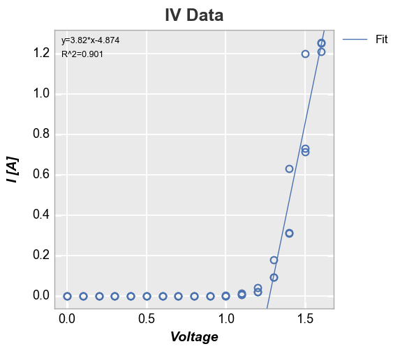
We can also constrain the region of interest for the fit by supplying a
start and stop value to either the fit_range_x or fit_range_y
keywords:
In [24]:
fcp.plot(df, x='Voltage', y='I [A]', title='IV Data', lines=False, show=SHOW,
         filter='Substrate=="Si" & Target Wavelength==450 & Boost Level==0.2 & Temperature [C]==25',
         fit=1, fit_eqn=True, fit_rsq=True, fit_font_size=9, fit_range_x=[1.3, 2])
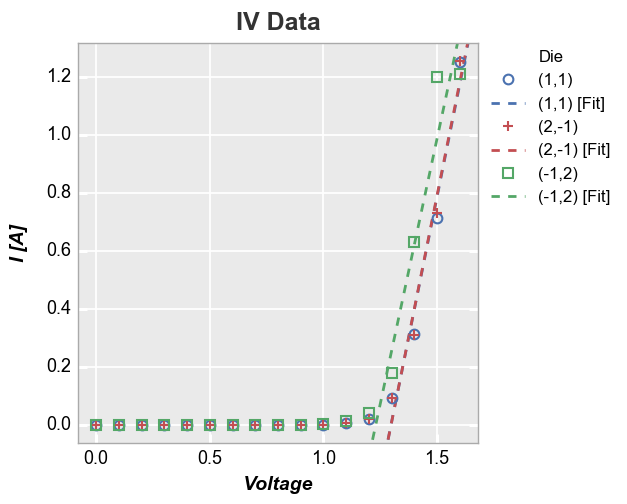
We can also add a line of fit for each item in a legend:
In [25]:
fcp.plot(df, x='Voltage', y='I [A]', title='IV Data', lines=False, show=SHOW, legend='Die',
         filter='Substrate=="Si" & Target Wavelength==450 & Boost Level==0.2 & Temperature [C]==25',
         fit=1, fit_range_x=[1.3, 2], fit_width=2, fit_style='--')
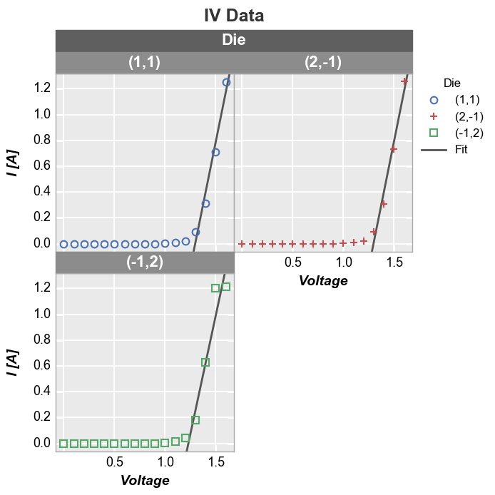
If we legend and group by the same value and select a single color for the fit line, the legend will collapse to show only one instance of “Fit”:
In [26]:
fcp.plot(df, x='Voltage', y='I [A]', title='IV Data', lines=False, show=SHOW, wrap='Die', legend='Die',
         filter='Substrate=="Si" & Target Wavelength==450 & Boost Level==0.2 & Temperature [C]==25',
         fit=1, fit_range_x=[1.3, 2], fit_width=2, fit_color='#555555', ax_size=[250, 250])
Stat lines
Rather than drawing connecting lines between all points, you can draw a
line through a representative statistic of the data, such as the
“median” value of the points, using the stat keyword (any stats that
can be applied to a pandas groupby object can be used). For cases
where the x-values are not identical for all data sets, use the keyword
stat_val and specify an alternative x-axis to use for the
statistical calculation (the actual plotted x-axis will be whatever is
specified for the x keyword).
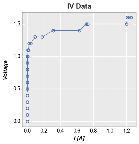
First consider a plot of Voltage vs I [A]. Because the actual measured
current values vary from the current set point value from measurement to
measurement, the x-values for each data set are not identical. The
stat line thus computes the median value for each x value where
there may only be a single data point. The result is ugly and useful.
In [27]:
fcp.plot(df, x='I [A]', y='Voltage', title='IV Data', lines=False, show=SHOW,
         filter='Substrate=="Si" & Target Wavelength==450 & Boost Level==0.2 & Temperature [C]==25',
         stat='median')
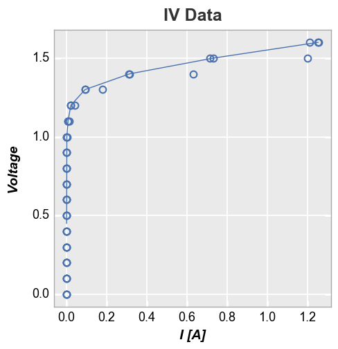
Instead, add the column name for the column containing the set point
value of I [A] to the keyword stat_val:
In [28]:
fcp.plot(df, x='I [A]', y='Voltage', title='IV Data', lines=False, show=SHOW,
         filter='Substrate=="Si" & Target Wavelength==450 & Boost Level==0.2 & Temperature [C]==25',
         stat='median', stat_val='I Set')
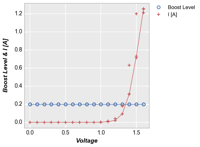
Stat lines also work with multiple DataFrame columns are plotted on a given axis. For example, consider the following with two values on the y-axis:
In [29]:
fcp.plot(df, x='Voltage', y=['Boost Level', 'I [A]'], show=SHOW, legend=True, stat='median',
         filter='Substrate=="Si" & Target Wavelength==450 & Boost Level==0.2 & Temperature [C]==25')
Confidence intervals
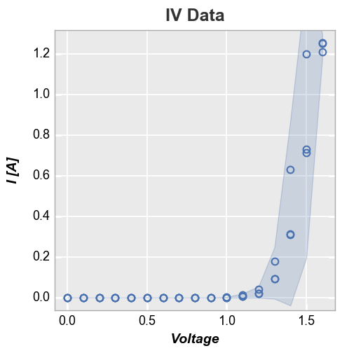
It is possible to display confidence intervals on a data set. By default
these are shown as partially transparent filled regions around a curve.
The actual confidence interval to display is set by the conf_int
keyword. Allowed values are any interval between 0 and 1 or the special
value range which plots a region from the min to the max value of
the data at a given point. The example below shows a 95% confidence
interval:
In [30]:
fcp.plot(df, x='Voltage', y='I [A]', title='IV Data', lines=False, show=SHOW,
         filter='Substrate=="Si" & Target Wavelength==450 & Boost Level==0.2 & Temperature [C]==25',
         conf_int=0.95)
Reference line
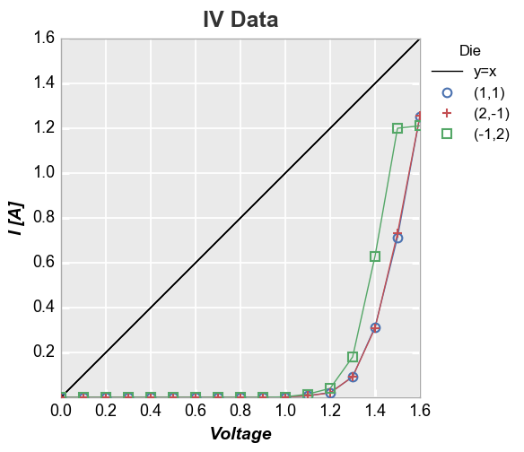
We can add a reference line to the plot using the keyword ref_line.
The value of this keyword is: (1) an equation applied to an existing
DataFrame column; or (2) a simple int or float. This value is used to
create a new column in the DataFrame that is plotted vs the value of
x
y=x reference
In [31]:
fcp.plot(df, x='Voltage', y='I [A]', title='IV Data', show=SHOW, legend='Die',
         filter='Substrate=="Si" & Target Wavelength==450 & Boost Level==0.2 & Temperature [C]==25',
         ref_line=df['Voltage'], ref_line_legend_text='y=x', xmin=0, ymin=0, xmax=1.6, ymax=1.6)
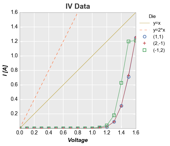
We can also add multiple reference lines to a single plot:
In [32]:
df['2*Voltage'] = 2*df['Voltage']
fcp.plot(df, x='Voltage', y='I [A]', title='IV Data', show=SHOW, legend='Die',
         filter='Substrate=="Si" & Target Wavelength==450 & Boost Level==0.2 & Temperature [C]==25',
         xmin=0, ymin=0, xmax=1.6, ymax=1.6,
         ref_line=['Voltage', '2*Voltage'], ref_line_legend_text=['y=x', 'y=2*x'], ref_line_style=['-', '--'], ref_line_color=[5,6])
More complex calculation
Now let’s use the fit equation calculated above and add the fit line as
a reference line (notice that because we are not specifying an exisiting
column in the DataFrame as the ref_line and we are not specifying
ref_line_legend_text, the legend defaults to a generic label “Ref
Line”):
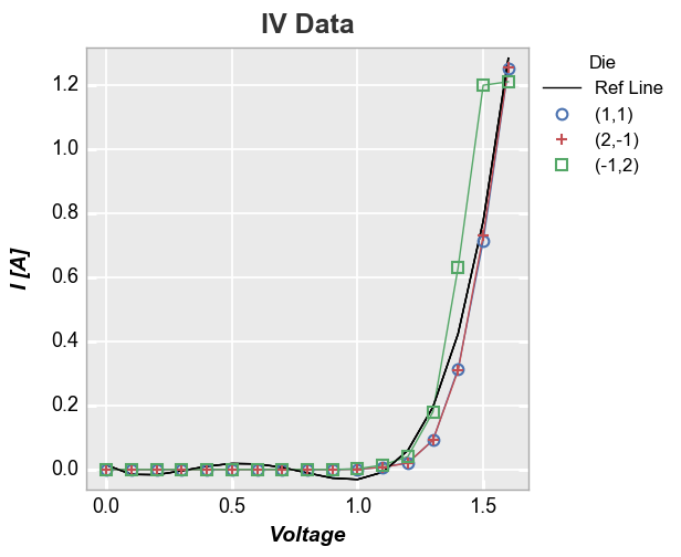
In [33]:
fcp.plot(df, x='Voltage', y='I [A]', title='IV Data', show=SHOW, legend='Die',
         filter='Substrate=="Si" & Target Wavelength==450 & Boost Level==0.2 & Temperature [C]==25',
         ref_line=1.555*df['Voltage']**4-3.451*df['Voltage']**3+2.347*df['Voltage']**2-0.496*df['Voltage']+0.014)
