barplot
fivecentplots can plot bar charts using fcp.bar. At a minimum, the
bar function requires the following keywords:
df: a pandas DataFramex: the name of the categorical data columny: the name of the DataFrame column containing the values for the data in columnx
Setup
Imports
In [1]:
%load_ext autoreload
%autoreload 2
%matplotlib inline
import fivecentplots as fcp
import pandas as pd
import numpy as np
import os, sys, pdb
osjoin = os.path.join
db = pdb.set_trace
Sample data
Read some fake bar chart data
In [2]:
df = pd.read_csv(osjoin(os.path.dirname(fcp.__file__), 'tests', 'fake_data_bar.csv'))
df.head()
Out[2]:
| Liquid | pH | Measurement | T [C] | |
|---|---|---|---|---|
| 0 | Lemon juice | 2.4 | A | 25 |
| 1 | Orange juice | 3.5 | A | 25 |
| 2 | Battery acid | 1.0 | A | 25 |
| 3 | Bottled water | 6.7 | A | 25 |
| 4 | Coke | 3.0 | A | 25 |
Other
In [4]:
SHOW = False
Bar plot types
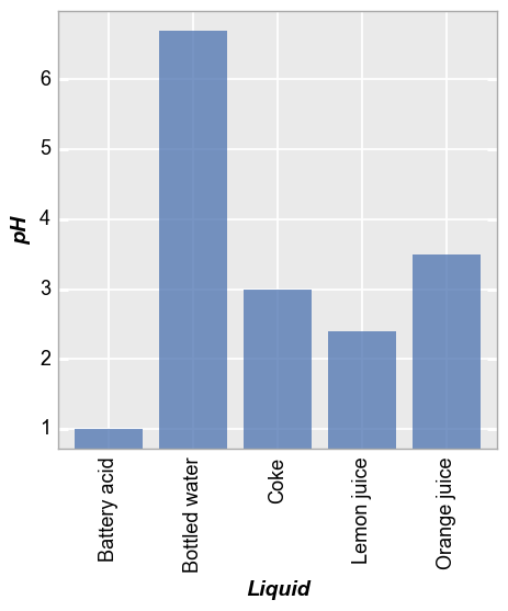
Vertical
Consider a DataFrame that contains several sets of measured pH data for various liquids. First we plot only one set of measured data (note that we envoke the keyword to rotate the x tick labels so they are all readable):
In [5]:
fcp.bar(df, x='Liquid', y='pH', show=SHOW, filter='Measurement=="A" & T [C]==25', tick_labels_major_x_rotation=90)
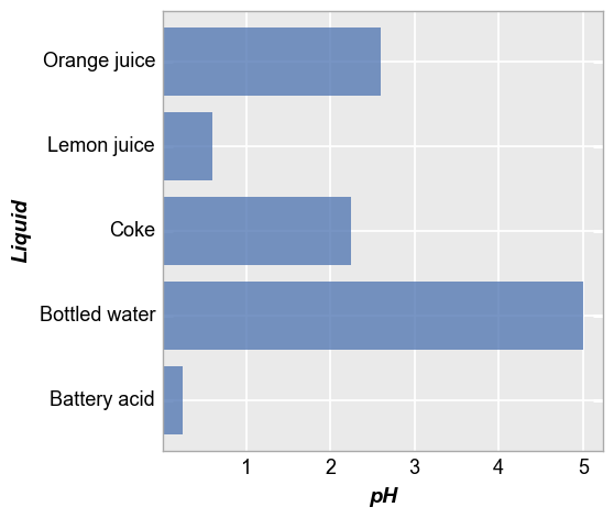
Horizontal
We can plot the same data horizontally by adding the keyword
horizontal=True (notice now we do not need to rotate tick labels):
In [6]:
fcp.bar(df, x='Liquid', y='pH', show=SHOW, filter='Measurement=="A"', horizontal=True)
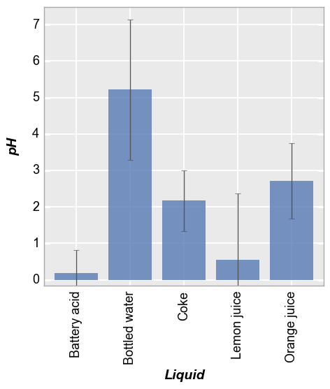
Error bars
Now we can include all measurement sets in a single bar char. Now the bars represent the mean value of all data sets. We can also add error bars to indidcate the standard deviation between measurements:
In [7]:
fcp.bar(df, x='Liquid', y='pH', show=SHOW, tick_labels_major_x_rotation=90, error_bars=True)
Grouping
Like the plot function, bar plots can grouped in various ways to provide
further insight intot the data set. This includes a legend,
“stacking”, row and/or col subplot values, and wrap values.
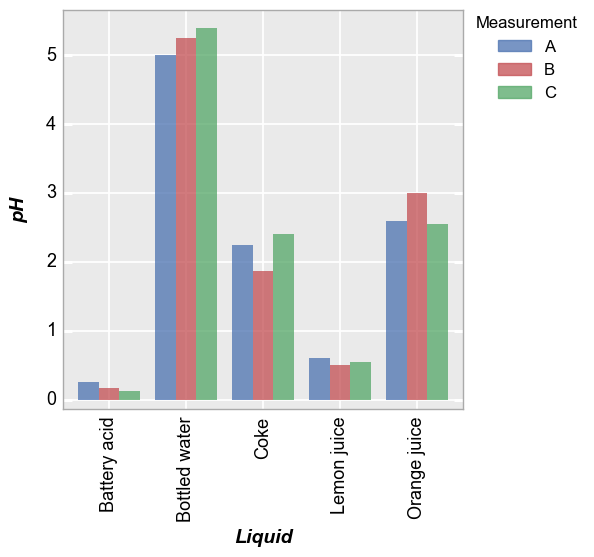
Legend
With a legend, each measurement set can be explicitly displayed in subsequent bars:
In [8]:
fcp.bar(df, x='Liquid', y='pH', show=SHOW, tick_labels_major_x_rotation=90, legend='Measurement')
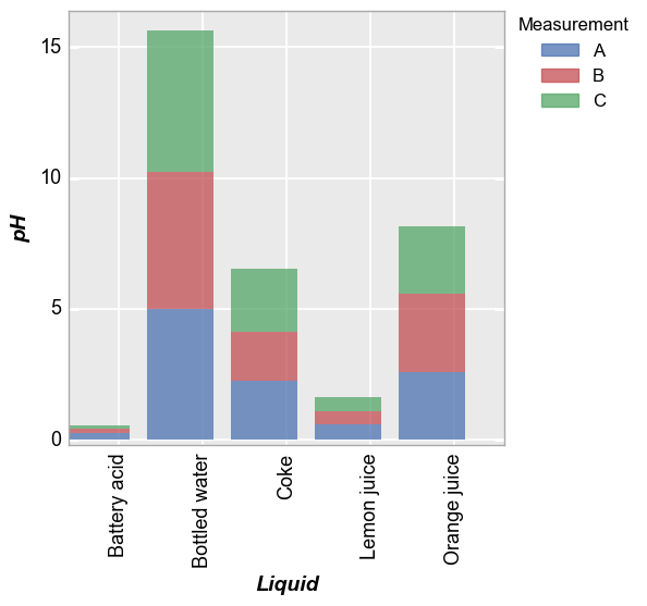
Stacked
Alternatively, we can stack the measurements to give a cumulative bar
using the keyword stacked=True (which makes absolutely no sense for
this data set but whatever):
In [9]:
fcp.bar(df, x='Liquid', y='pH', show=SHOW, tick_labels_major_x_rotation=90, stacked=True, legend='Measurement')
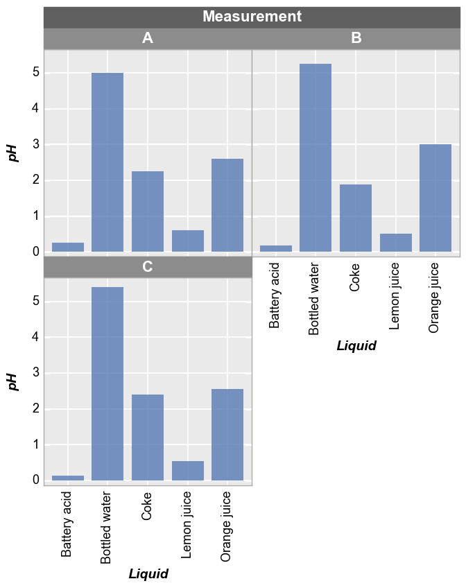
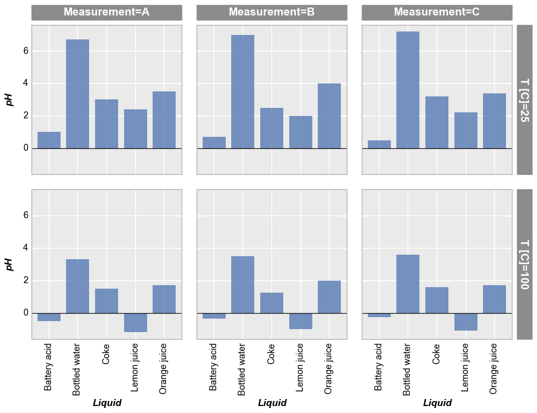
Row/column plot
We can separate different conditions using row/col plots as shown below:
In [10]:
fcp.bar(df, x='Liquid', y='pH', show=SHOW, tick_labels_major_x_rotation=90, col='Measurement', row='T [C]', ax_hlines=0, ax_size=[300, 300])
Wrap plot
Alternatively, we can use a wrap plot to visualize:
In [11]:
fcp.bar(df, x='Liquid', y='pH', show=SHOW, tick_labels_major_x_rotation=90, wrap='Measurement', ax_size=[300, 300])