barplot
This section describes various options available for bar charts in fivecentplots
Setup
Import packages:
import fivecentplots as fcp
import pandas as pd
from pathlib import Path
Read some fake bar chart data with 3 replicates of pH data for various liquids measured at multiple temperatures:
df = pd.read_csv(Path(fcp.__file__).parent / 'test_data/fake_data_bar.csv')
df.groupby(['Liquid', 'Measurement', 'T [C]']).count()
| pH | |||
|---|---|---|---|
| Liquid | Measurement | T [C] | |
| Battery acid | A | 25 | 1 |
| 100 | 1 | ||
| B | 25 | 1 | |
| 100 | 1 | ||
| C | 25 | 1 | |
| 100 | 1 | ||
| Bottled water | A | 25 | 1 |
| 100 | 1 | ||
| B | 25 | 1 | |
| 100 | 1 | ||
| C | 25 | 1 | |
| 100 | 1 | ||
| Coke | A | 25 | 1 |
| 100 | 1 | ||
| B | 25 | 1 | |
| 100 | 1 | ||
| C | 25 | 1 | |
| 100 | 1 | ||
| Lemon juice | A | 25 | 1 |
| 100 | 1 | ||
| B | 25 | 1 | |
| 100 | 1 | ||
| C | 25 | 1 | |
| 100 | 1 | ||
| Orange juice | A | 25 | 1 |
| 100 | 1 | ||
| B | 25 | 1 | |
| 100 | 1 | ||
| C | 25 | 1 | |
| 100 | 1 |
Optionally set the design theme (skipping here and using default):
#fcp.set_theme('gray')
#fcp.set_theme('white')
Bar plot types
Vertical bars
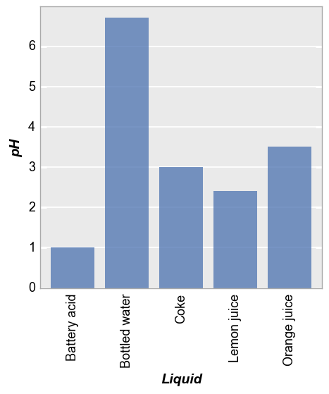
We can plot a basic vertical bar chart as follows. Note: * filter is applied to show only measurement “A” at 25C * tick labels are rotated 90° for readability (fcp.bar does not currently have auto-rotation for long tick labels)
fcp.bar(df, x='Liquid', y='pH', filter='Measurement=="A" & T [C]==25', tick_labels_major_x_rotation=90)
Horizontal bars
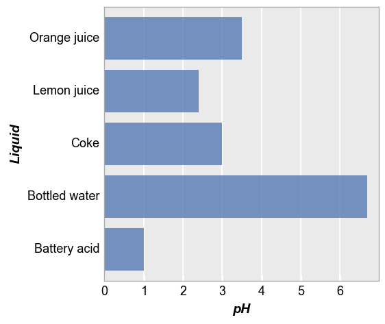
We can plot the same data with horizontal bars by adding the keyword horizontal=True.
For convenience, fivecentplots often supports two versions of plot-specific keywords (in this case, horizontal or bar_horizontal). For inline plotting the shorter version may be preferred but for cases where kwargs are pulled from theme files or when precision is required to avoid applying a particular kwarg to other Elements in the plot, the long version is recommended.
fcp.bar(df, x='Liquid', y='pH', filter='Measurement=="A" & T [C]==25', horizontal=True)
Error bars
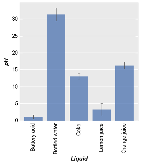
Next we group all measured data by liquid, regardless of replicate or temperature, into a single bars (this means each bar represents the mean value of a given liquid across all data sets). We add error bars to indicate the standard deviation across measurements with the error_bars keyword:
fcp.bar(df, x='Liquid', y='pH', tick_labels_major_x_rotation=90, error_bars=True)
Grouping
Like all other plots in fivecentplots, bar plots can grouped in various ways to provide further insight into the data set. This includes:
legendstackingrowcolwrap
keyword options.
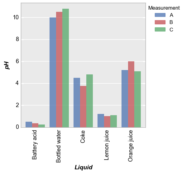
Legend
When a legend is applied, each measurement set is displayed in its own bar:
fcp.bar(df, x='Liquid', y='pH', tick_labels_major_x_rotation=90, legend='Measurement')
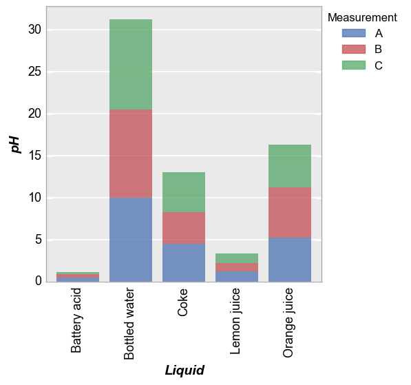
Stacked
Alternatively, we can stack the measurements to give a cumulative bar using stacked=True (which makes absolutely no sense for this example but whatever):
fcp.bar(df, x='Liquid', y='pH', tick_labels_major_x_rotation=90, stacked=True, legend='Measurement')
[ 0.5 10.   4.5  1.2  5.2]
[ 0.85 20.5   8.25  2.2  11.2 ]
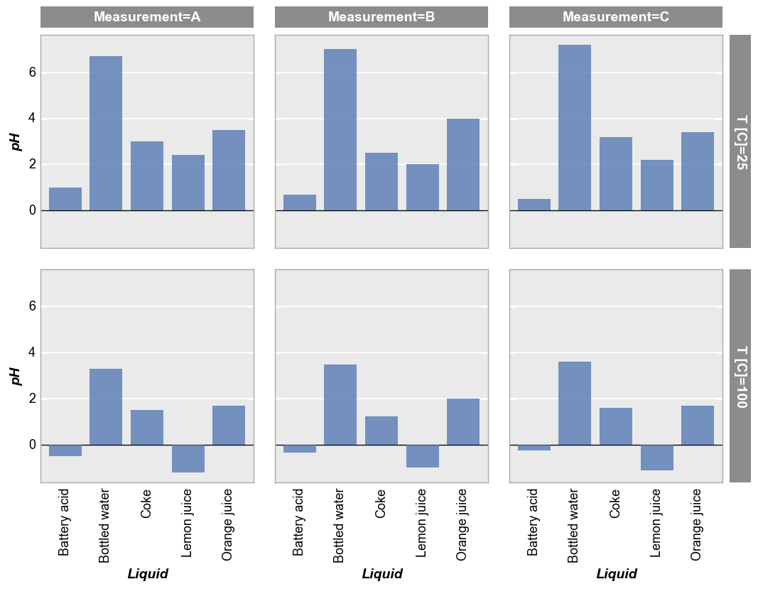
Row/column plot
We can separate different conditions using row/col plots as shown below. (Negative pH values?? These data are truly fake!)
fcp.bar(df, x='Liquid', y='pH', tick_labels_major_x_rotation=90, col='Measurement', row='T [C]', ax_hlines=0, ax_size=[300, 300])
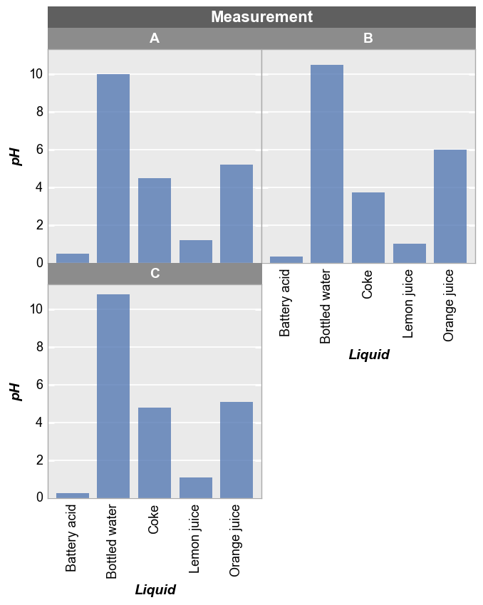
Wrap plot
We can use a wrap plot to visualize:
fcp.bar(df, x='Liquid', y='pH', tick_labels_major_x_rotation=90, wrap='Measurement', ax_size=[300, 300])
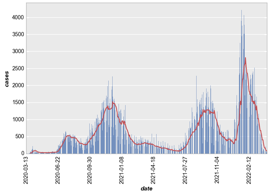
Rolling mean
fivecentplots can automatically apply a rolling mean to bar chart data using rolling_mean, to which we pass a positive integer for the window size of the mean calculation. For this example, we read in some different data.
df2 = pd.read_csv(Path(fcp.__file__).parent / 'test_data/real_data_bar.csv')
Default line styling
By default, the rolling mean curve will have markers disabled and will use the second color in the default color list (red) and a line width of 2:
fcp.bar(df2, x='date', y='cases', ax_size=[800, 500], tick_labels_major_x_rotation=90, rolling_mean=14)
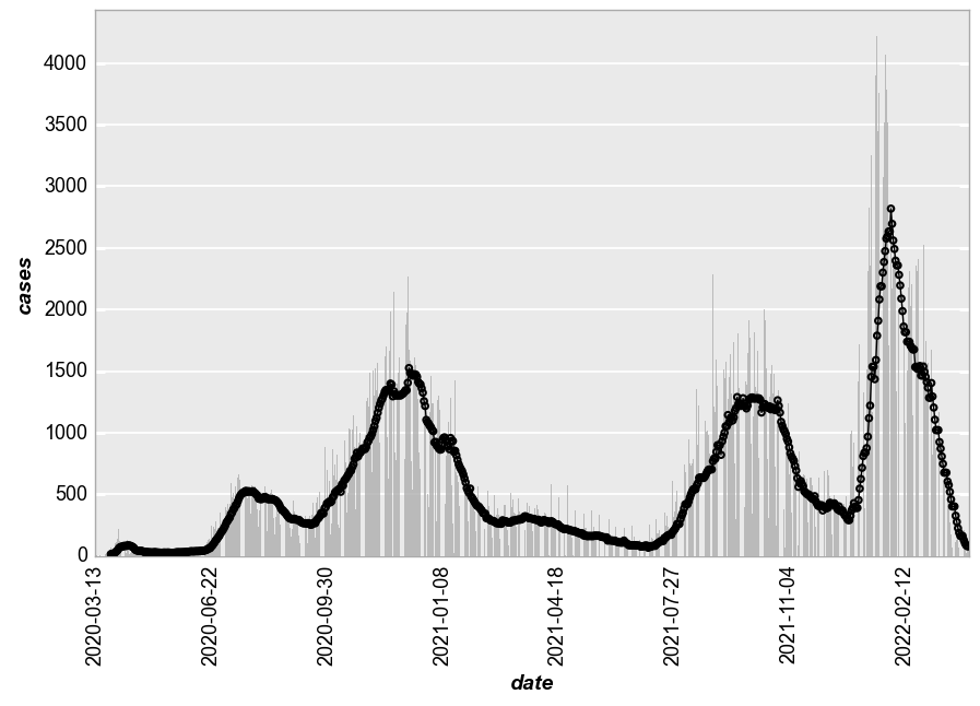
Custom line style
The rolling mean curve style can be easily modified using standard kwargs for line plots with a rolling_mean_ prefix. Markers can also be enabled using the markers element object:
fcp.bar(df2, x='date', y='cases', ax_size=[800, 500], tick_labels_major_x_rotation=90, rolling_mean=14,
        bar_fill_color='#aaaaaa', rolling_mean_line_color='#000000', rolling_mean_line_width = 1, markers=True, marker_size=4)
Styles
Bar plots have many style options. A few are demonstrated below.
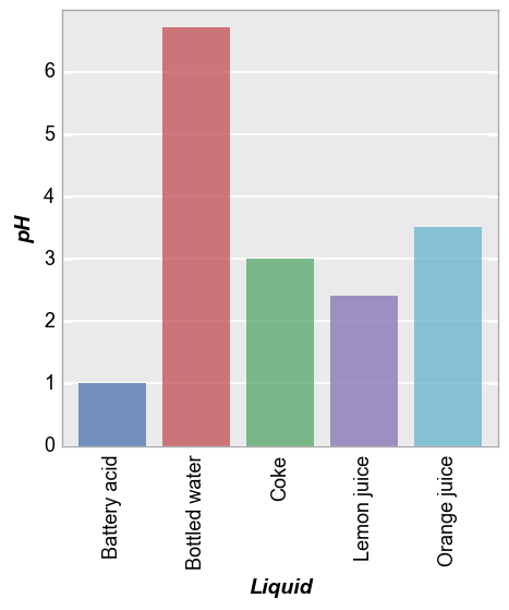
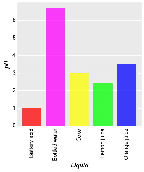
Color by bar
color_by_bar gives each bar in the chart a different color. These colors can be set manually or the fcp.DEFAULT_COLORS scheme is used by default.
fcp.bar(df, x='Liquid', y='pH', filter='Measurement=="A" & T [C]==25', tick_labels_major_x_rotation=90, color_by_bar=True)
fcp.bar(df, x='Liquid', y='pH', filter='Measurement=="A" & T [C]==25', tick_labels_major_x_rotation=90,
        color_by_bar=True, colors=['#FF0000', '#FF00FF', '#FFFF00', '#00FF00', '#0000FF'])
Other color kwargs
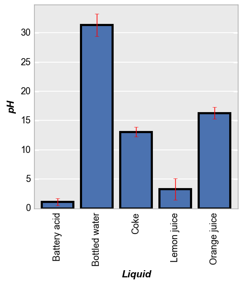
fcp.bar(df, x='Liquid', y='pH', tick_labels_major_x_rotation=90, error_bars=True,
        bar_error_color='#FF0000', bar_fill_alpha=1, bar_edge_color='#000000', bar_edge_width=3)